rideeazy
A service brand for easier group transportation
rideeazy is a digital transportation product for booking private group rides. I received an existing product concept and booking system without a defined brand identity. The name was developed through a collaborative brainstorming process, and my role was to shape the brand around it - from visual identity and service website design to tutorial storyboards based on existing product screens and launch communication.
Client: rideeazy / electra afikim
Created at: Kiss Marketing Agency
Role: Creative Direction / Brand Identity
Website Design / Tutorial Storyboards
Digital Campaign Assets
From Existing Product
to Brand Experience
The brief was to turn a functional transportation product into a clear, trustworthy service brand. The challenge was to create a consistent identity and communication system across the brand’s public-facing touchpoints: website, tutorial content and launch assets.

Brand Idea
& Identity
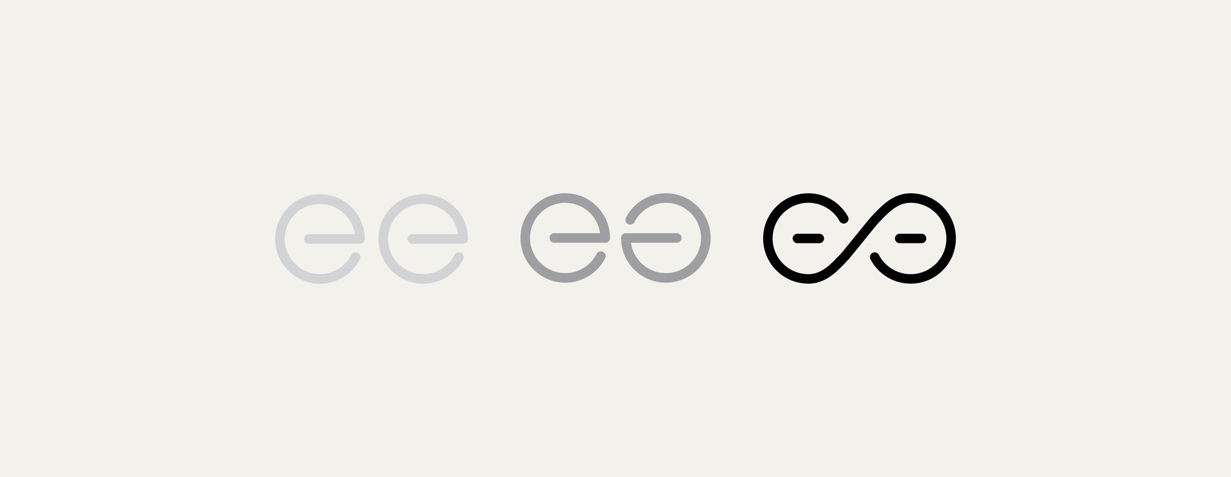
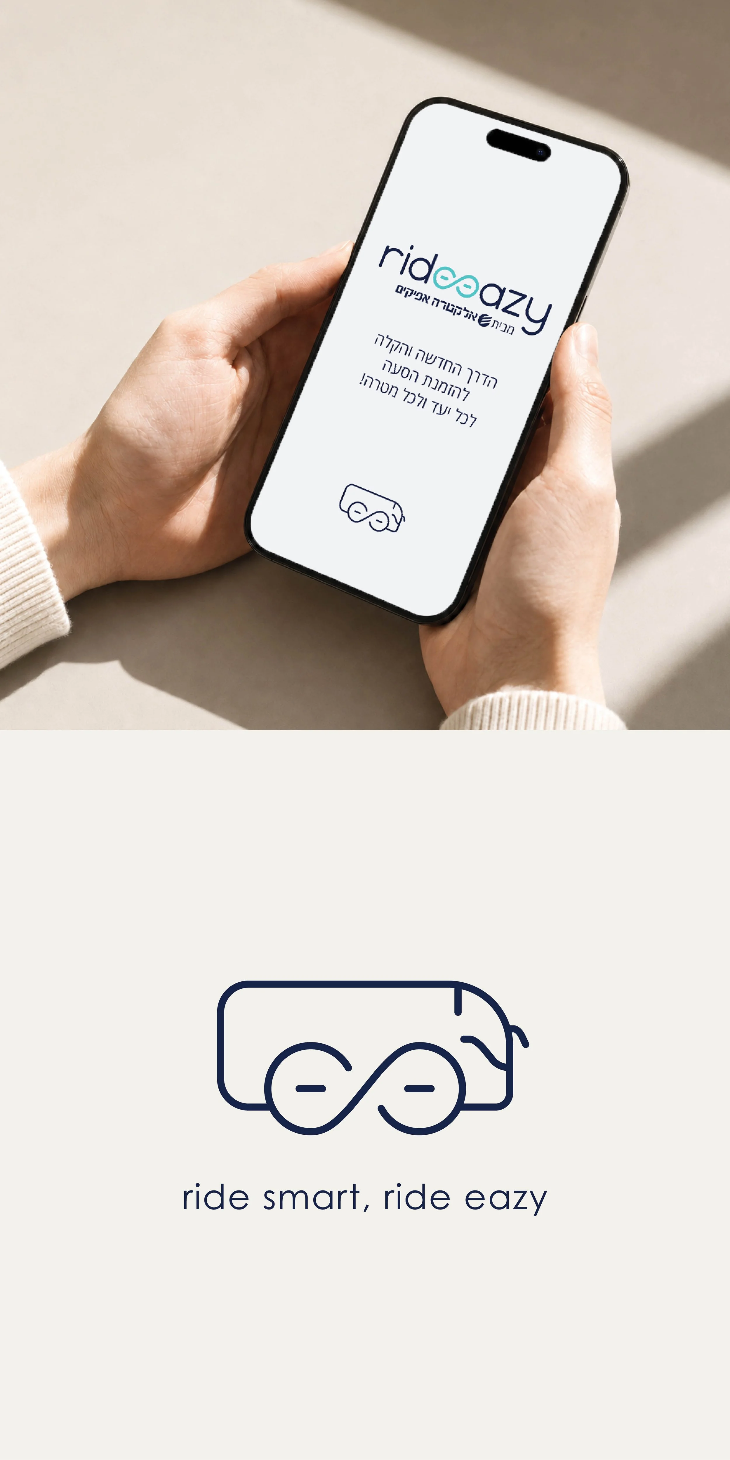
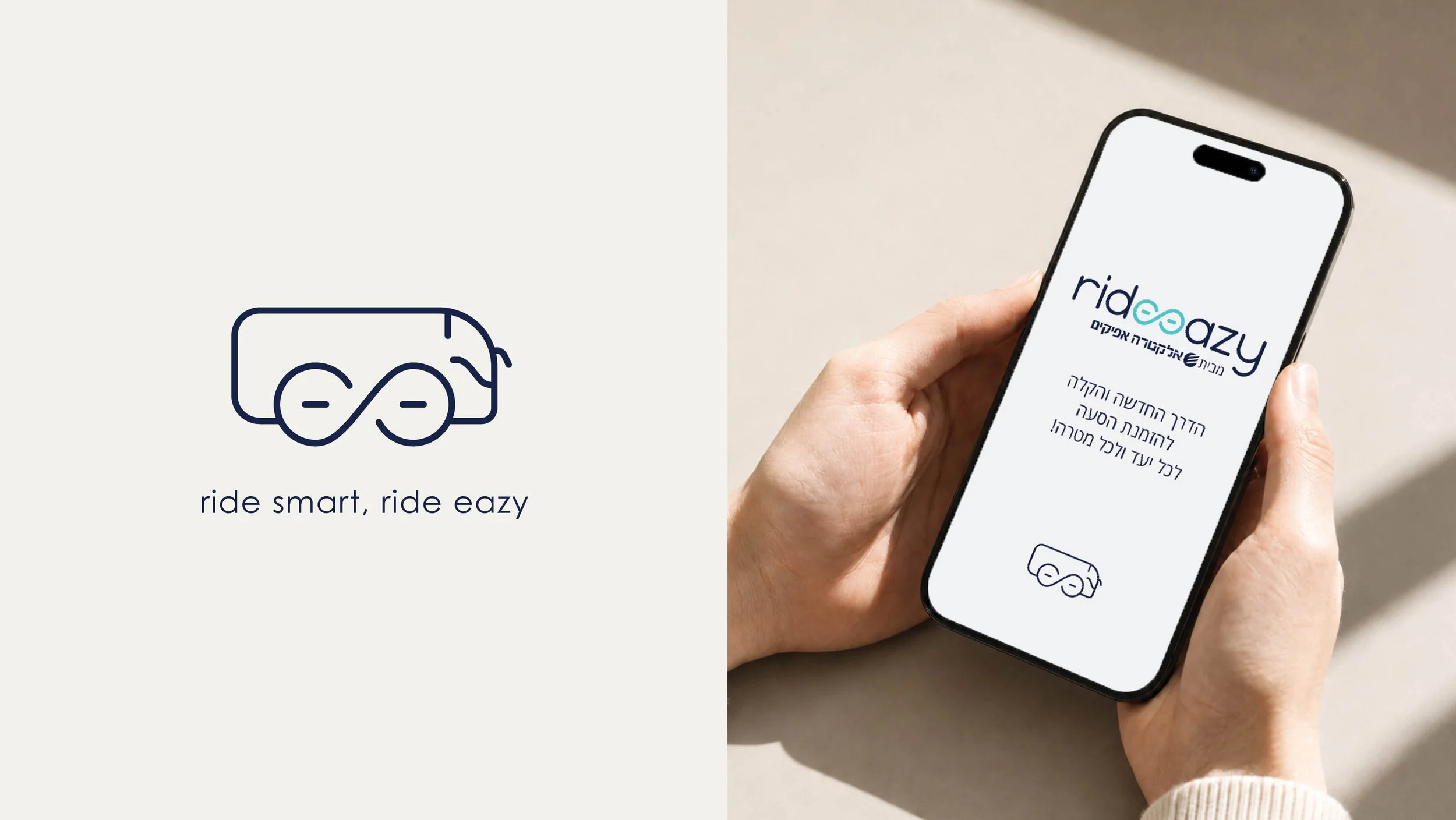
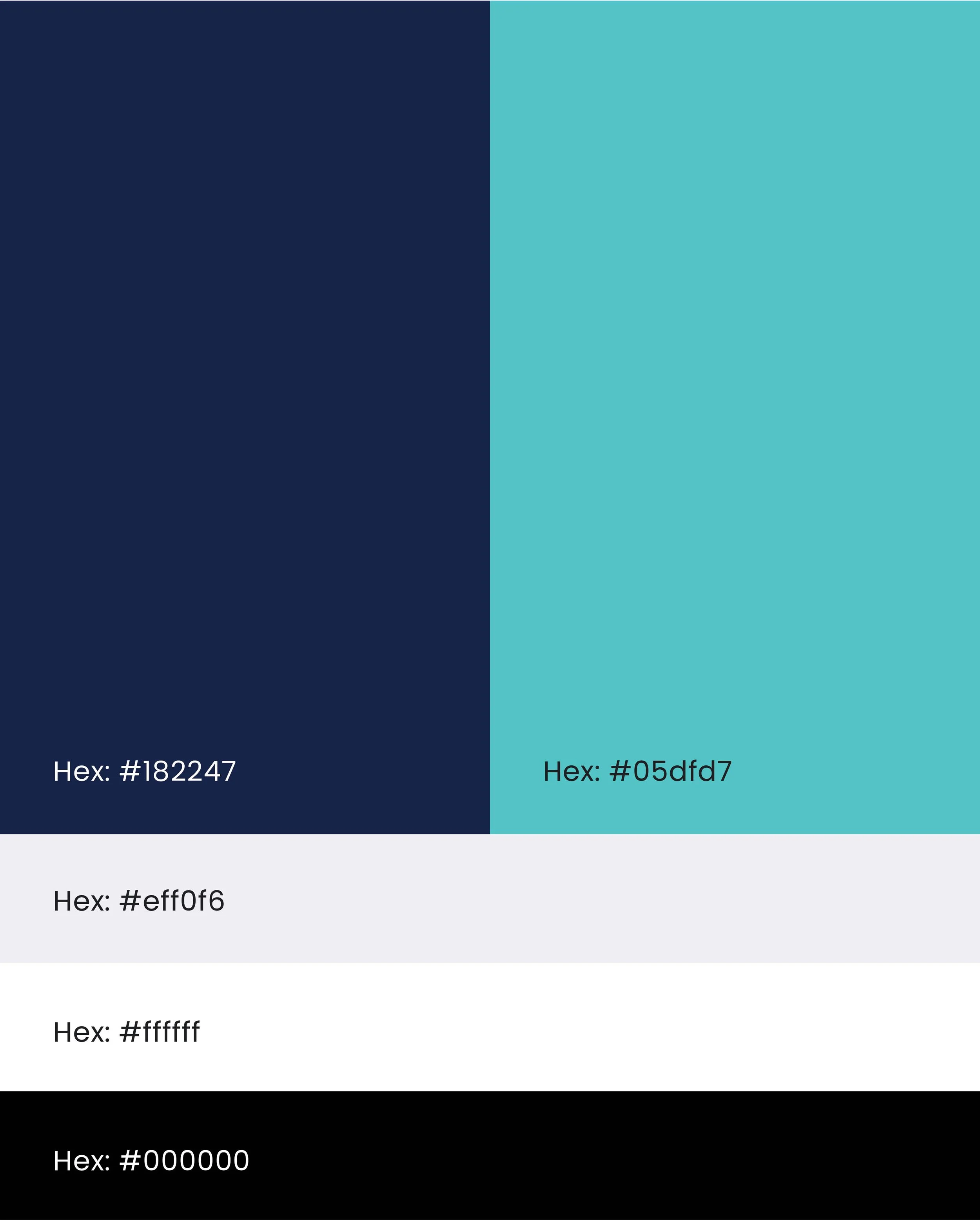
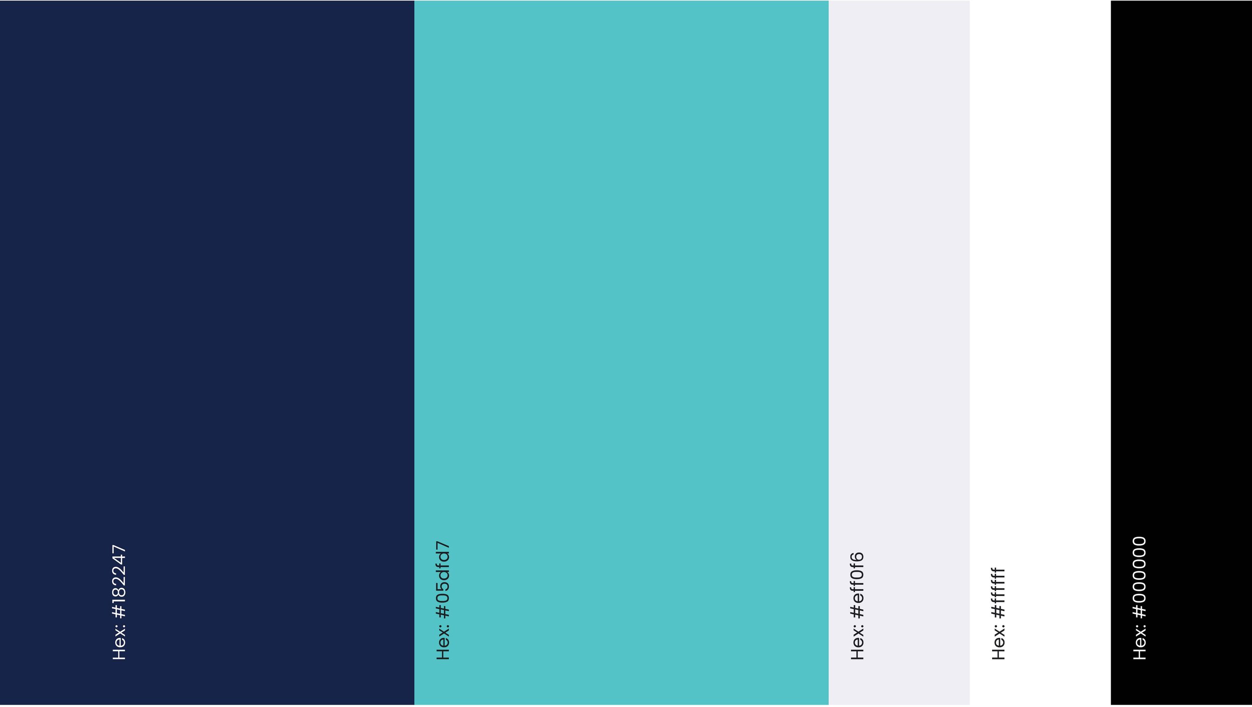
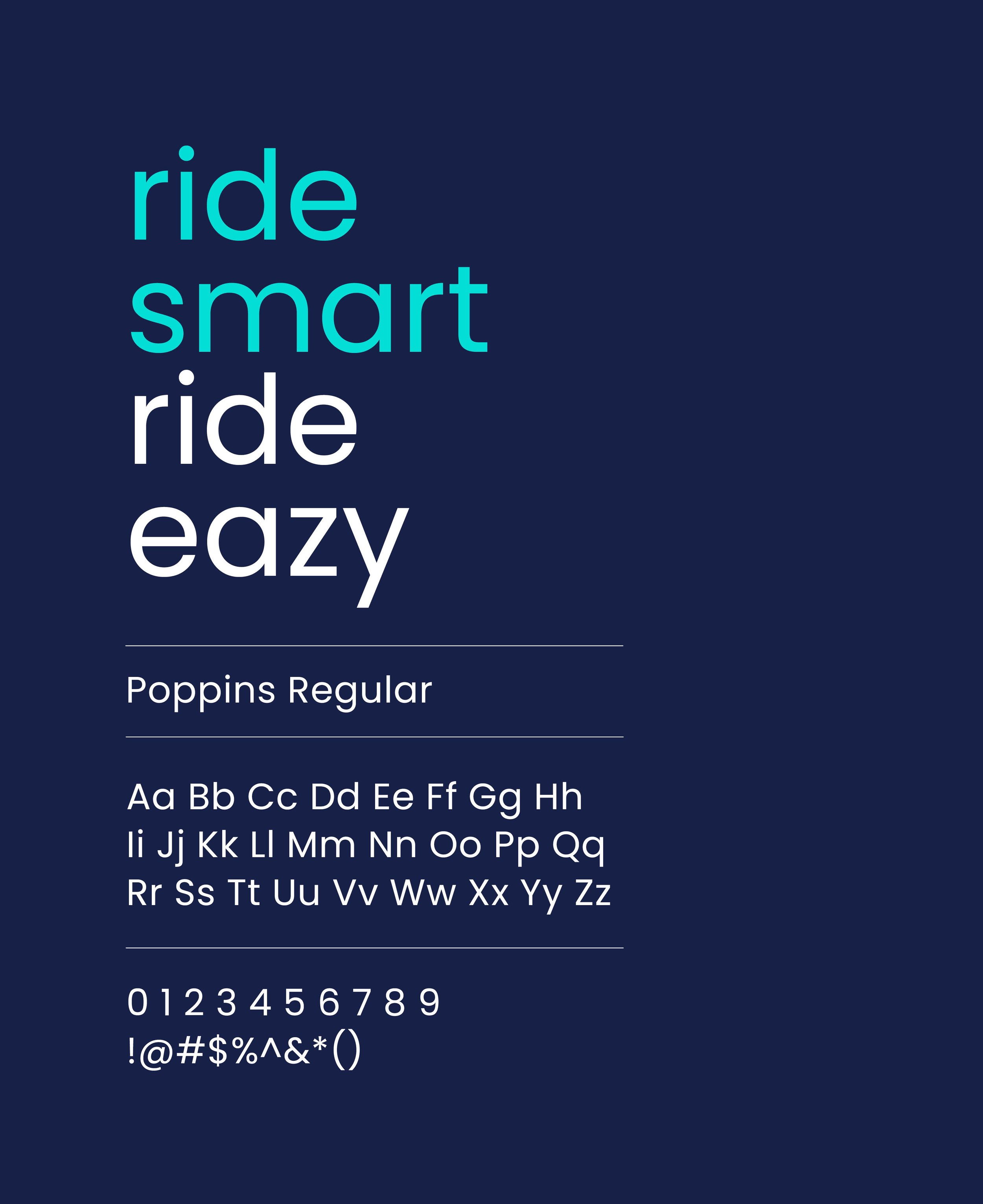
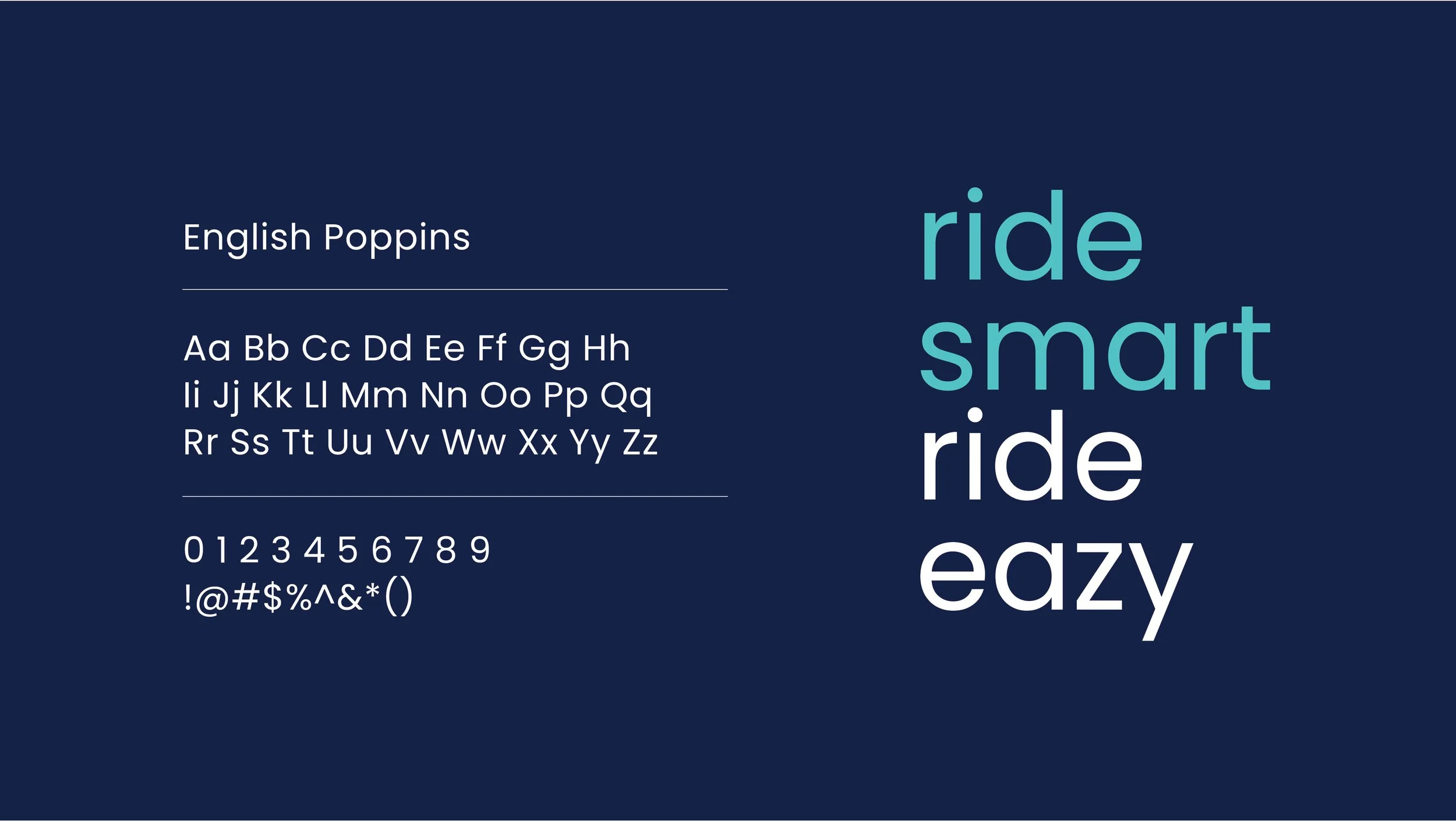
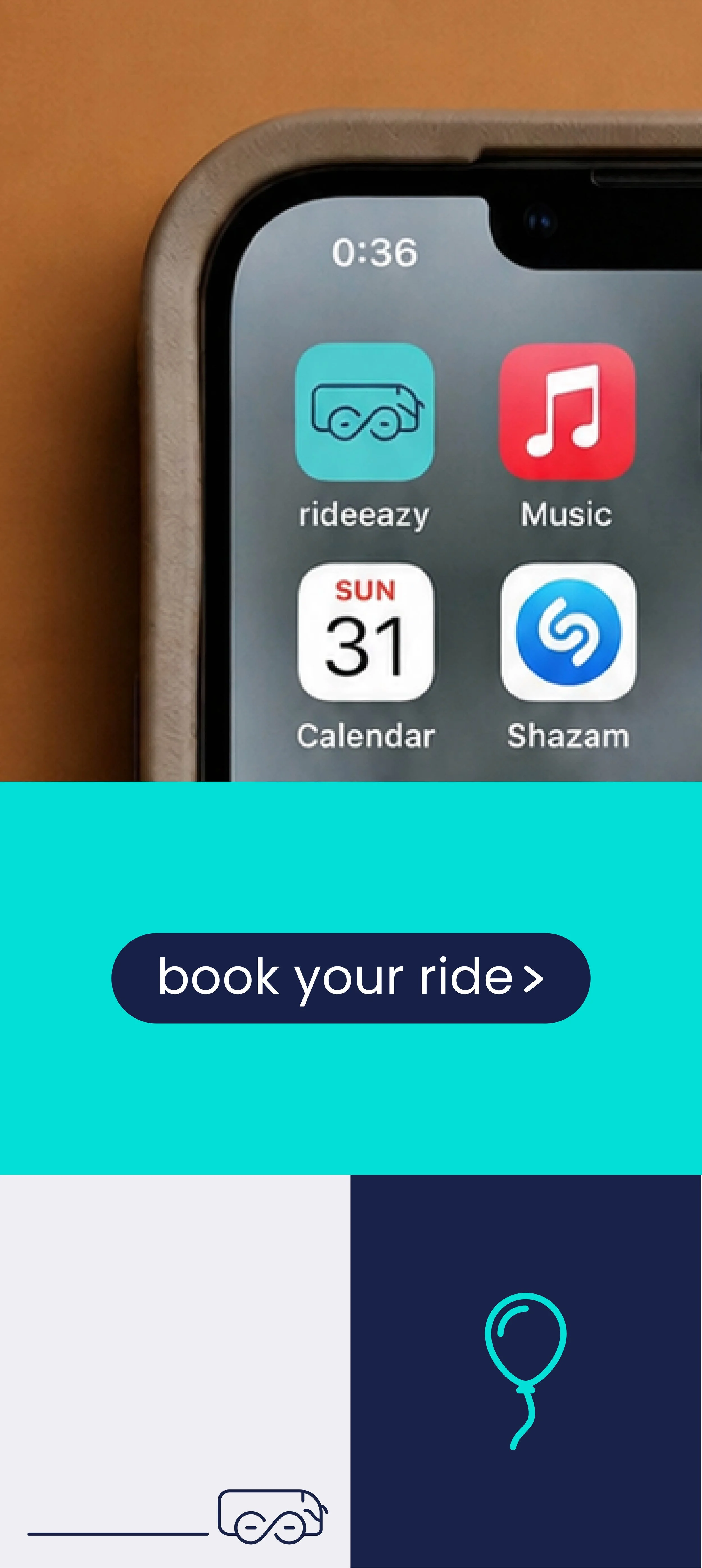
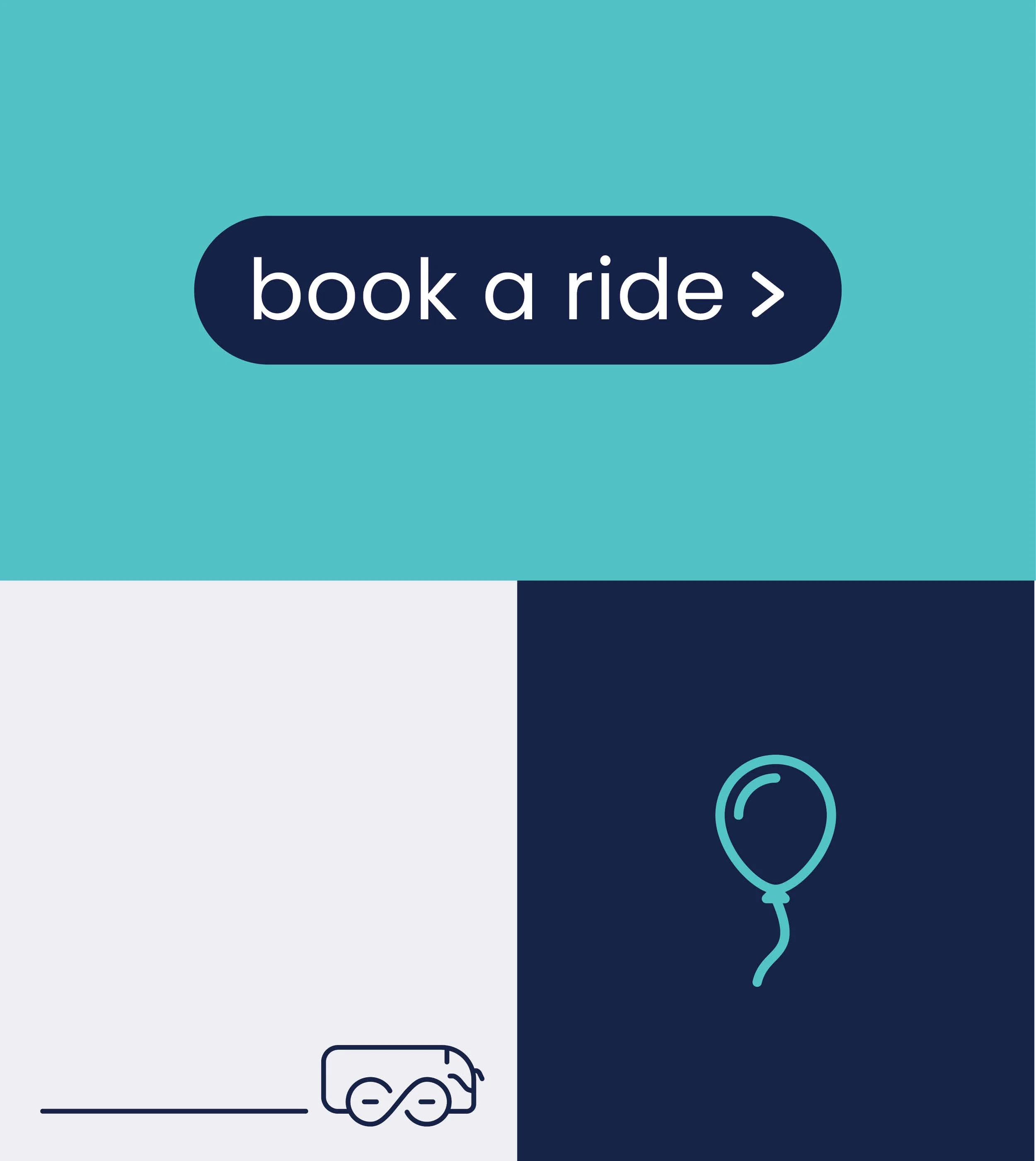
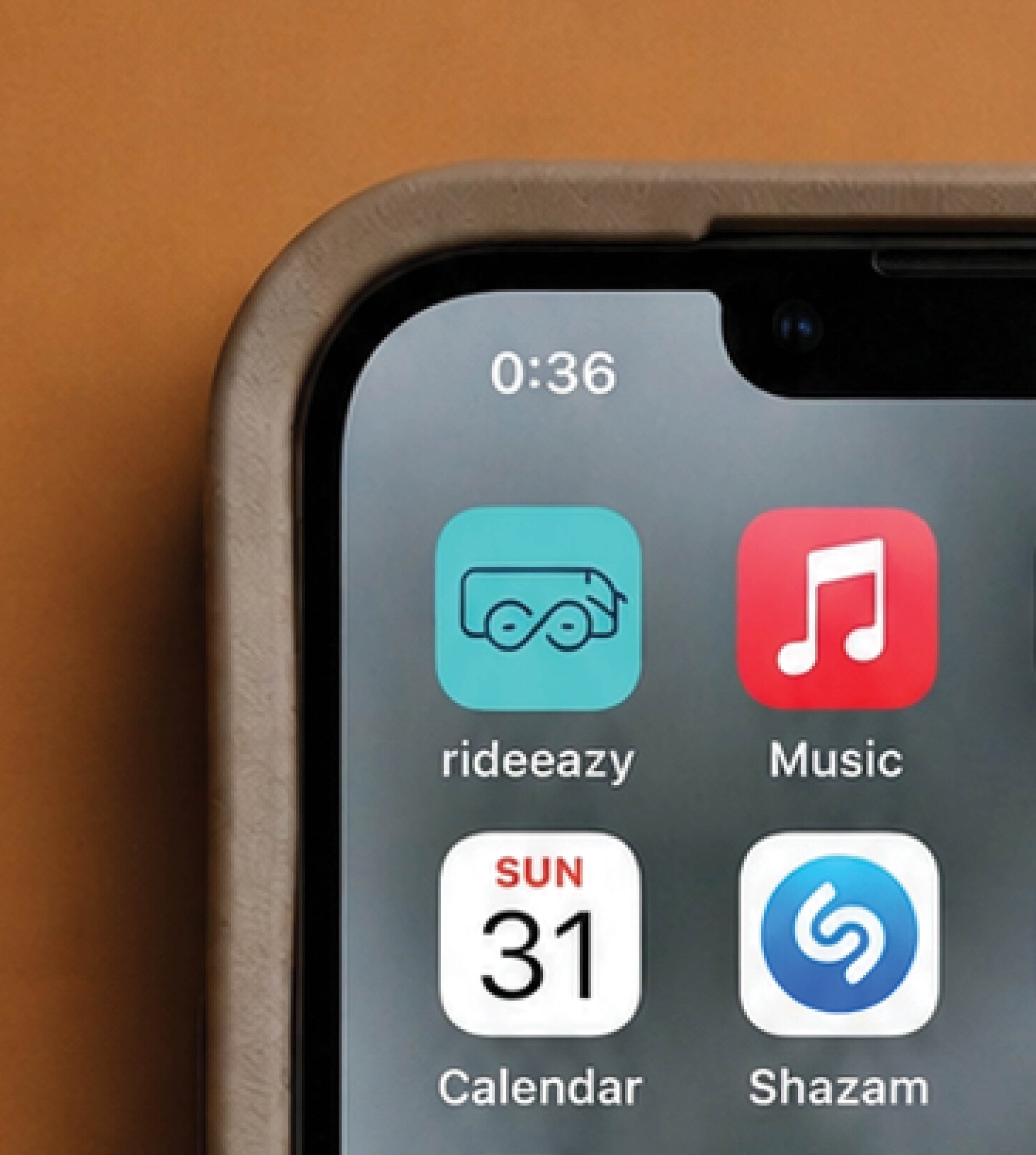
The brand direction was built around reducing friction and creating a sense of control. The infinity inspired symbol suggests continuous movement and endless ride possibilities - from different occasions and group sizes to different vehicle types. A focused blue-cyan palette, rounded typography and clear icon language complete a system that communicates ease, trust and flexibility.
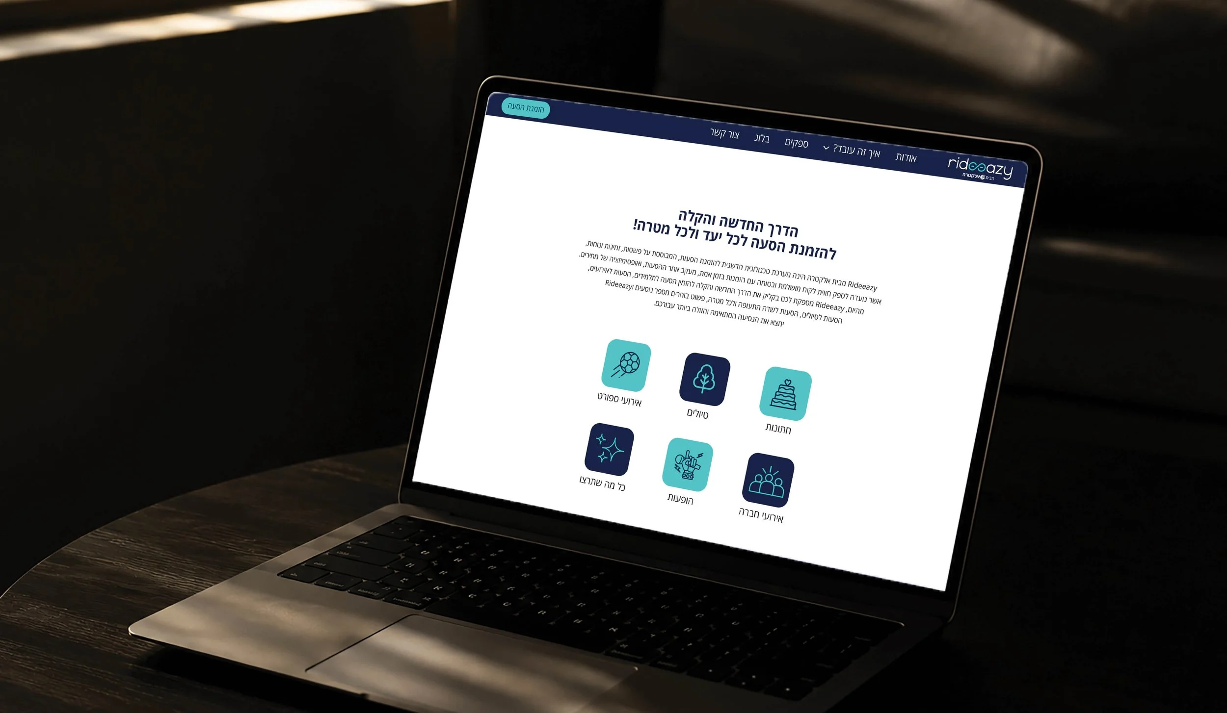
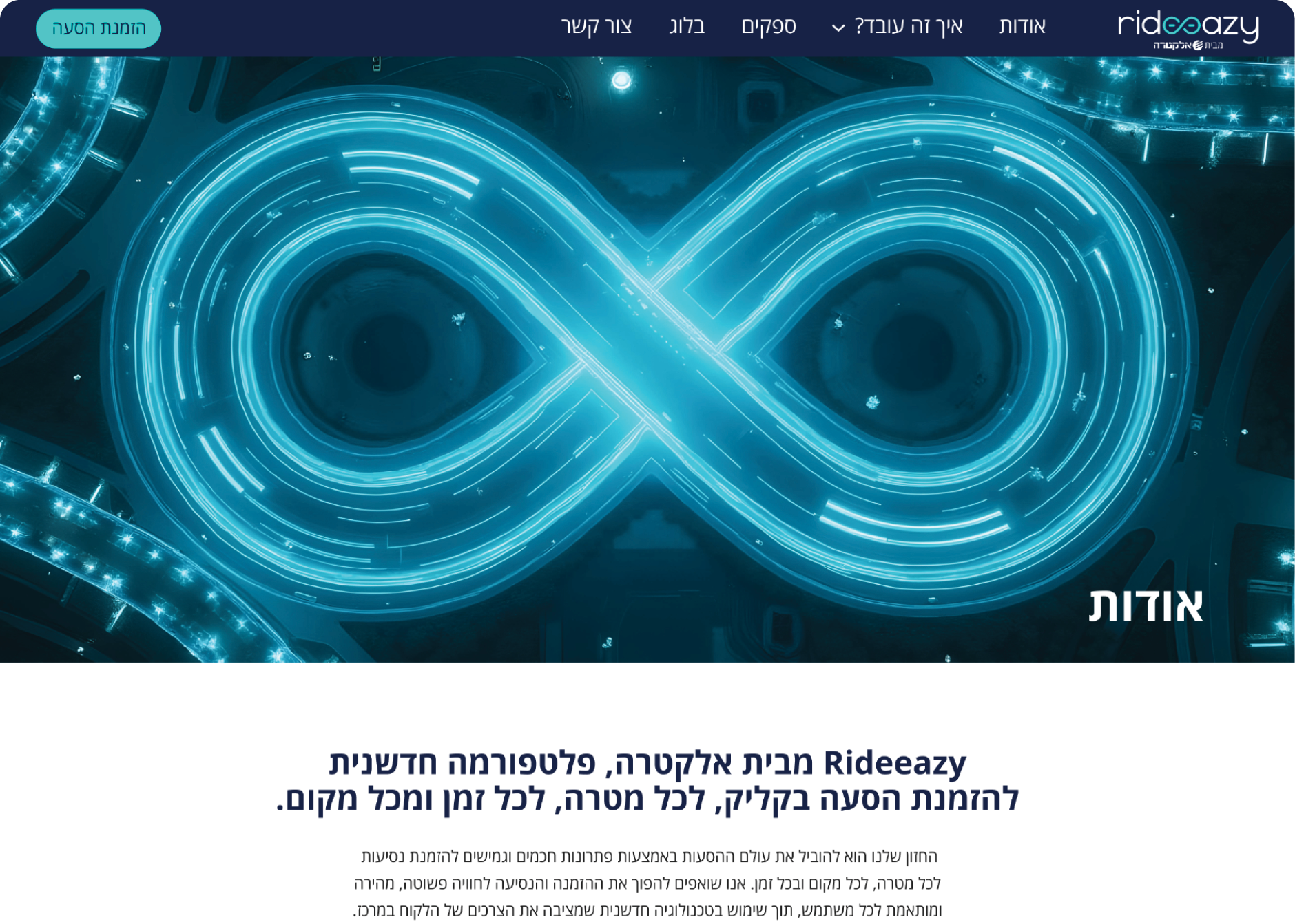
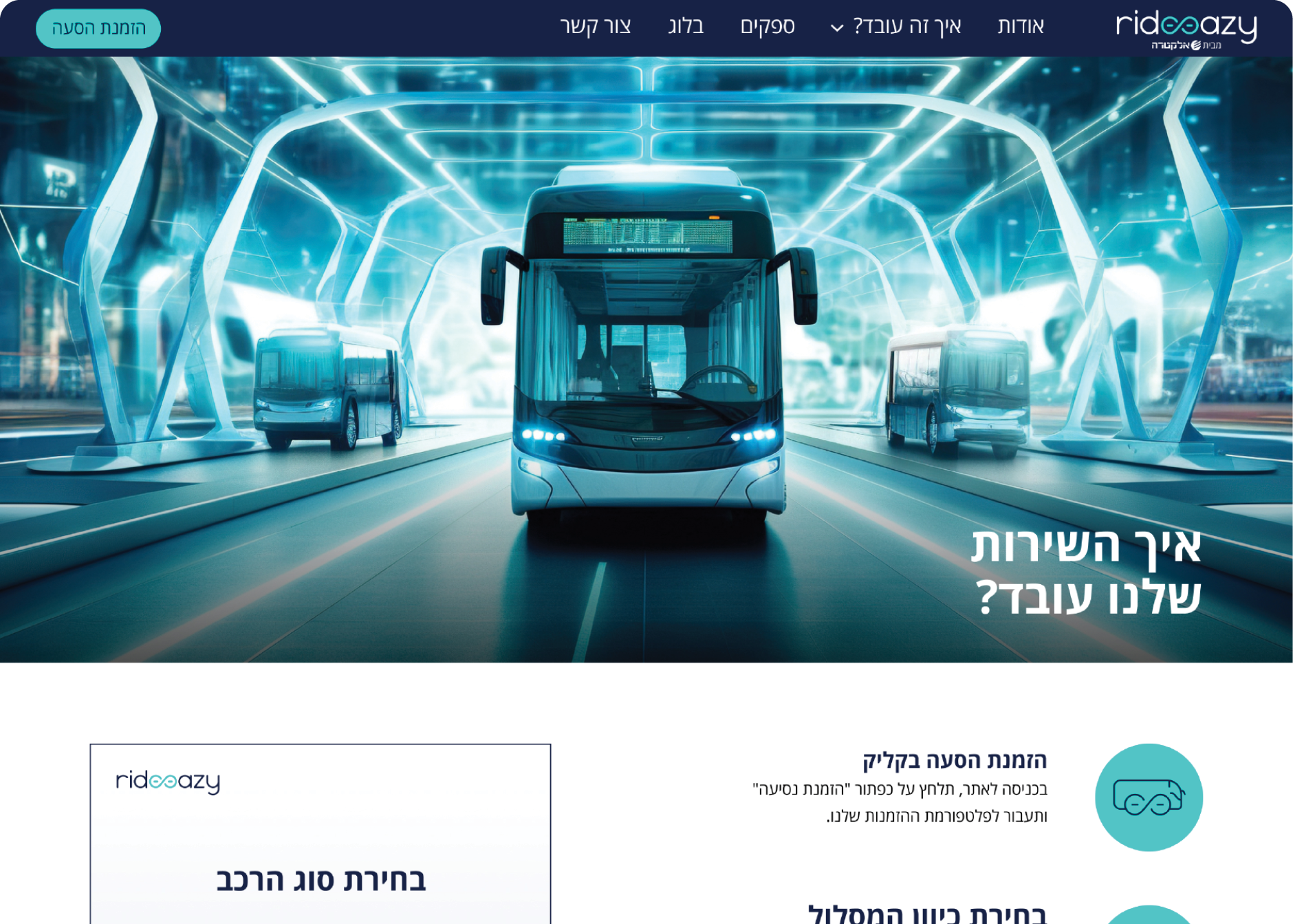
Service Website
The service website was designed to introduce rideeazy, explain the platform’s value and build trust before users enter the booking experience. The page makes the service easy to understand: what it does, how it helps and why it makes group transportation easier to manage.
Tutorial Storyboards Direction
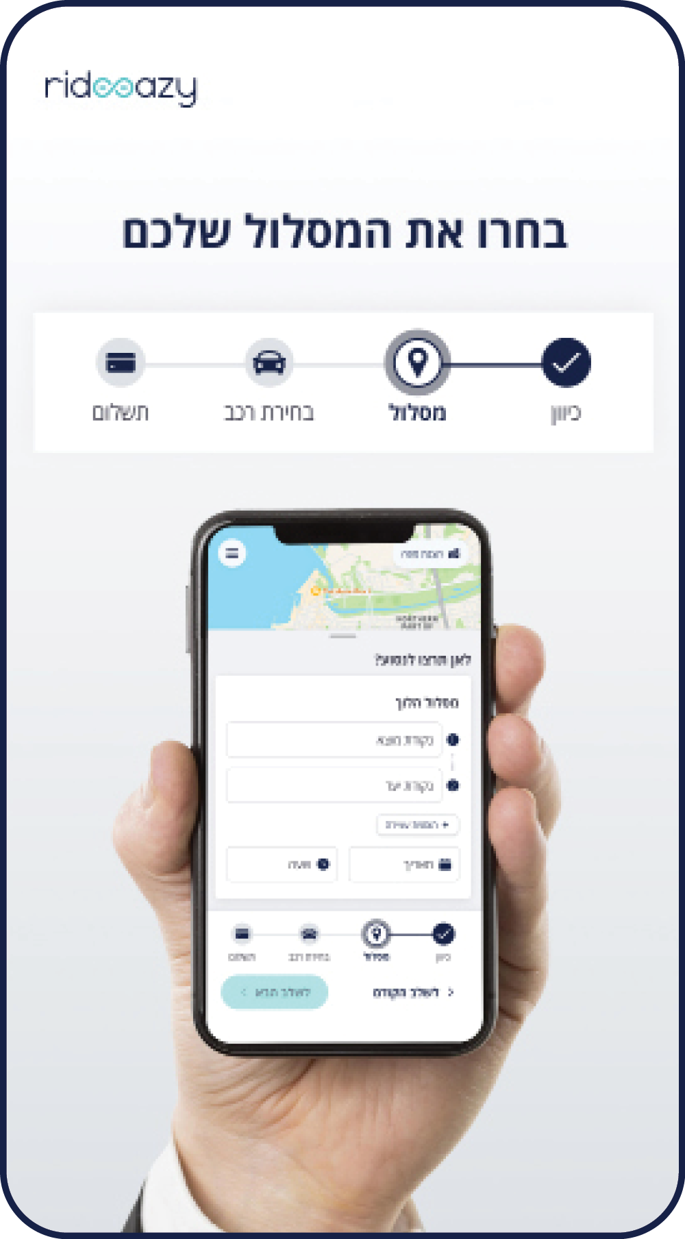
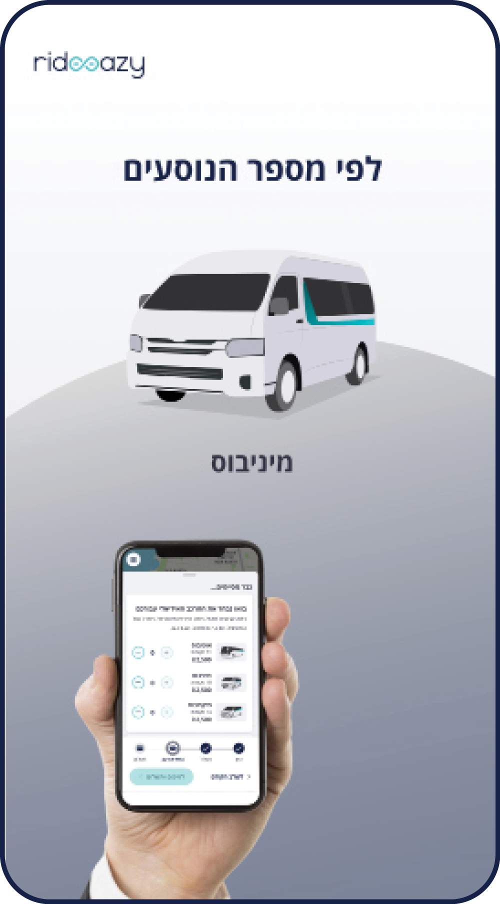
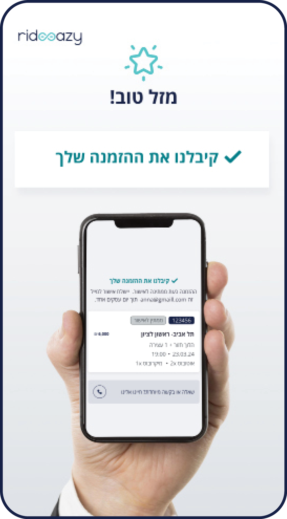
The booking system already existed. My role was to use its screens as source material and translate them into branded tutorial storyboards: one for customers booking a ride, and one for drivers and bus owners responding to ride requests.
Launch Campaign
The launch assets translated the brand into everyday ride occasions: weddings, birthdays, games, trips and events. A modular structure - logo, icon, headline, image and brand line - kept the campaign consistent while adapting to different scenarios.