
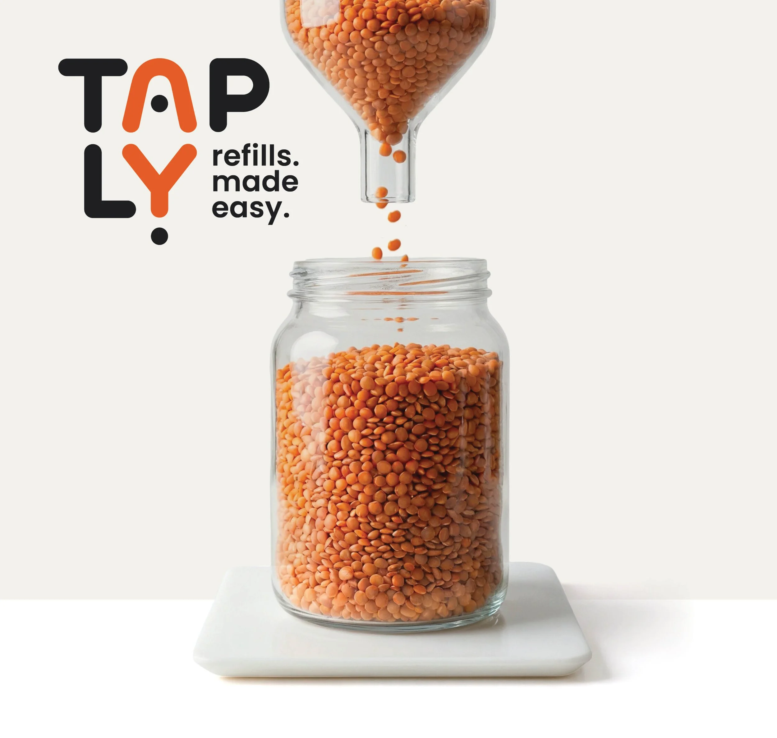

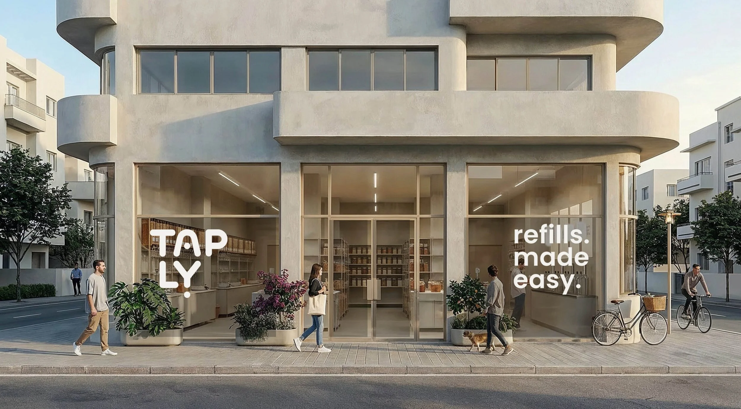
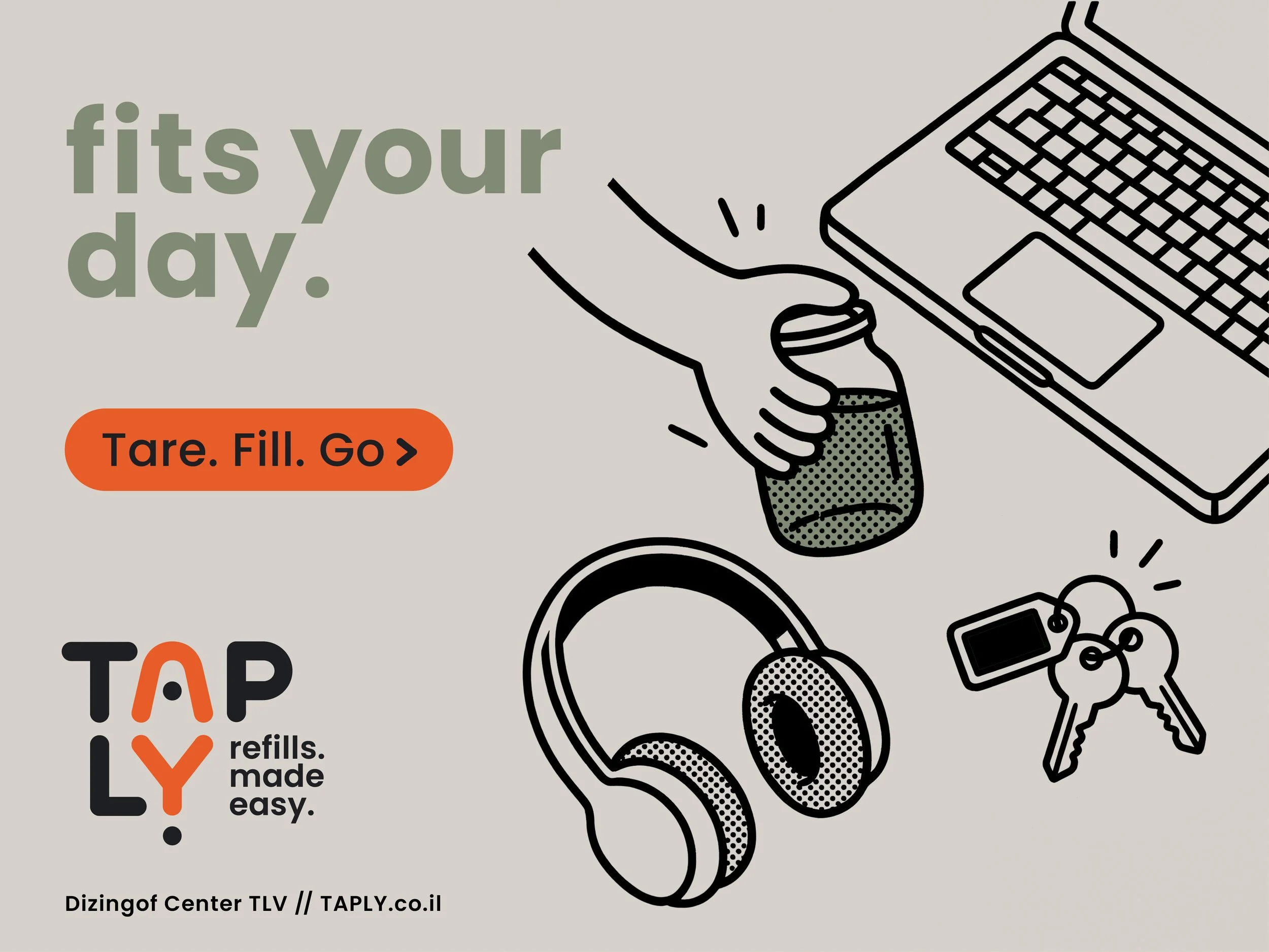
TAPLY
refills. made easy.
Concept project - TAPLY is a refill grocery brand based in Tel Aviv, designed to make zero-waste feel effortless. Developed with AI as both a creative and strategic collaborator throughout the process, the project spans positioning, naming, visual identity, campaign thinking, and rollout applications. The result is a cohesive brand system that reframes refill as a clear, convenient, and repeatable habit - shaped by everyday use rather than extra effort.
The Brief
The client wanted a calm, trustworthy, community-minded grocery and refill store focused on sustainability, local produce, pantry staples, household refills, and reusable alternatives.
They were looking for a brand that could feel grounded and modern without becoming preachy, rustic, or overly trend-driven.
The identity also needed to work as a full system - across signage, packaging, social media, and future loyalty touchpoints.
The brief pointed to a bigger challenge: how to turn low-waste shopping into something clear, convenient, and easy to repeat.
The Problem
Low-waste shopping often feels slower, less intuitive, and harder to fit into everyday life. For busy city shoppers, convenience remains the real barrier: in most cases, buying a pre-packaged product is still easier than bringing containers from home and navigating the refill process.
At the same time, most refill offers cover only part of the basket. With household refills, pantry staples, and fresh produce often split across different places, the experience feels fragmented instead of easy to build into a regular routine.
AI support:
ChatGPT helped unpack the brief and identify the core challenge behind the brand: reducing friction in low-waste shopping.
Research
Research focused on market behavior, competitor positioning, and audience friction. The key finding was not just a lack of awareness, but a structural gap in how refill is offered.
Existing competitors each cover part of the space — refill culture, organic grocery, or lifestyle aesthetics — but none bring together refill, local grocery, household essentials, and an intuitive user flow into one cohesive, everyday experience.
AI support:
Perplexity supported market and competitor research, while ChatGPT helped synthesize the findings into clearer strategic patterns.
Audience Insight
Urban Tel Aviv locals, aged 25–45
Sustainability-minded, but convenience-driven Looking for quiet mastery, not eco performance
Fast rhythm / Small apartments / Local mindset / Friction-free habits
The Opportunity
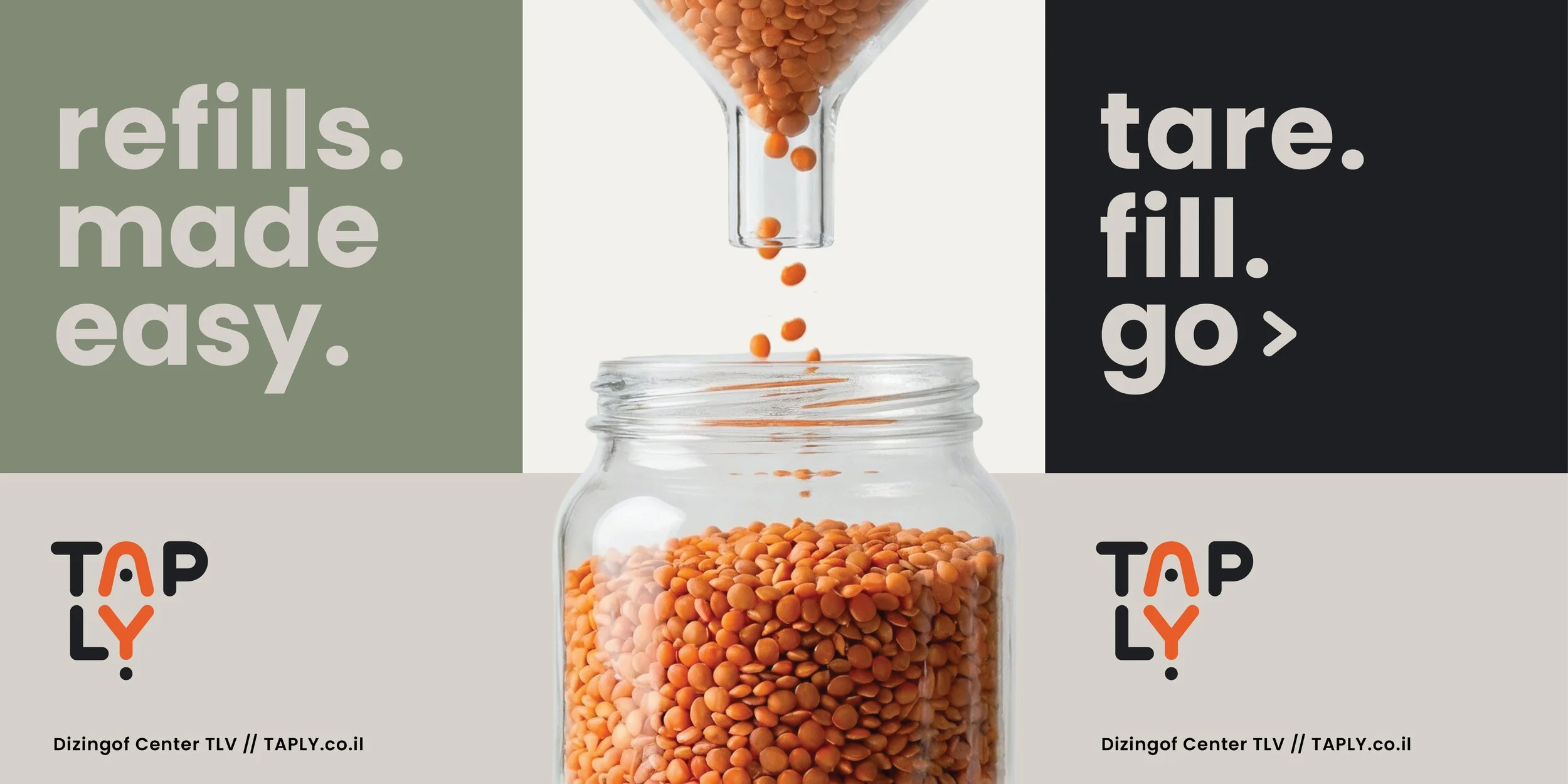
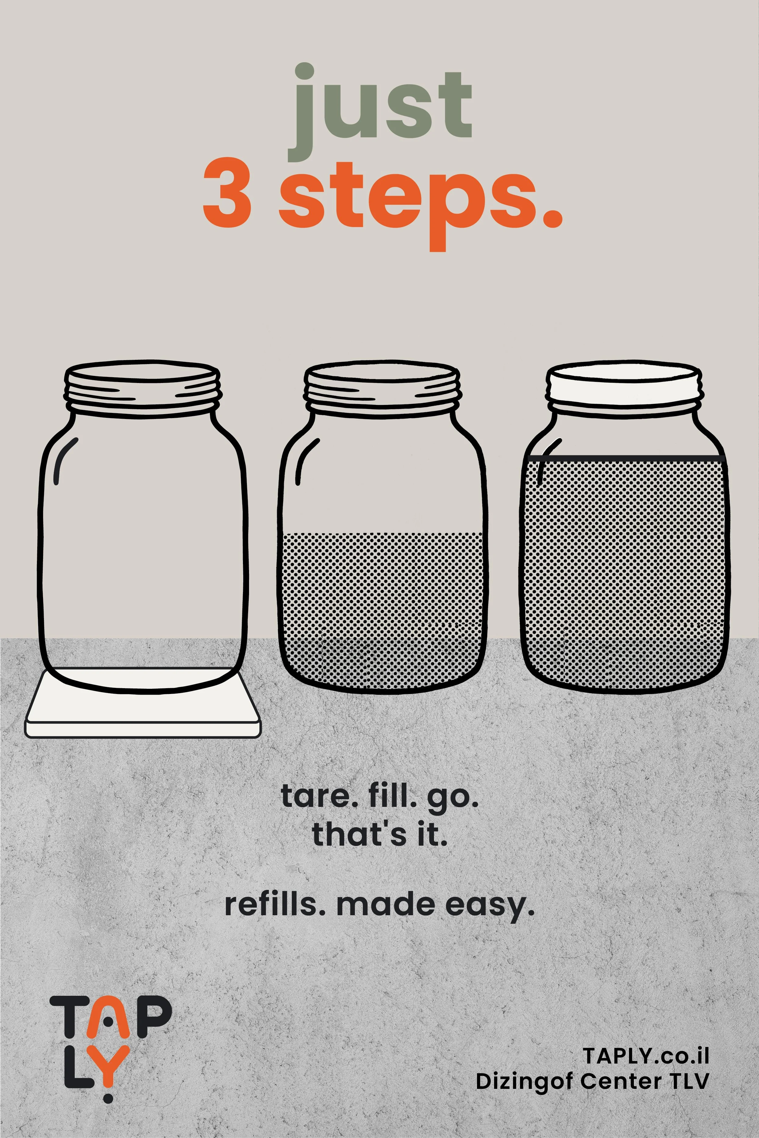
The opportunity was to redesign refill as a smarter, more intuitive retail experience. Instead of relying on slow, manual routines, TAPLY introduces a clear three-step system - tare. fill. go. - supported by a mechanism that guides the process with speed, precision, and ease.
By reducing friction and decision fatigue, the brand turns refill into something that feels less like effort and more like a natural everyday habit. This convenience-led approach is further strengthened by a full-basket offer that brings grocery essentials, local produce, and household refills into one seamless routine.
The strategy
Zero-waste
on autopilot
The refill & grocery store that turns zero-waste into an effortless Tel Aviv habit - smart urban UX with the cozy familiarity of a place that already gets you.
AI support:
ChatGPT helped connect the research, audience needs, and market gap into a sharper positioning platform and clearer brand language.
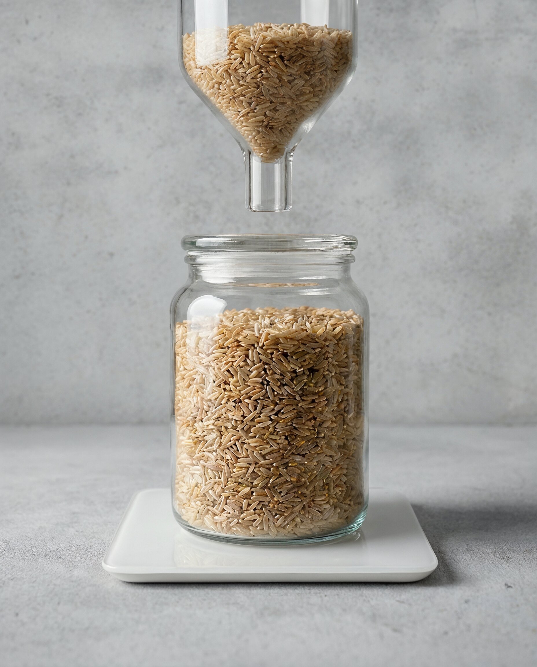
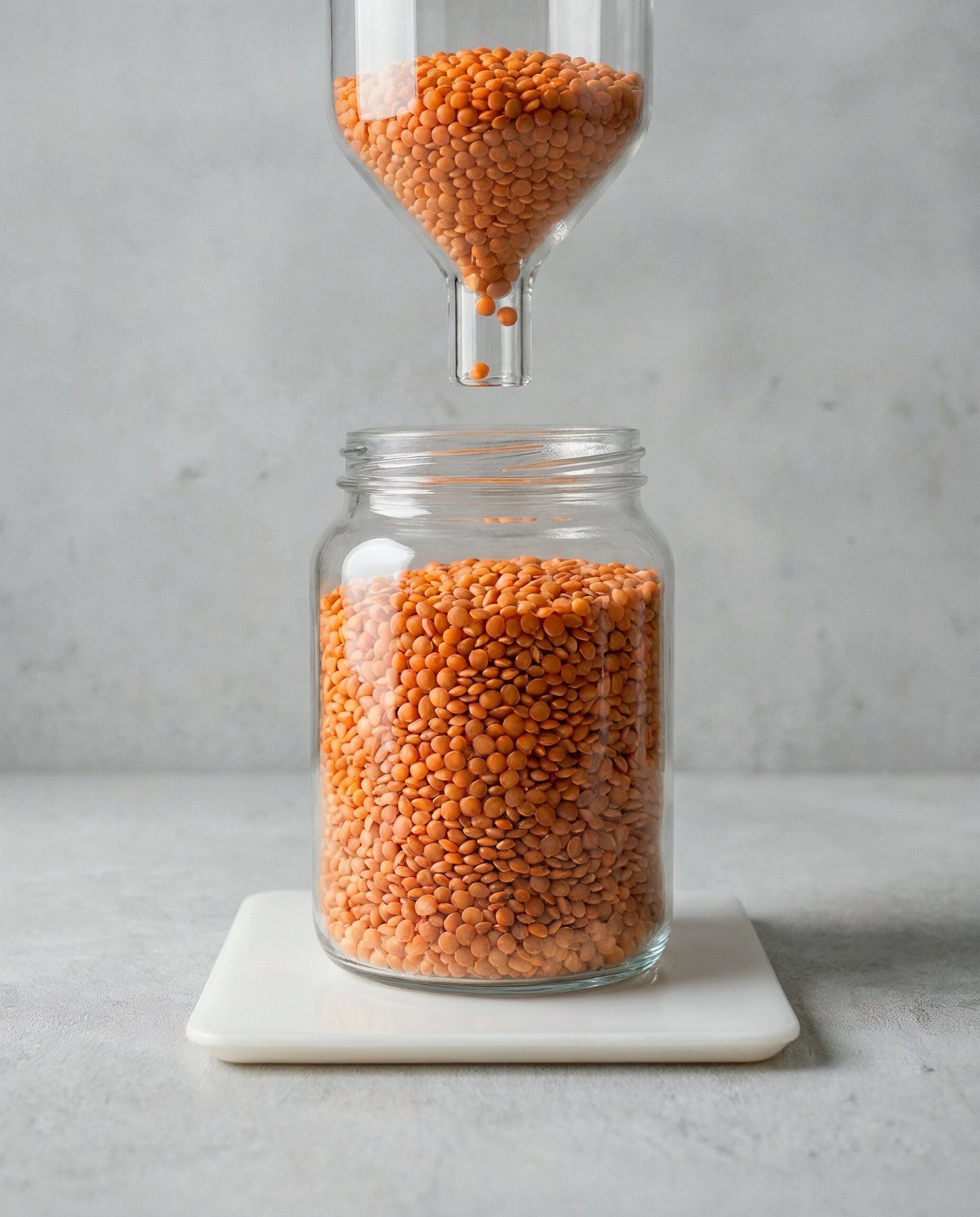
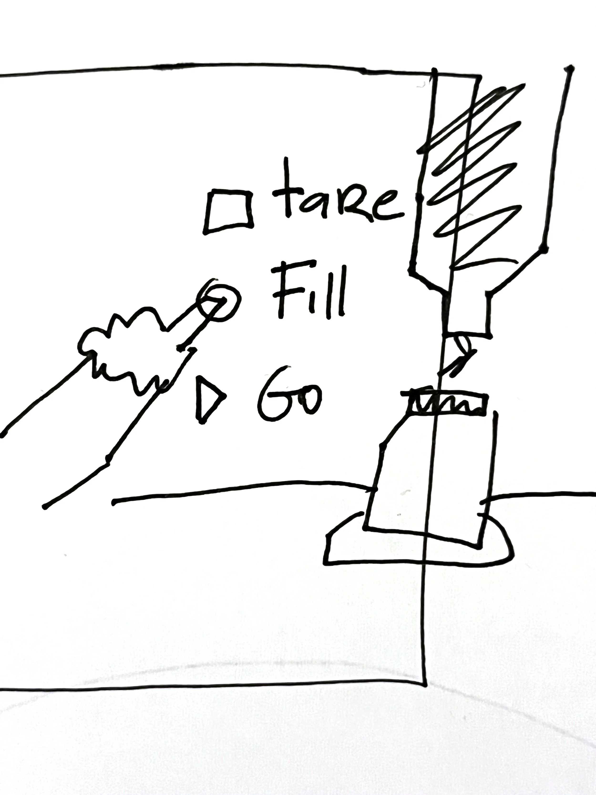
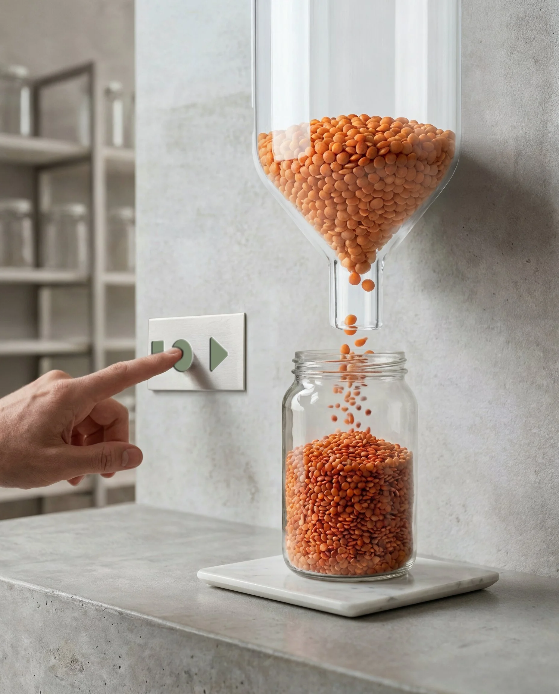
The Mechanism
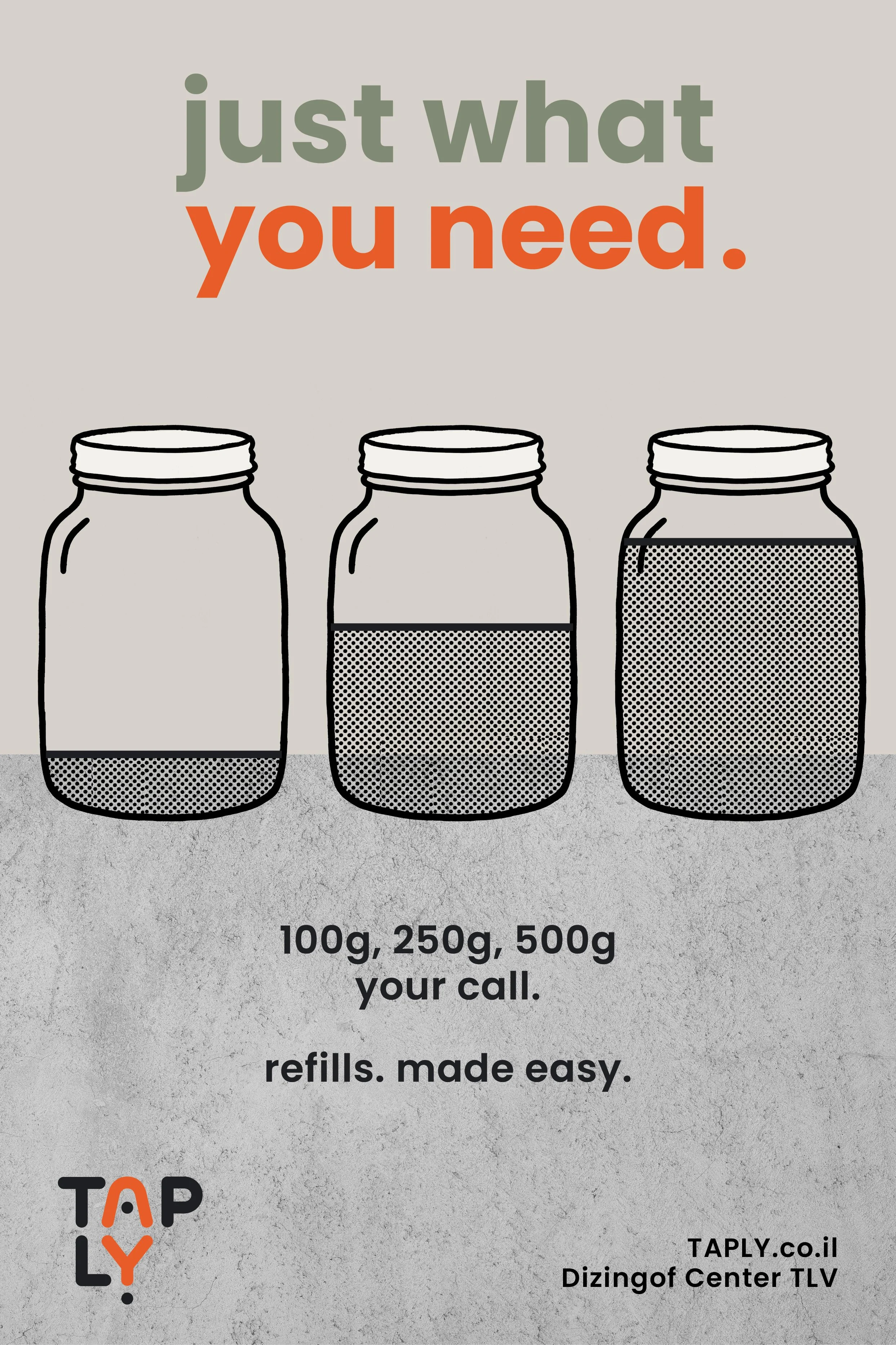
A universal refill station designed to deliver precise amounts by target mass across categories including dry goods, powders, liquids, and viscous products.
The station measures weight in real time and dispenses in two speeds - fast fill, then precision trim - stopping automatically at the exact target.
This marks a clear shift from most refill formats today, where weighing is still manual and the process depends on pouring control and inconsistent flow.
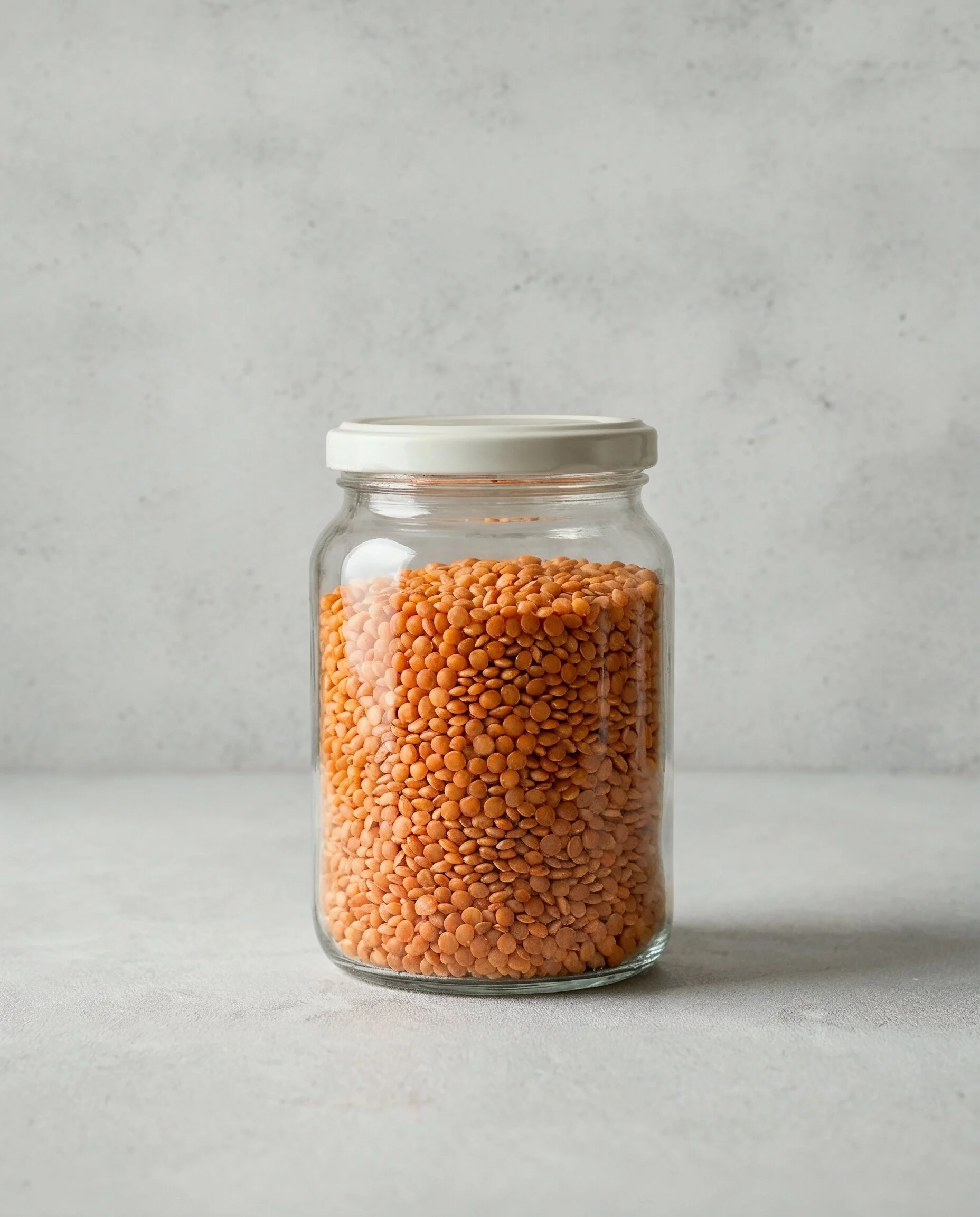
tare.

fill.
go.
Identity Concept
The identity reflects the brand’s promise of making refill feel simple, intuitive, and effortless. By turning the “A” and “Y” into a small flow system - fill above, release below - the logo expresses the brand values through structure: clarity, ease, and smooth everyday use.
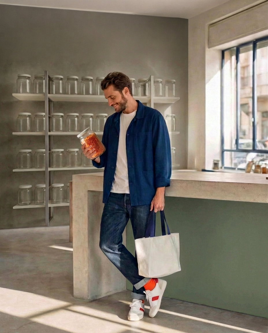
Visual Identity
A cozy, smart urban system - designed to make ease feel built-in. Soft neutrals, a sharp orange accent, and bold modular typography create a language that’s calm, modern, and instantly legible.
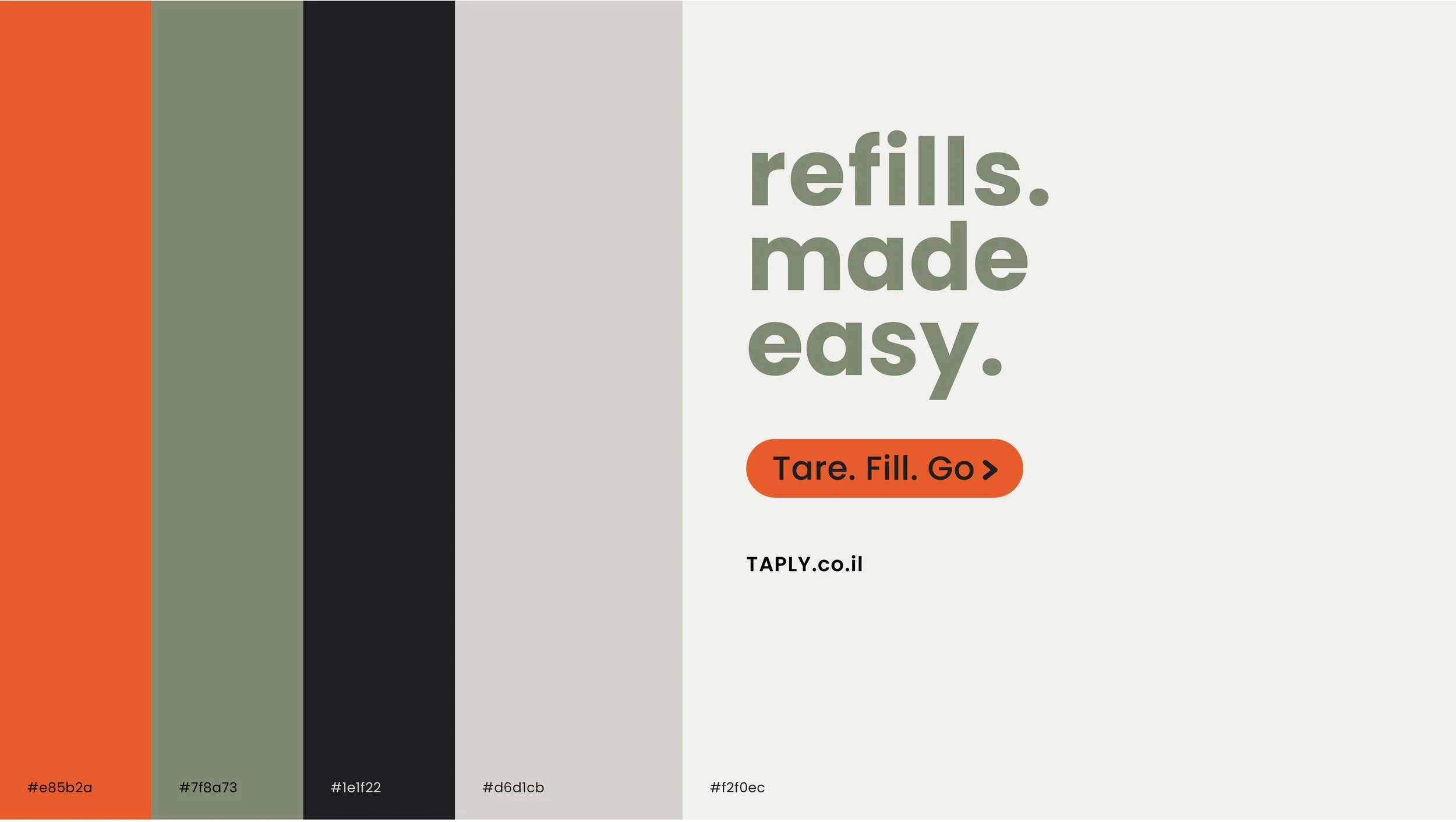
Accessible typography supports both signage and product information, while maintaining a premium, design-aware tone.
A refined, warm palette keeps the brand fresh and contemporary, while connecting to a sense of familiarity - a place that feels comfortable, local, and part of everyday life, avoiding health-food and “green lifestyle” clichés.
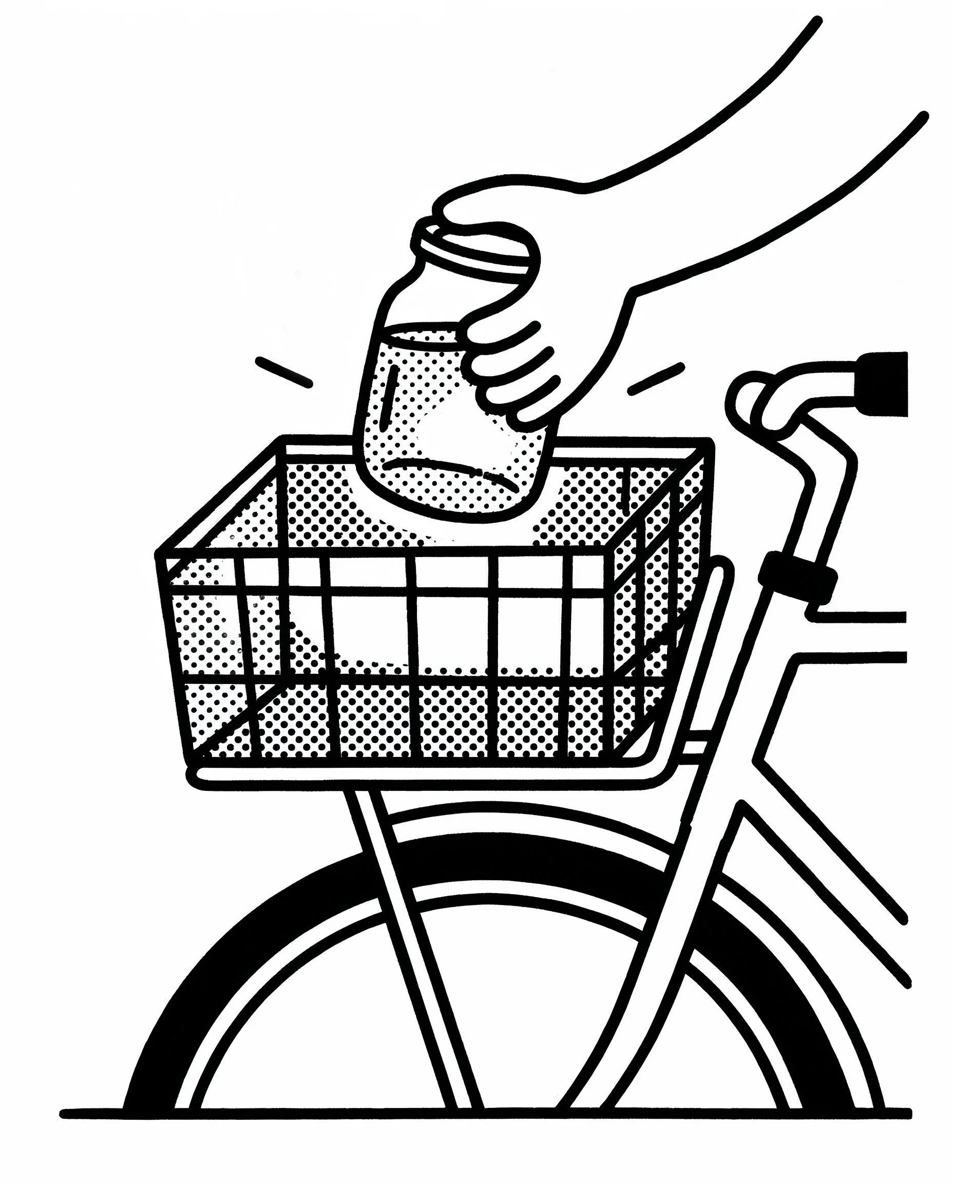
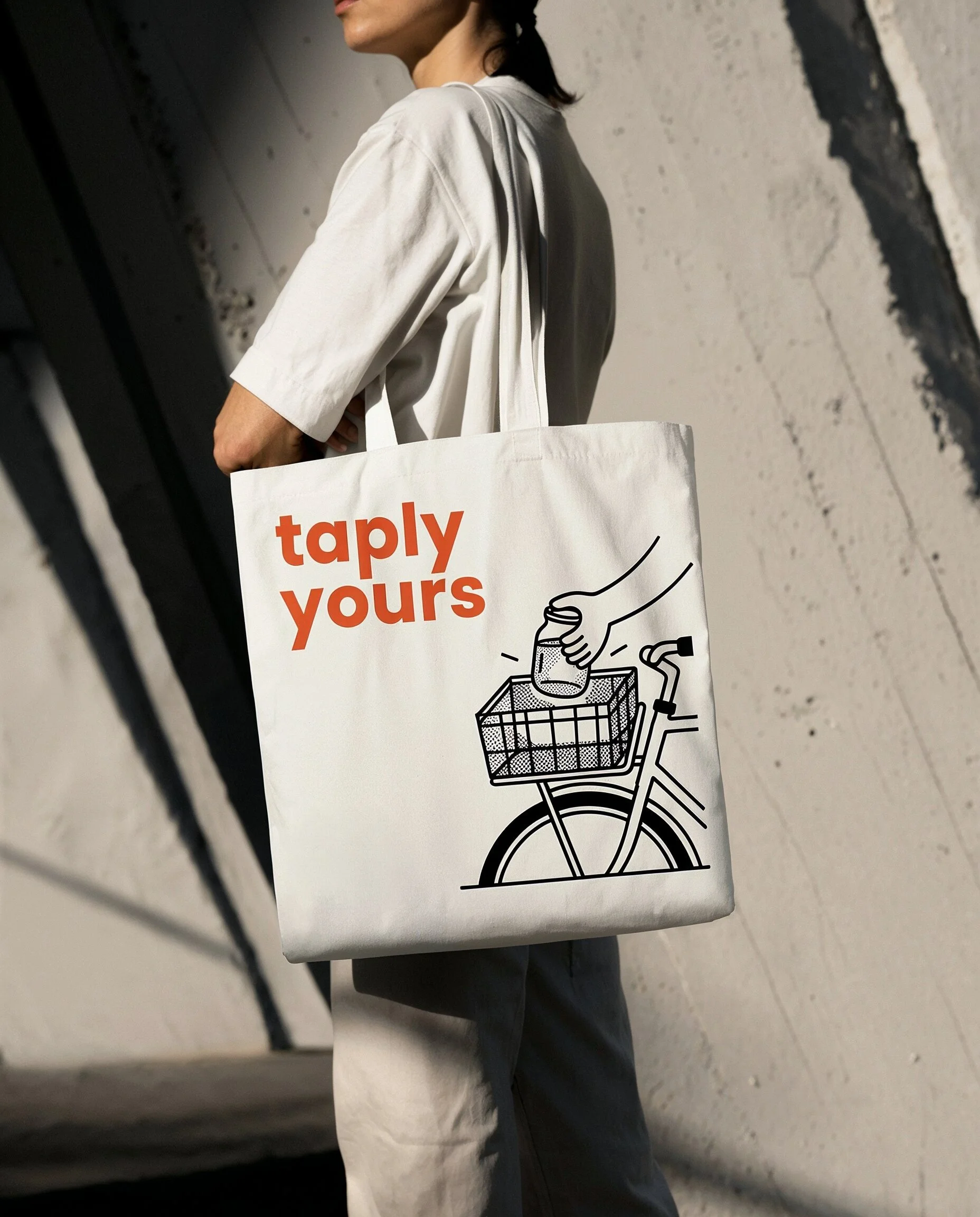
The visual world draws from real refill moments, modular systems, and everyday urban rituals. Single-line illustrations rooted in daily city life add warmth and an urban sense of familiarity, while keeping the overall system clean, precise, and as legible as an interface.
Visual prompt direction
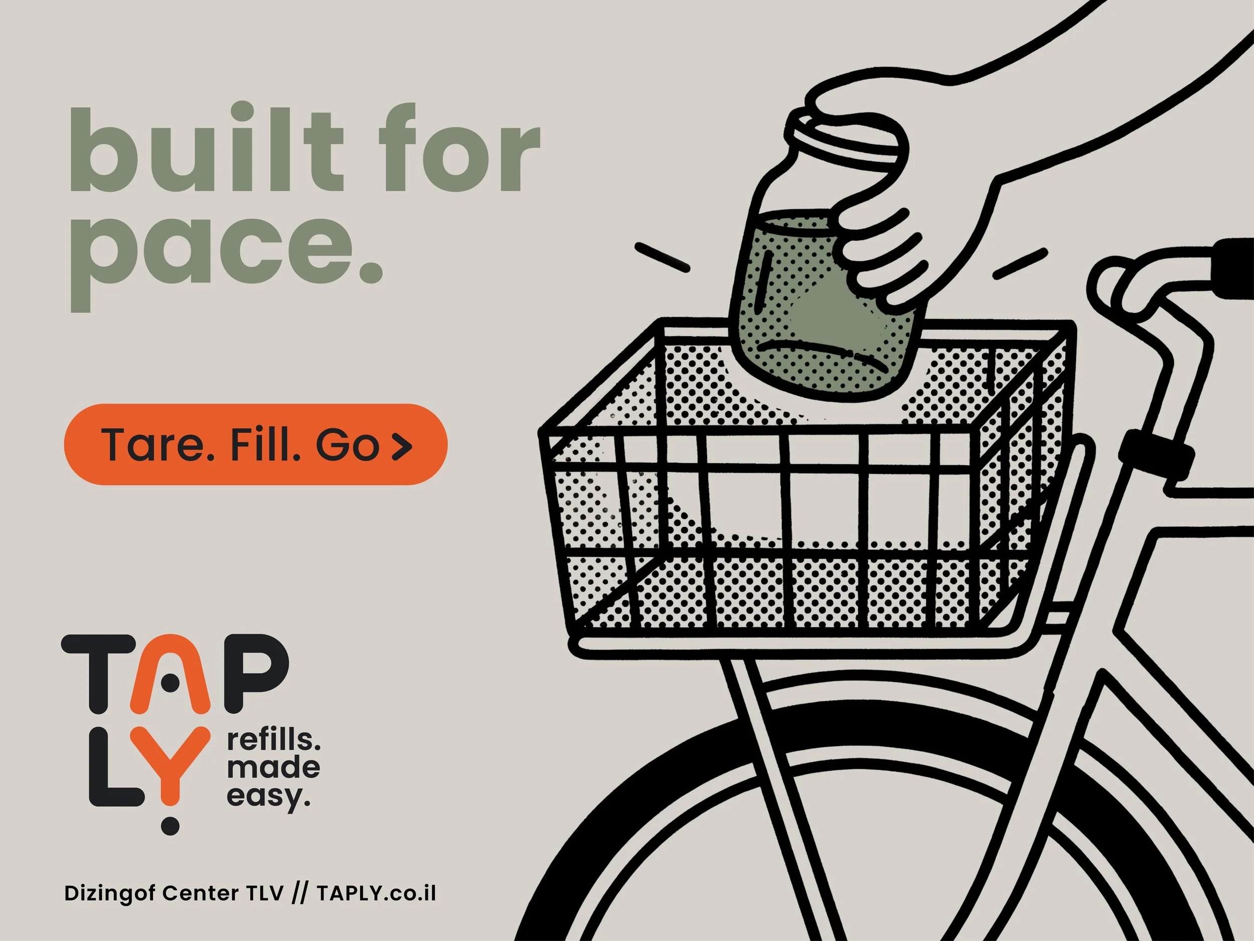
Single-line bicycle illustration with a jar placed into a rear crate. Bold black outlines, minimal detail, playful graphic tone, and a poster-like composition.
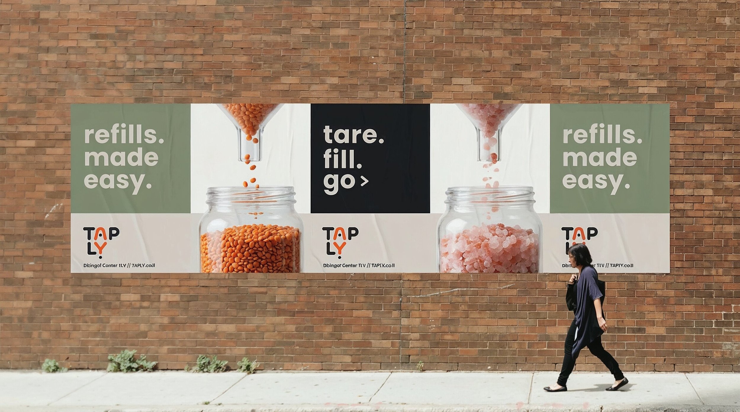
Poster system
Phase 01 - Core promise
TAPLY’s launch concept is captured in the line “Refill. Made easy.” - a clear expression of refill reimagined around convenience. Guided by the simple sequence “Tare. Fill. Go.”, the brand turns refill into a smart, intuitive routine that slips naturally into everyday city life.
Phase 02 - Everyday proof points
The second phase breaks the promise into familiar moments of daily city life - pace, flexibility, and ease. Instead of explaining sustainability, the campaign shows how TAPLY fits naturally into existing routines.
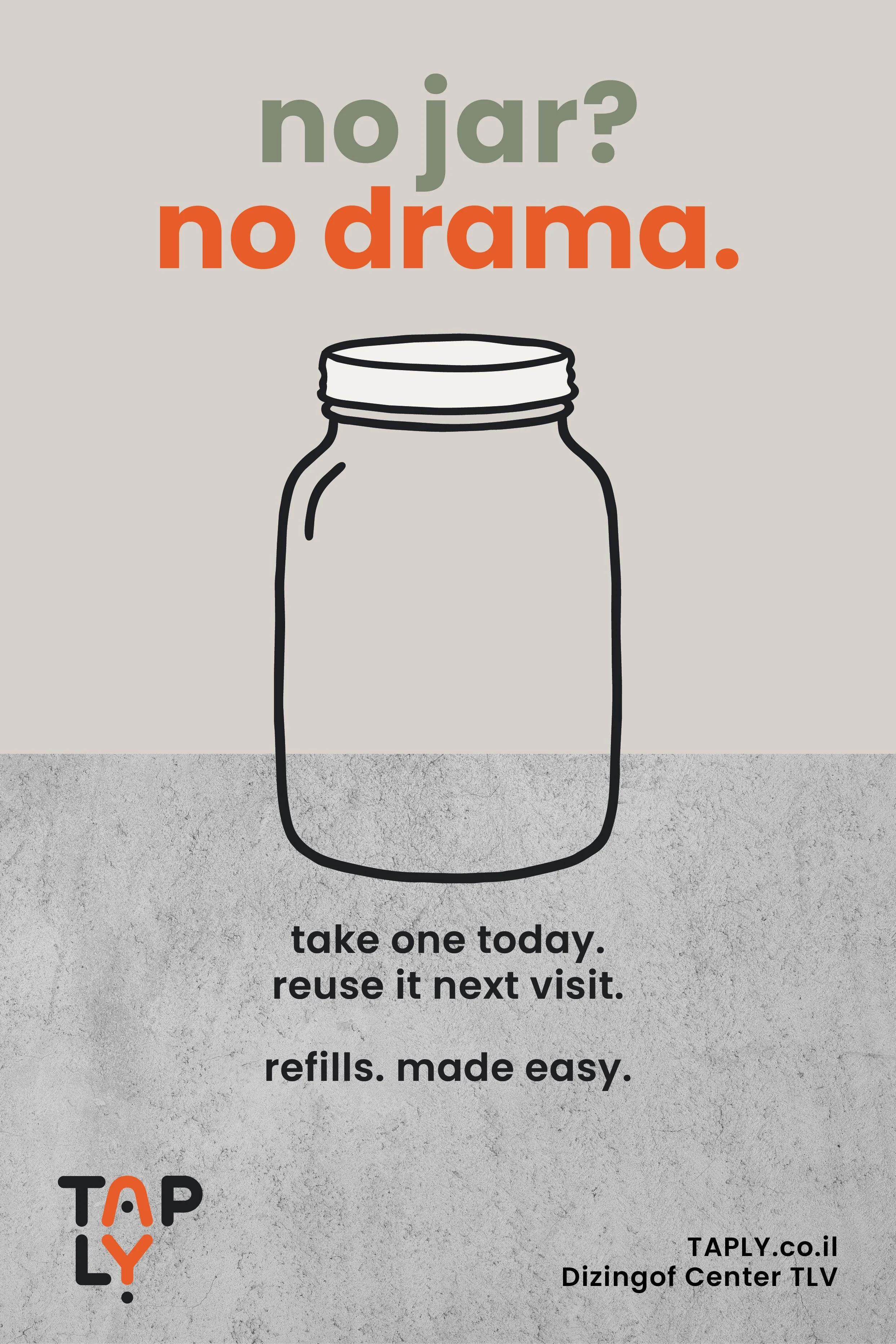
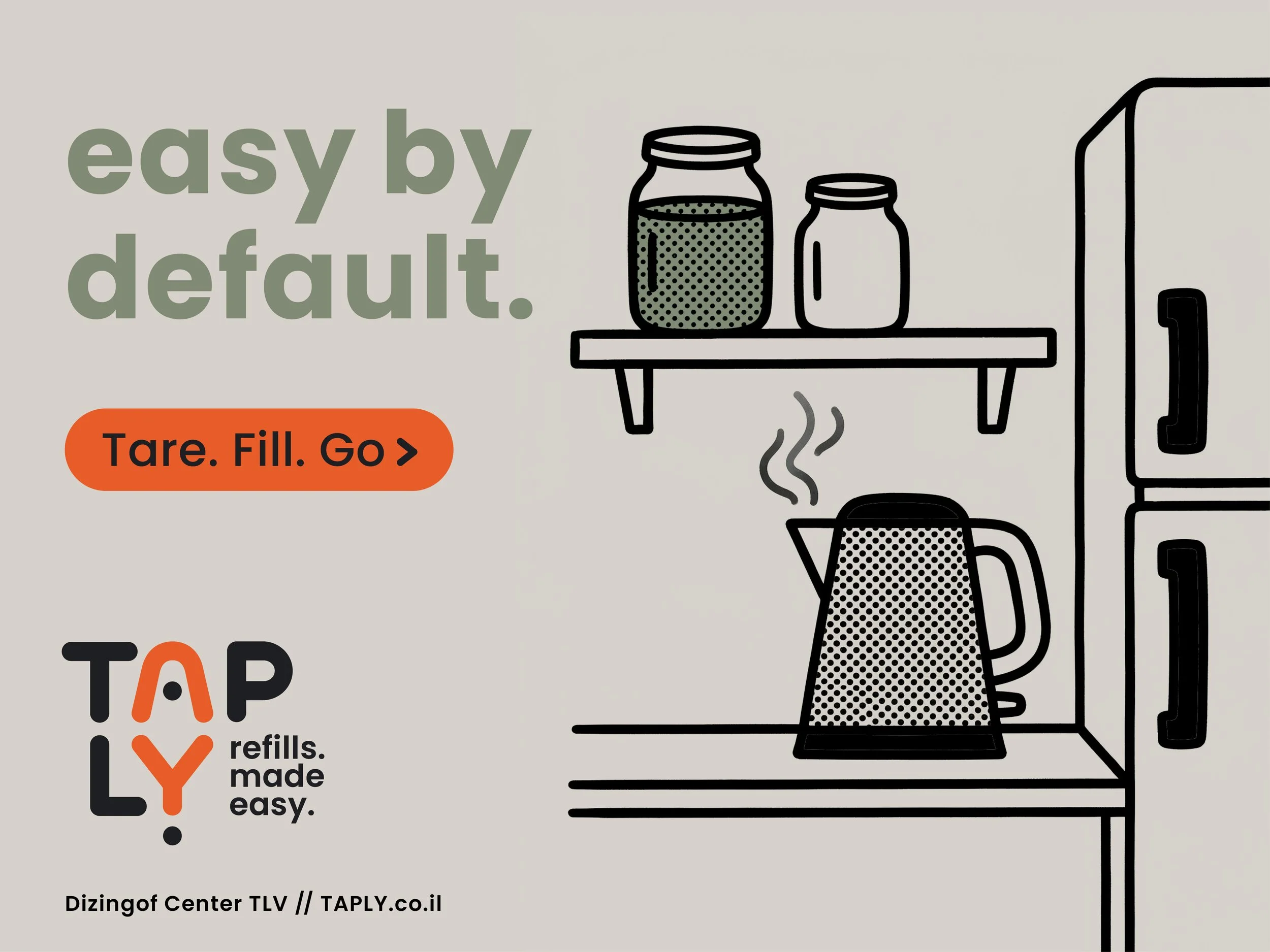
Phase 03 - Friction Removal
A poster series showing how TAPLY removes the friction that makes refilling feel slow, effortful, or impractical.

Prompt logic
A composition built around the refill action: vessel above, jar below, hand entering the frame to activate the process. Materials, composition, and tone were then translated into a cleaner visual direction through AI image-making.
Outcomes
& Learnings
This project showed how AI can expand a branding process without replacing authorship.
AI was integrated into the project from the outset as part of both the strategic and creative workflow. In the early stages, Perplexity helped speed up market and competitor research, while a custom GPT supported the process of unpacking the brief, shaping a sharper return brief, and clarifying the strategic opportunity behind the brand. As the project developed, that same tool became useful in refining the concept, testing positioning language, and sharpening the strategic direction.
It also supported naming and tagline exploration, while tools like Weavy, Nano Banana, and Midjourney helped expand image-making and poster development. Together, they made it possible to test visual territories more quickly and work through a wider range of directions across the creative phase.
Throughout the project, AI worked best as a tool for research, structure, and iteration. It helped me move faster through information, compare options more broadly, and push ideas further - but the core decisions remained mine: what the brand should stand for, which directions felt right, what needed to be cut, and how the final system should come together. Rather than replacing the creative process, AI made it easier to navigate with more clarity, range, and momentum.
taply
yours!
Role: Brand Strategy / Naming / Verbal Identity / Visual Identity / Art Direction / Poster Design
Created at: AI Branding Masterclass House of gAi
Tools: Adobe Illustrator / Photoshop / InDesign
AI Tools: ChatGPT / Perplexity / Weavy / Nano Banana / Midjourney / Veo3