ROOTS
Rebranding a Real Estate &
Interior Design Service

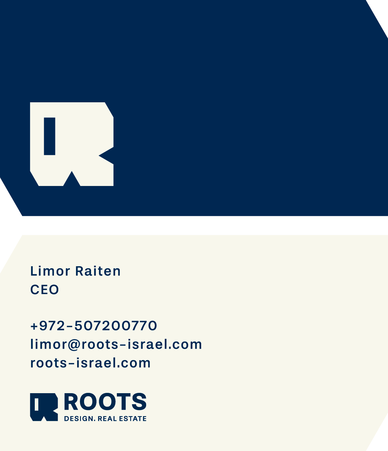
Client: ROOTS / Design. Real Estate
Created at: Kiss Marketing Agency
Role: Brand Strategy, Visual Identity, Art Direction, Web Design (UI/UX) & Print.
The Challenge
Building Long-Distance Trust
ROOTS provides real estate, interior design, and property management for international clients purchasing premium properties in Israel. While the service itself was high-end, the original branding, built around a complex illustration of tree roots - felt like a small local agency. The goal was to develop a clear, premium identity that establishes immediate professionalism and builds confidence with buyers managing investments from afar.

The Strategy
Visual Stability
Purchasing a home from New York or London requires a high level of trust, especially when clients manage the entire renovation and buying process from abroad. To build that confidence, we moved away from literal, illustrative interpretations of the word "roots" and shifted the visual language toward clean architectural lines and structural stability.
The Concept
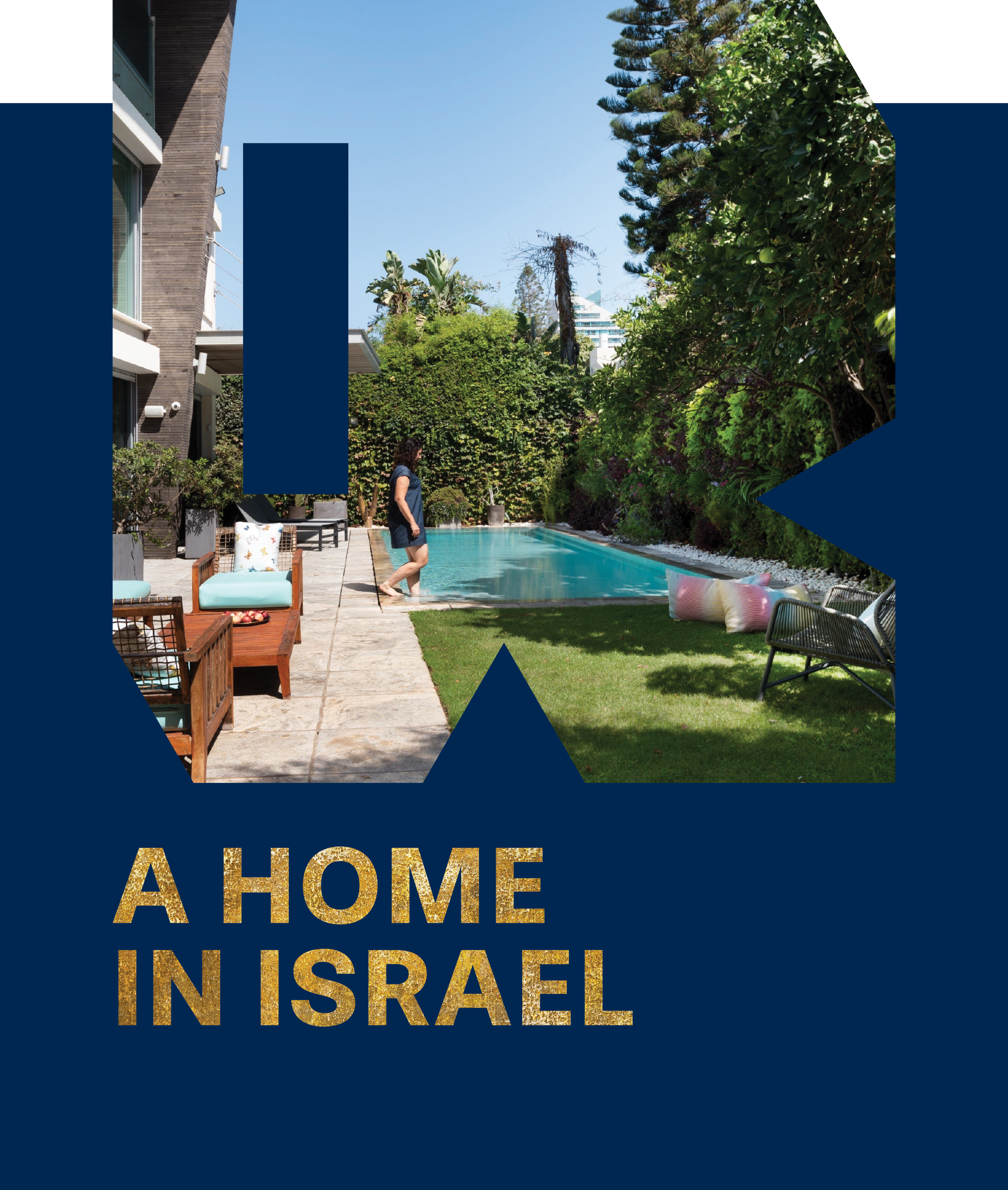
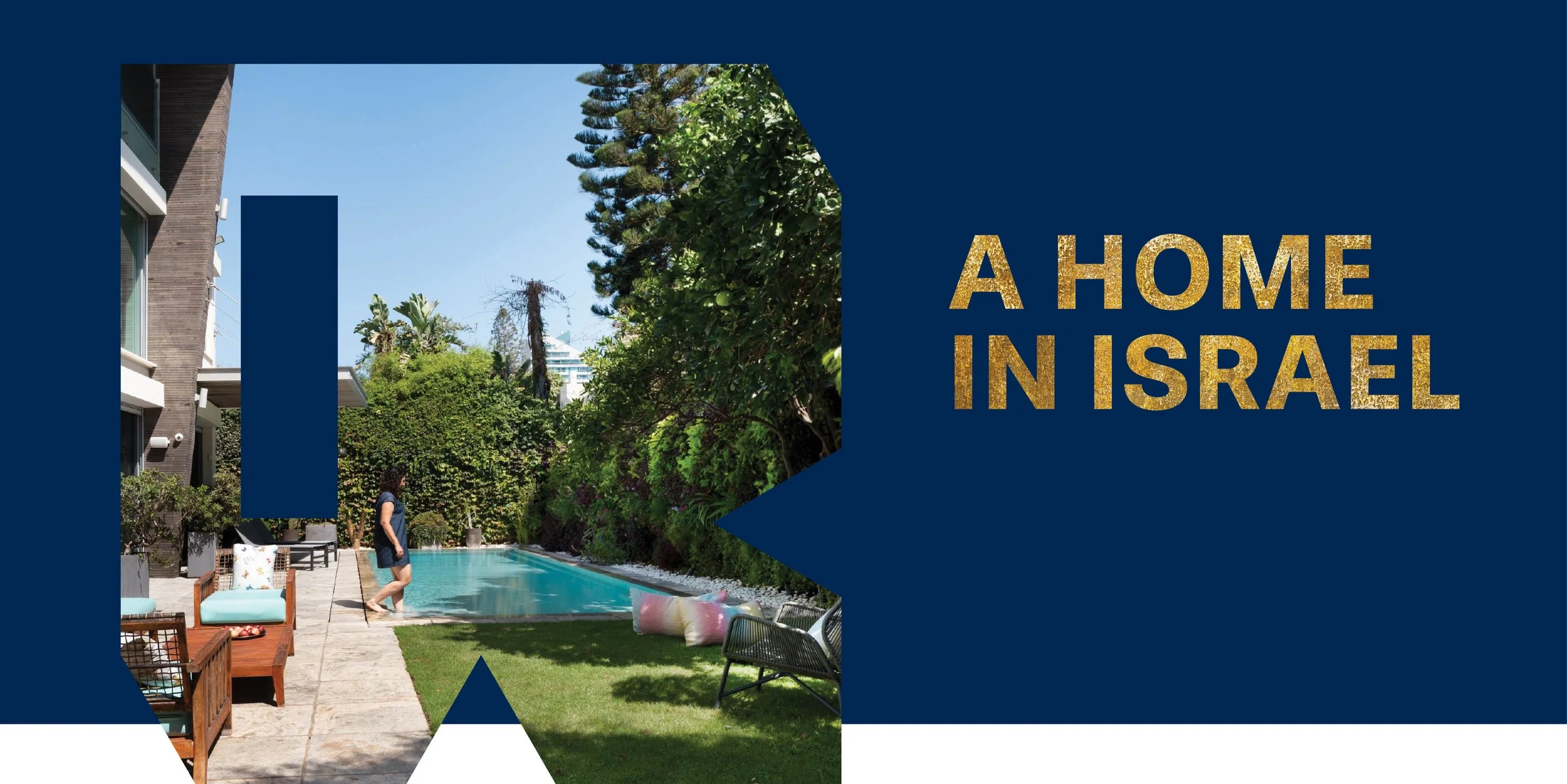
A Structural Anchor
We designed a solid, geometric 'R' monogram that serves as a strong architectural frame. This clean, heavy shape functions as a window to display architectural photography and raw Israeli textures. The concept directly connects high-end design standards with a physical feeling of home and land.
Art Direction &
Execution
Visual Direction & Selection
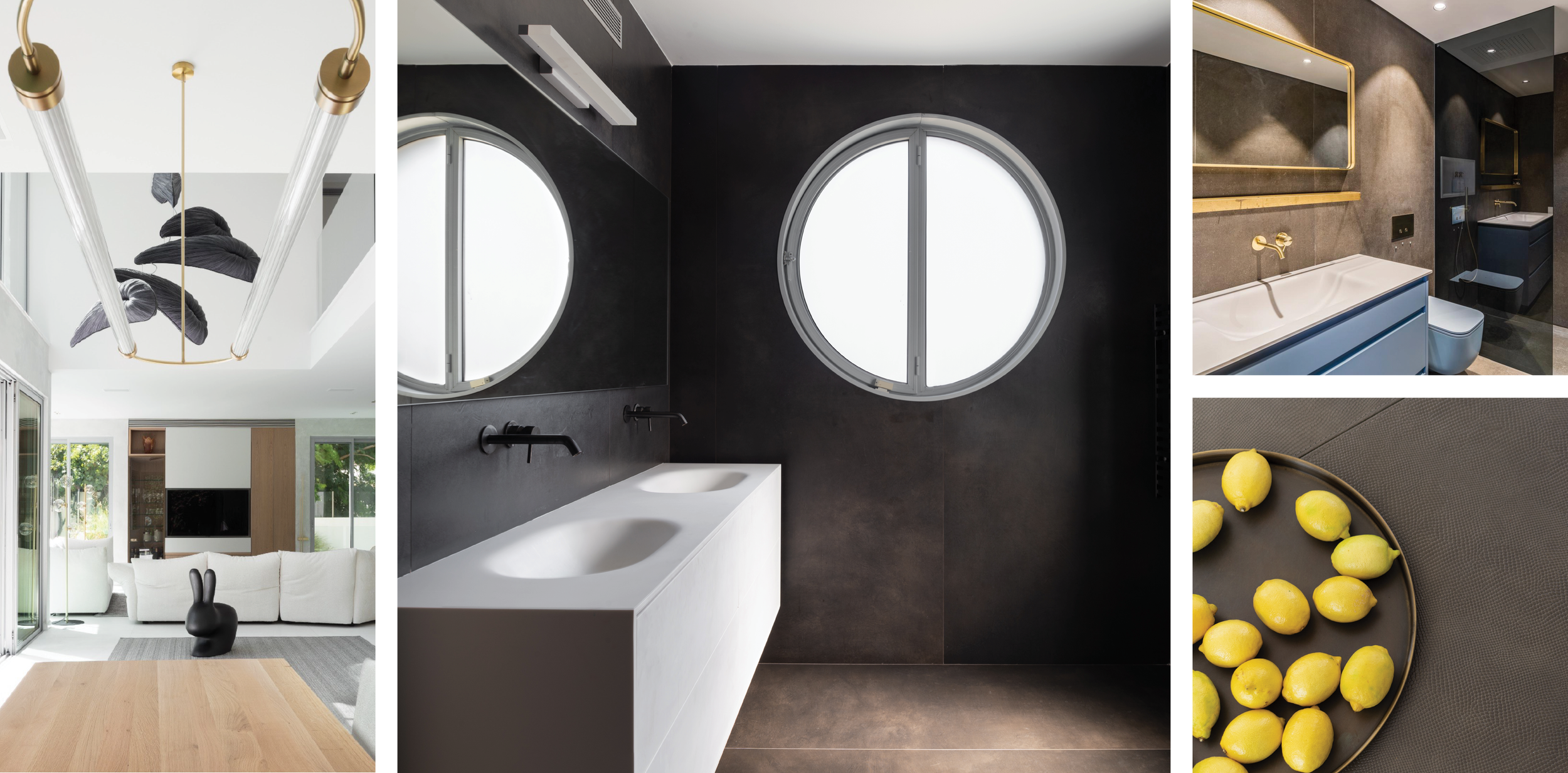
Working with a focused set of client photographs, we selected imagery that captures the balance between architectural scale and high-end styling—pairing clean, minimalist lines with warm, premium textures.

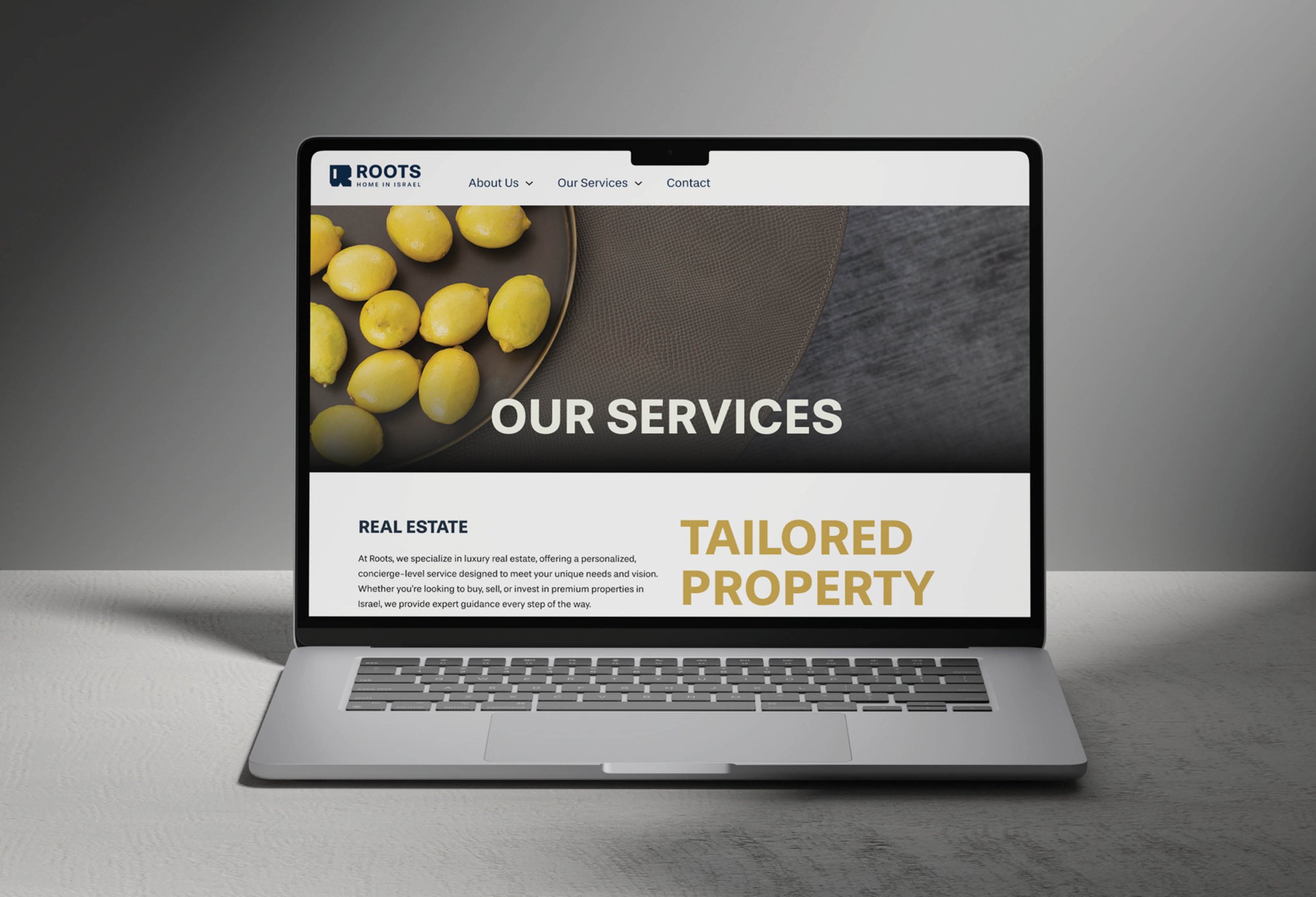
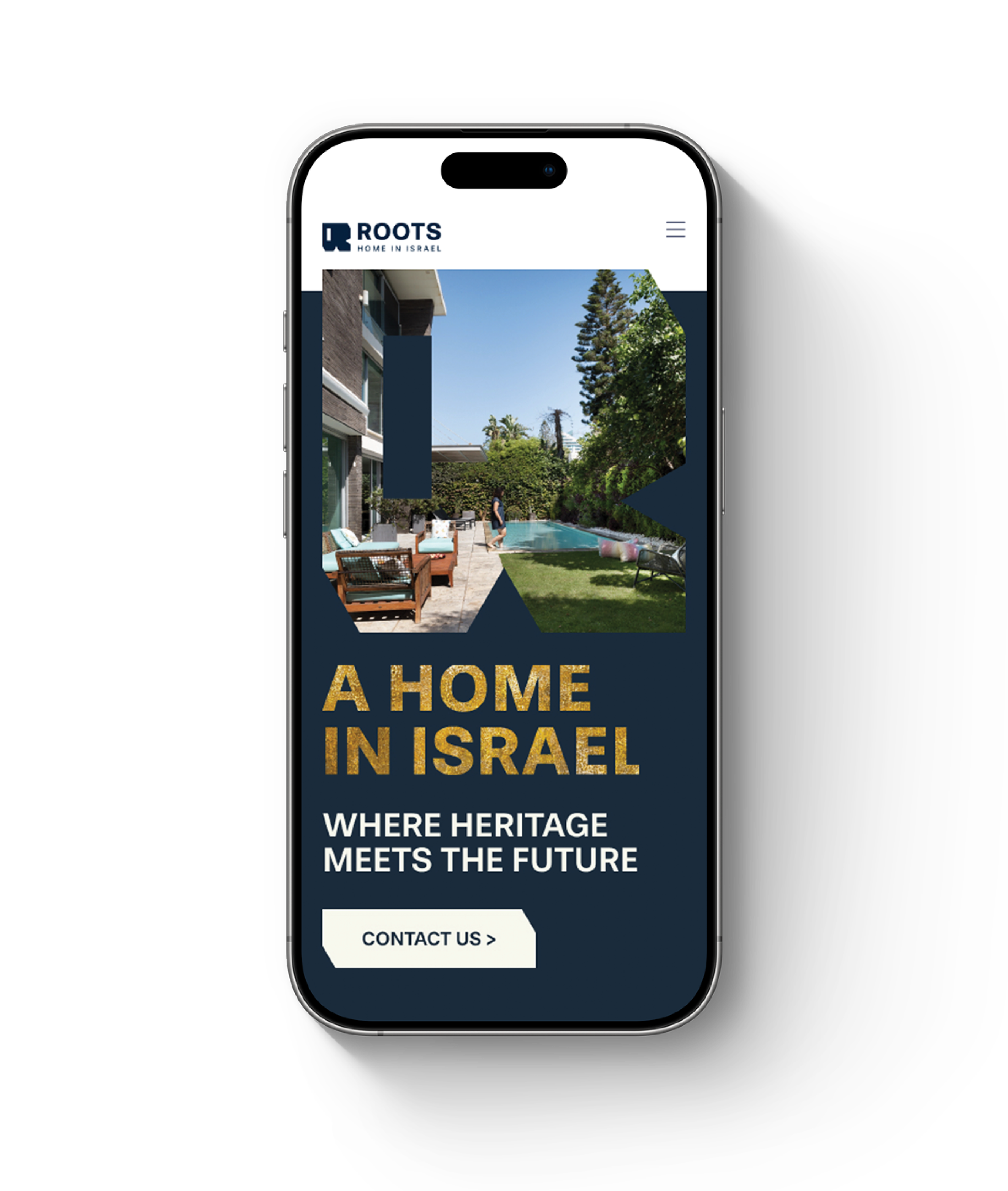
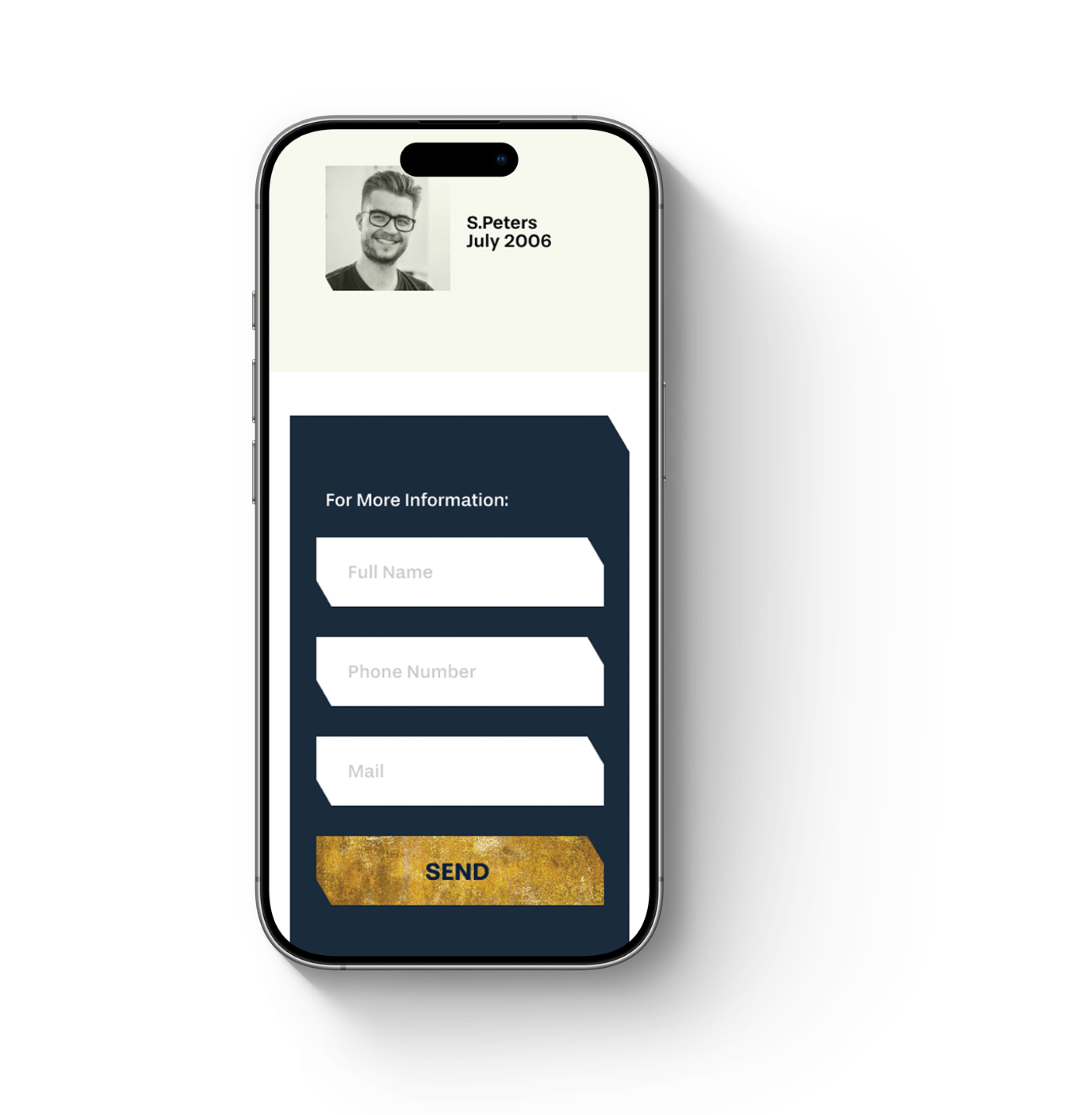
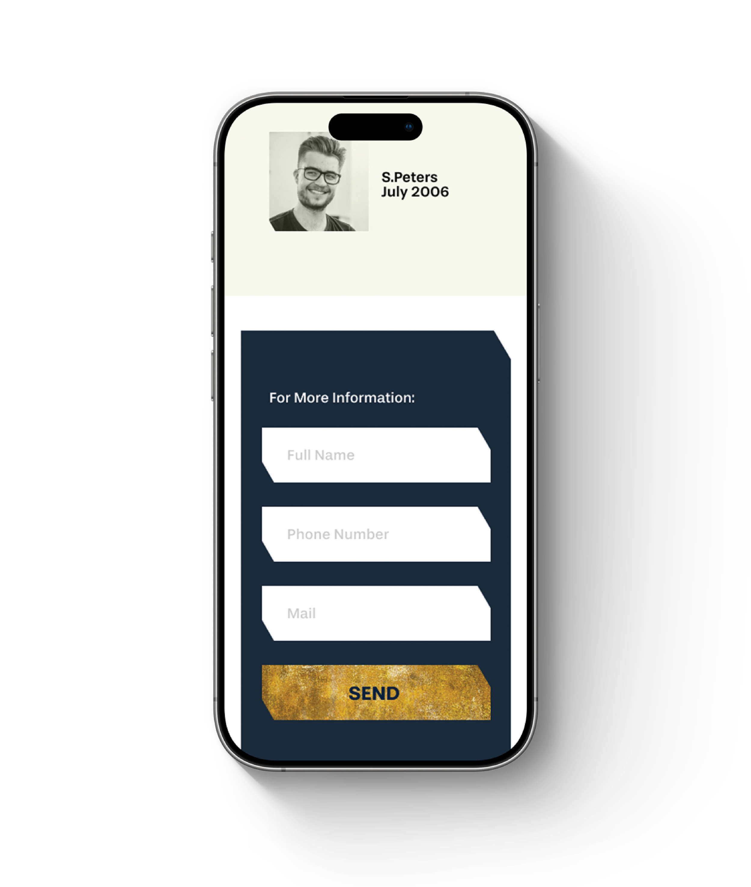
Digital Interface (UI/UX)
The website mirrors a clean, structured layout. To reflect the bespoke nature of the business, we applied a consistent cut corner detail across image frames, buttons, and forms. This simple geometric choice reinforces the idea of custom, intentional design in every functional detail.

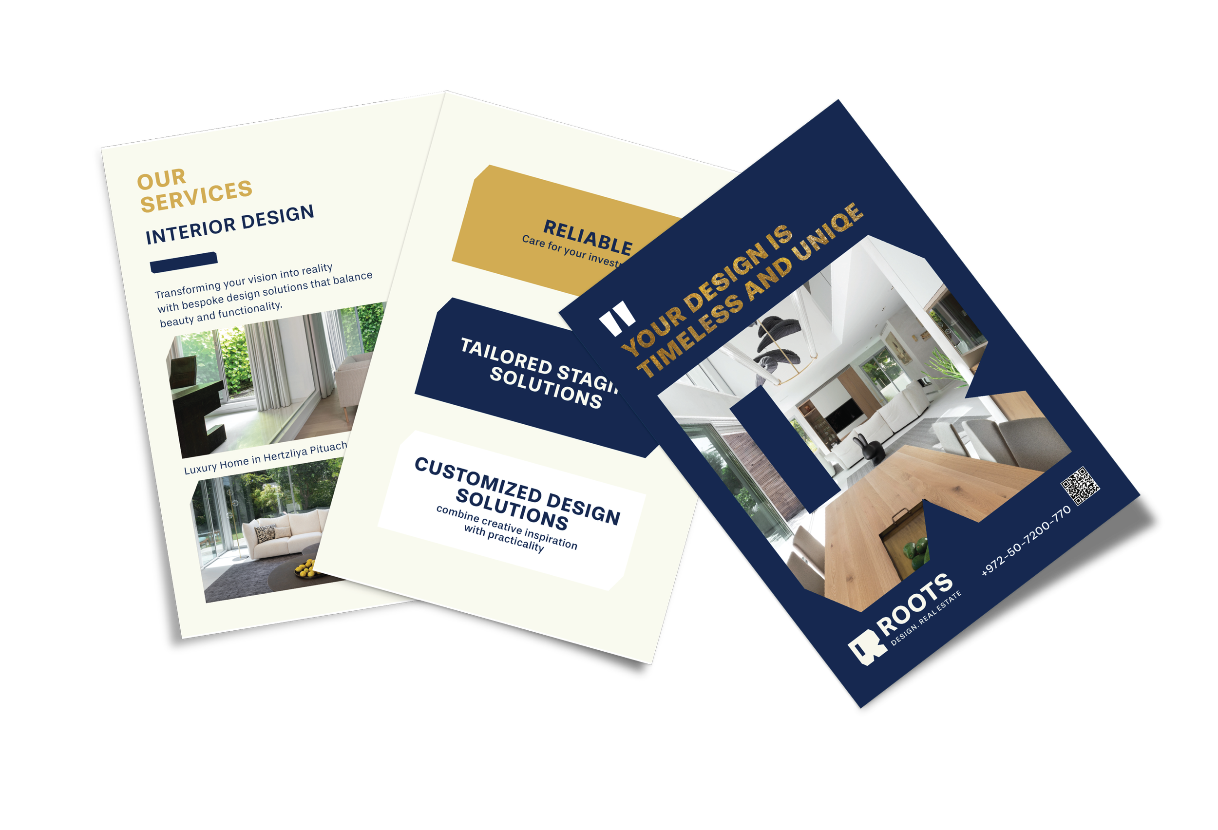
Property
Presentation Kit
We designed a set of physical property postcards. Using clean typography, the signature chamfered frames, and direct layouts, these cards present properties clearly and professionally.
System Resiliency
The new visual identity was fully embraced by the client and integrated smoothly across all platforms.