Tel Aviv Pride 2022
A high-visibility campaign for the return of Tel Aviv's international pride parade.
Client: Tel Aviv Municipality
The LGBTQ Center
Created at: Kiss Marketing Agency
Photographer: Sasha Prilutsky
Role: Art Direction, Brand Strategy,
Design System
The Challenge
After a two-year break caused by the pandemic, the Tel Aviv Pride Parade faced a critical dual challenge: overcoming the psychological barrier of mass public gatherings locally, and reclaiming Tel Aviv’s position as a premier global LGBTQ+ destination during a period of intense international isolation. The brief was not only to promote an event, but to create a powerful, euphoric moment of reclaiming community visibility and public space.
The Strategy
In that period, LGBTQ+ visibility had been pushed out of public space and into digital spaces. The Shift: move the narrative from “attending a festival” to “reclaiming the streets.” Tel Aviv became the stage for a powerful return to collective, unfiltered visibility.
Concept & Identity Design


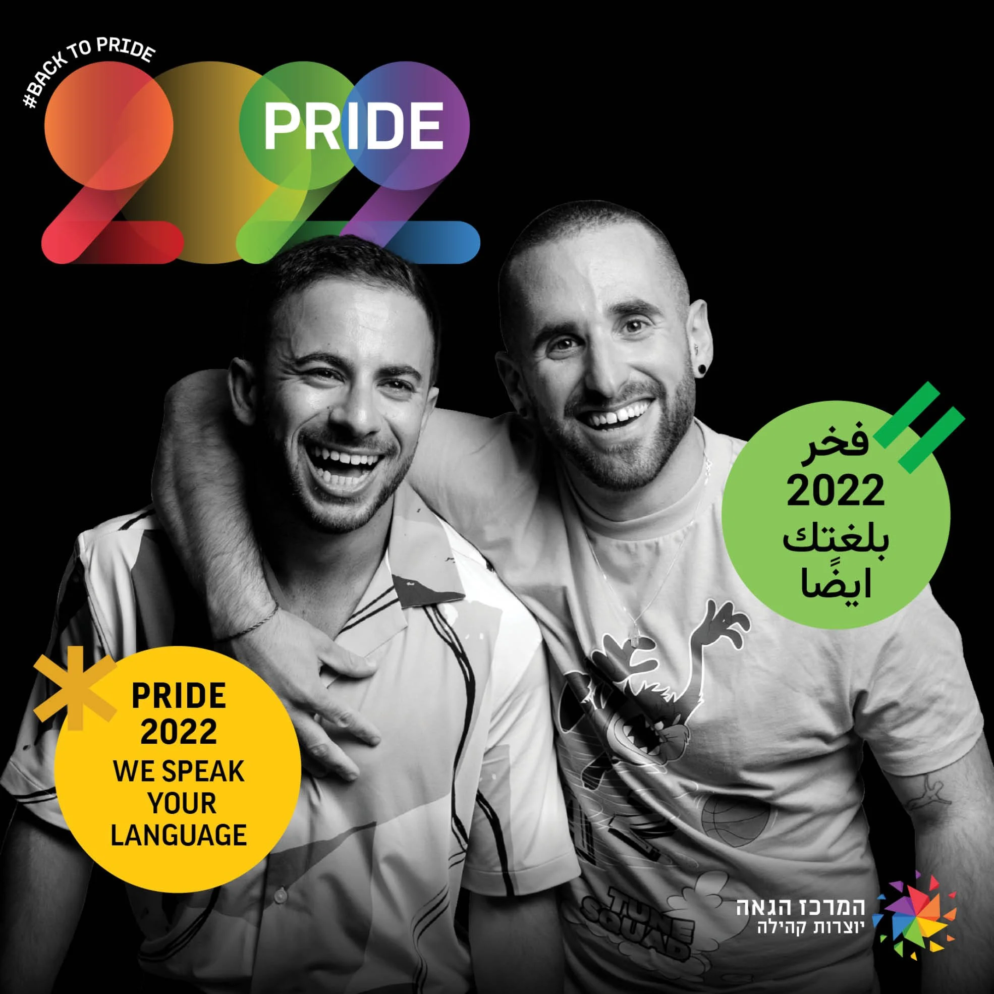
To reclaim the streets, we shifted the narrative from abstract symbols to human stories.
We placed the literal and metaphorical spotlight on real individuals from the community, capturing the exact moment they felt unapologetically proud.
Visually, this "spotlight" was translated into a modular graphic system of light beams.
These points of light connected to form a dynamic grid used across all campaign assets.
Art Direction &
Visual System
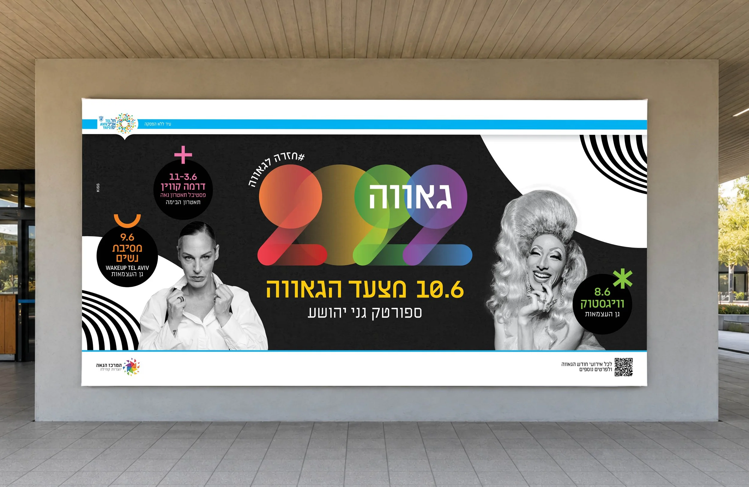
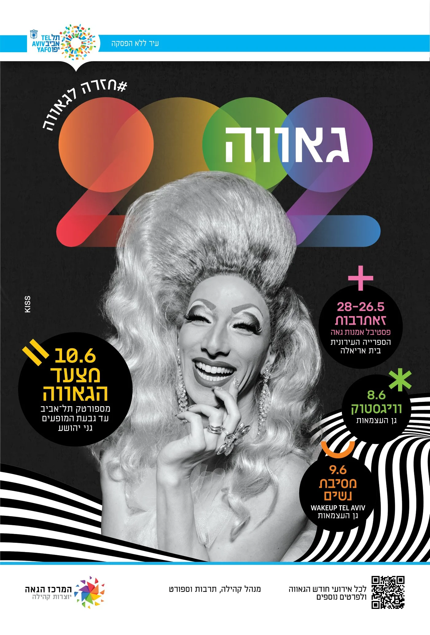
We developed a high-contrast visual identity to cut through urban noise and maximize visibility across the city.
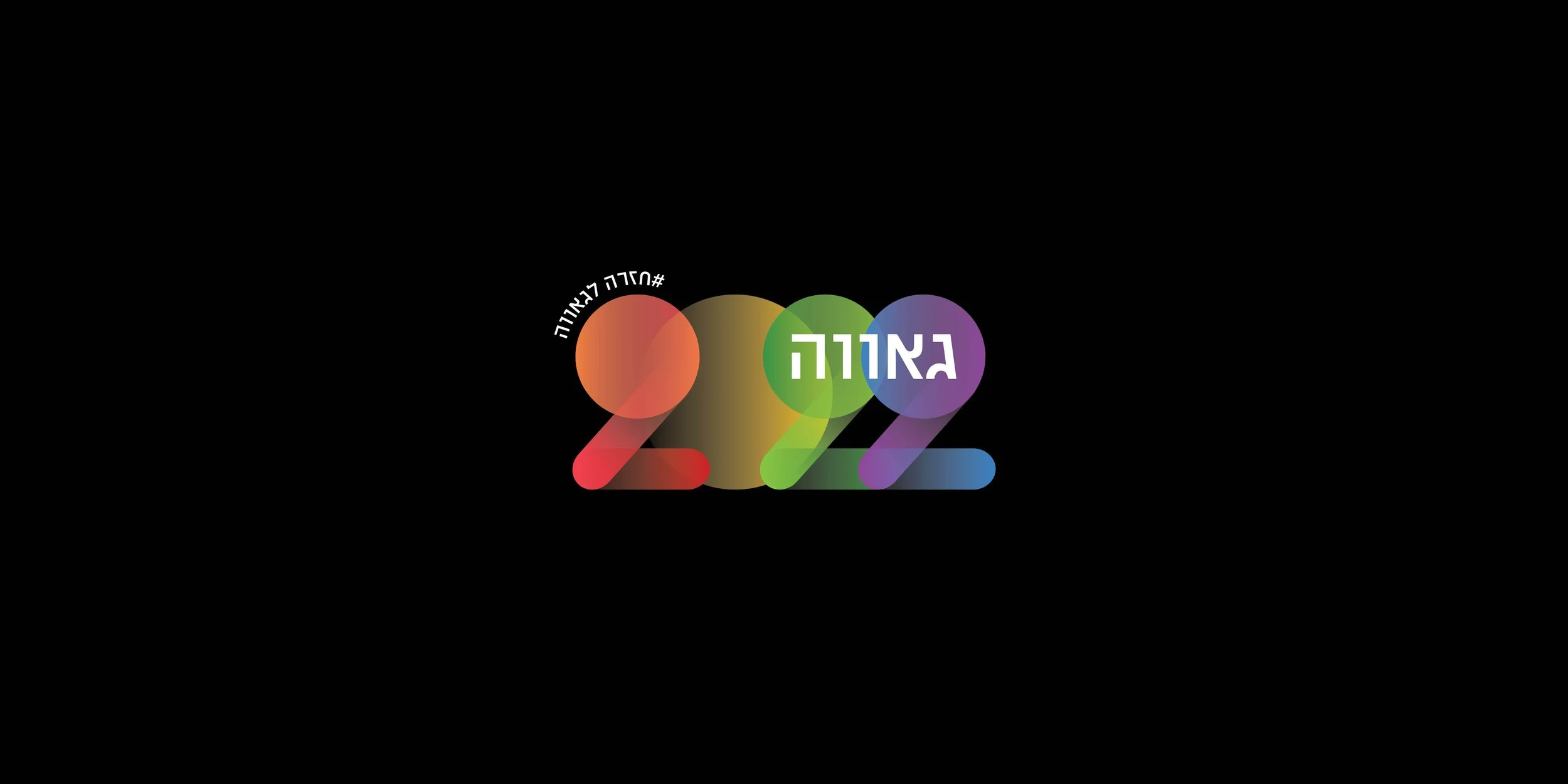
Typography:
The core asset "2022" was custom-built using interlocking circular paths to mimic physical light beams. It was paired with a clean, bold sans-serif font for maximum legibility in public spaces.
Color & Contrast:
To avoid visual clutter, a hyper-colorful logo was set against a dark, minimal background. Modular colorful icons, inspired by LGBTQ+ history, categorized different urban events.
Photography:
Campaign participants, real community members, were shot in raw, high-contrast black and white. This created a strong visual contrast against the vibrant, colorful geometric branding.


Digital Integration
& Scale
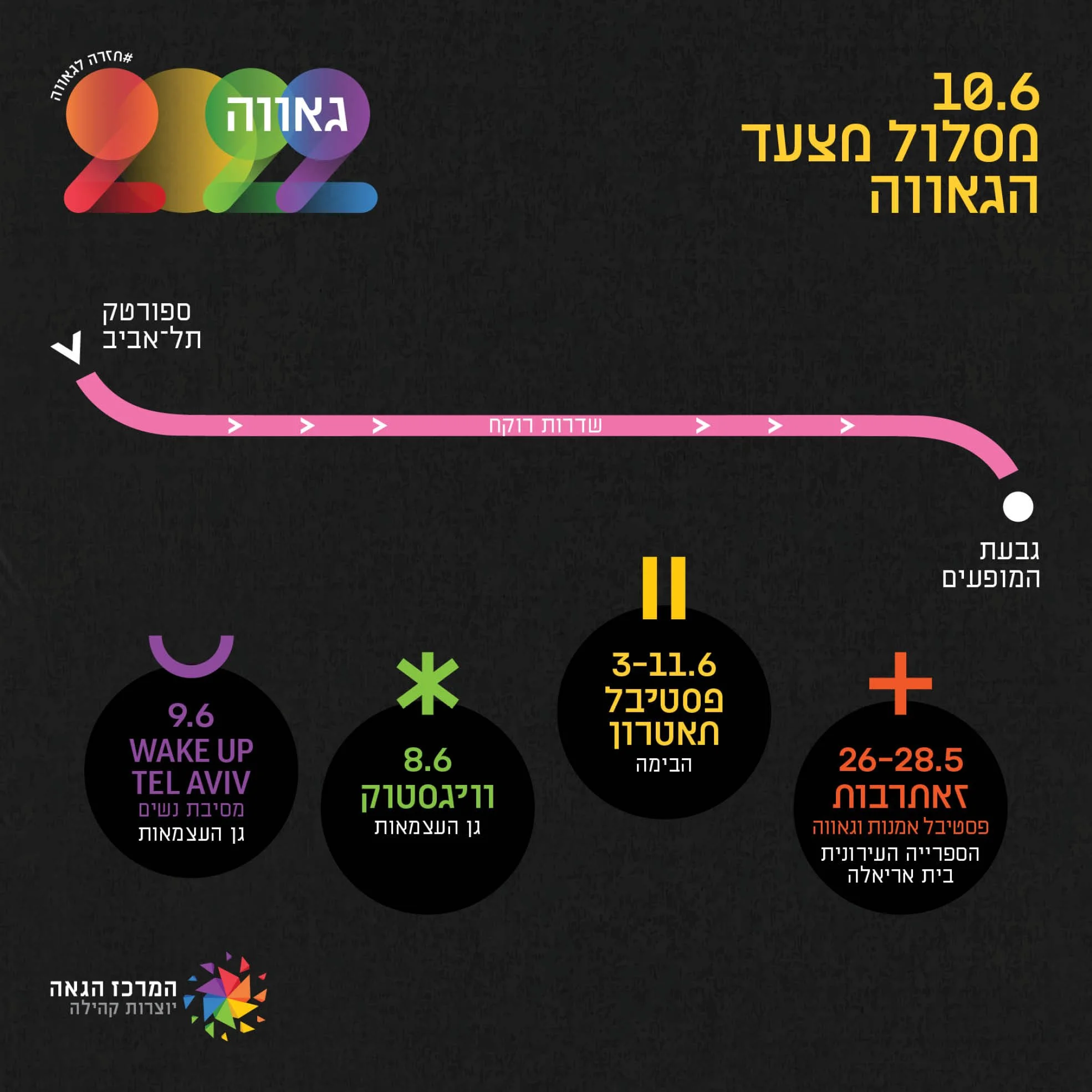
The identity system was designed to scale seamlessly across digital channels, social media, and localized formats.
Adaptability:
A graphic "wave" element acted as a flexible frame, adapting to different backgrounds and textures, while maintaining brand consistency.
Localization:
The modular layout accommodated Hebrew, Arabic, and English layouts cleanly, ensuring clear information architecture for event schedules and parade route maps.
Motion:
The geometric light elements were animated as moving searchlights for digital billboards, adding a dynamic layer to the city-wide rollout.

Brand Governance
& Global Scaling
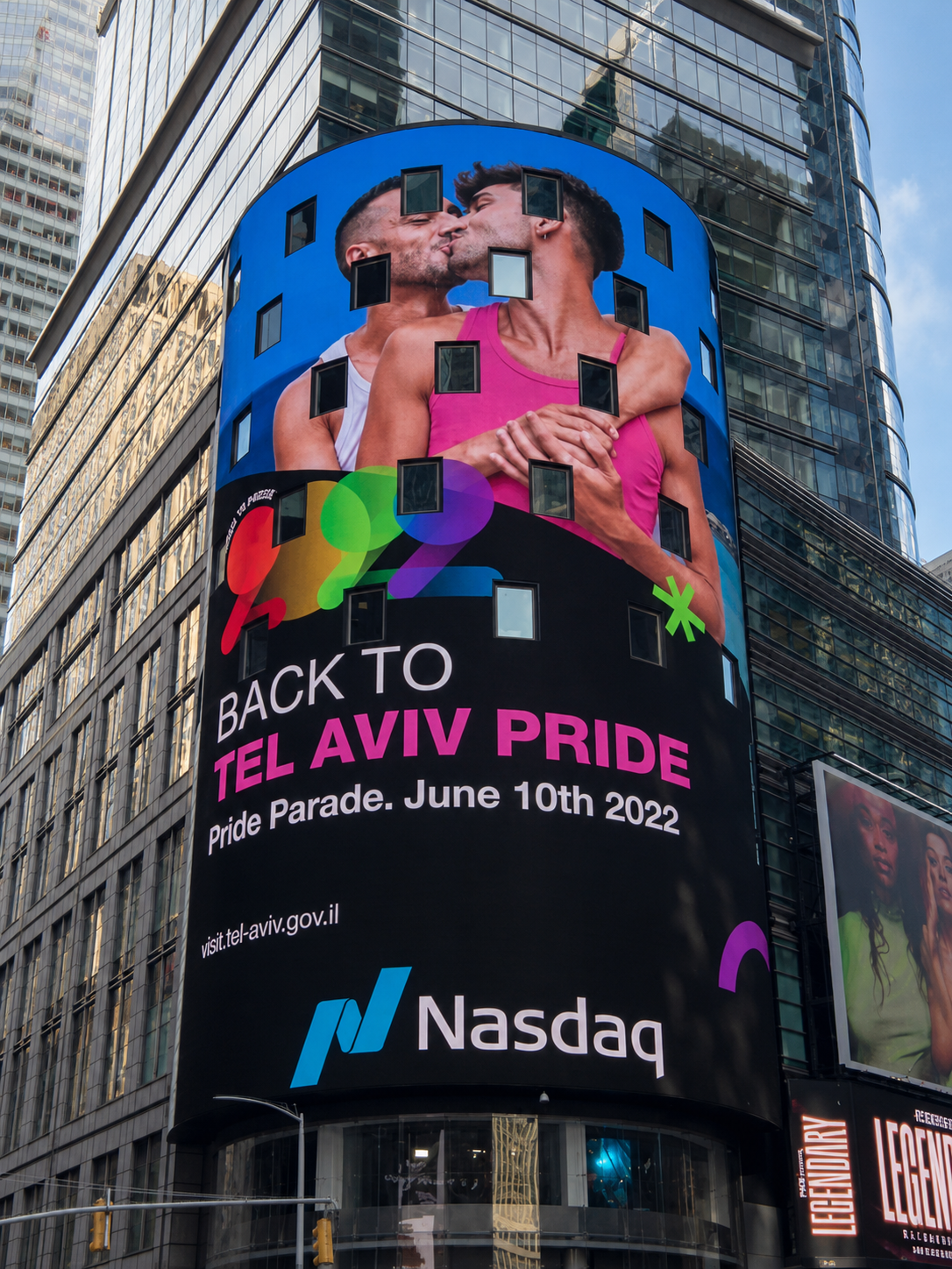
A successful visual identity must remain consistent when deployed by external partners. As lead Art Director, I delivered a structured brand kit and visual guidelines for international distribution.
When global agencies executed the campaign rollouts in New York and London, the underlying design system - the typographic grid, modular icons, and geometric layouts - ensured the brand remained instantly recognizable despite localized changes in photography.