rideeazy
rideeazy is a digital platform designed for booking private group rides - connecting passengers with private drivers and fleet operators. I received an existing product concept and booking system without a defined brand identity. The name was developed through a collaborative brainstorming process, and my role was to shape the brand system around it: from the visual identity and service website layout, to launch communications and tutorial storyboards based on the existing product screens.

Client: rideeazy / electra afikim
Created at: Kiss Marketing Agency
Role: Creative Direction / Brand Identity
Website Design / Tutorial Storyboards
Digital Campaign Assets
The Challenge
Group transportation logistics are traditionally unpredictable and cause high anxiety for organizers. The platform needed to serve two distinct audiences: passengers (from corporate managers to private event organizers) and drivers managing fleets. The challenge was to design a visual language that instantly communicates simplicity, trust, and mutual control on both sides of the system.
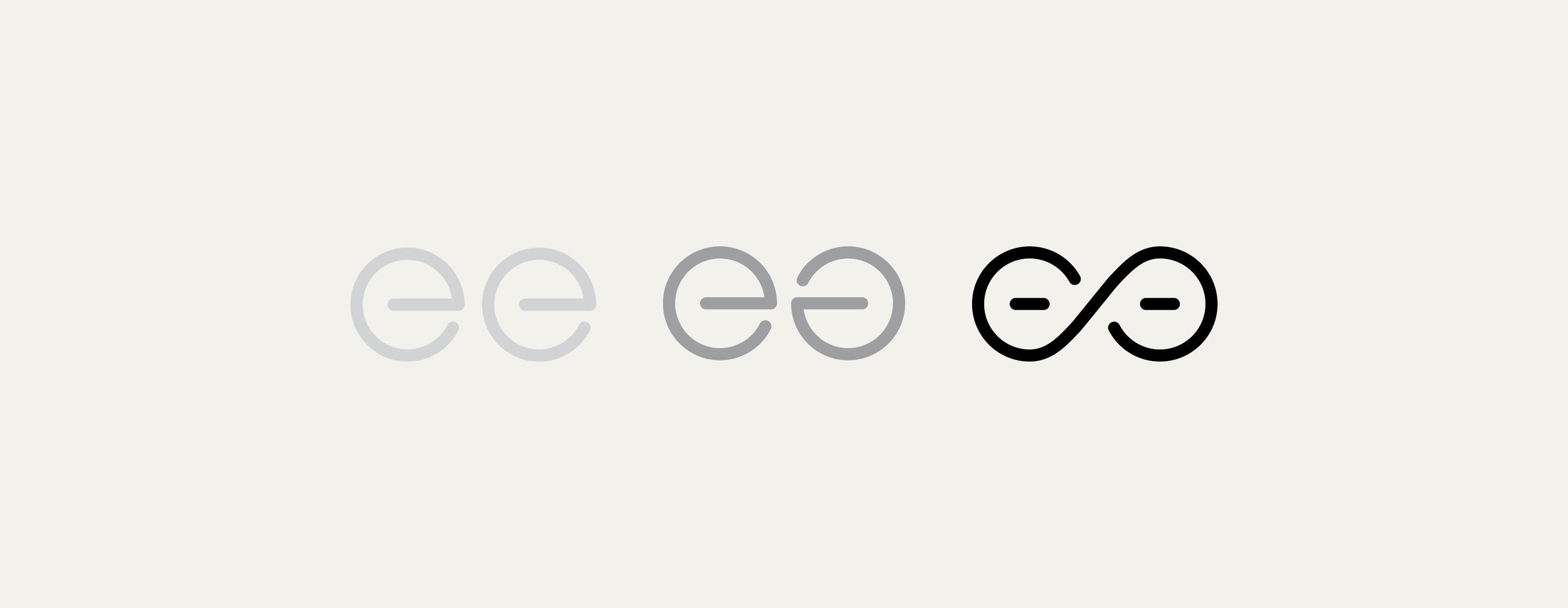
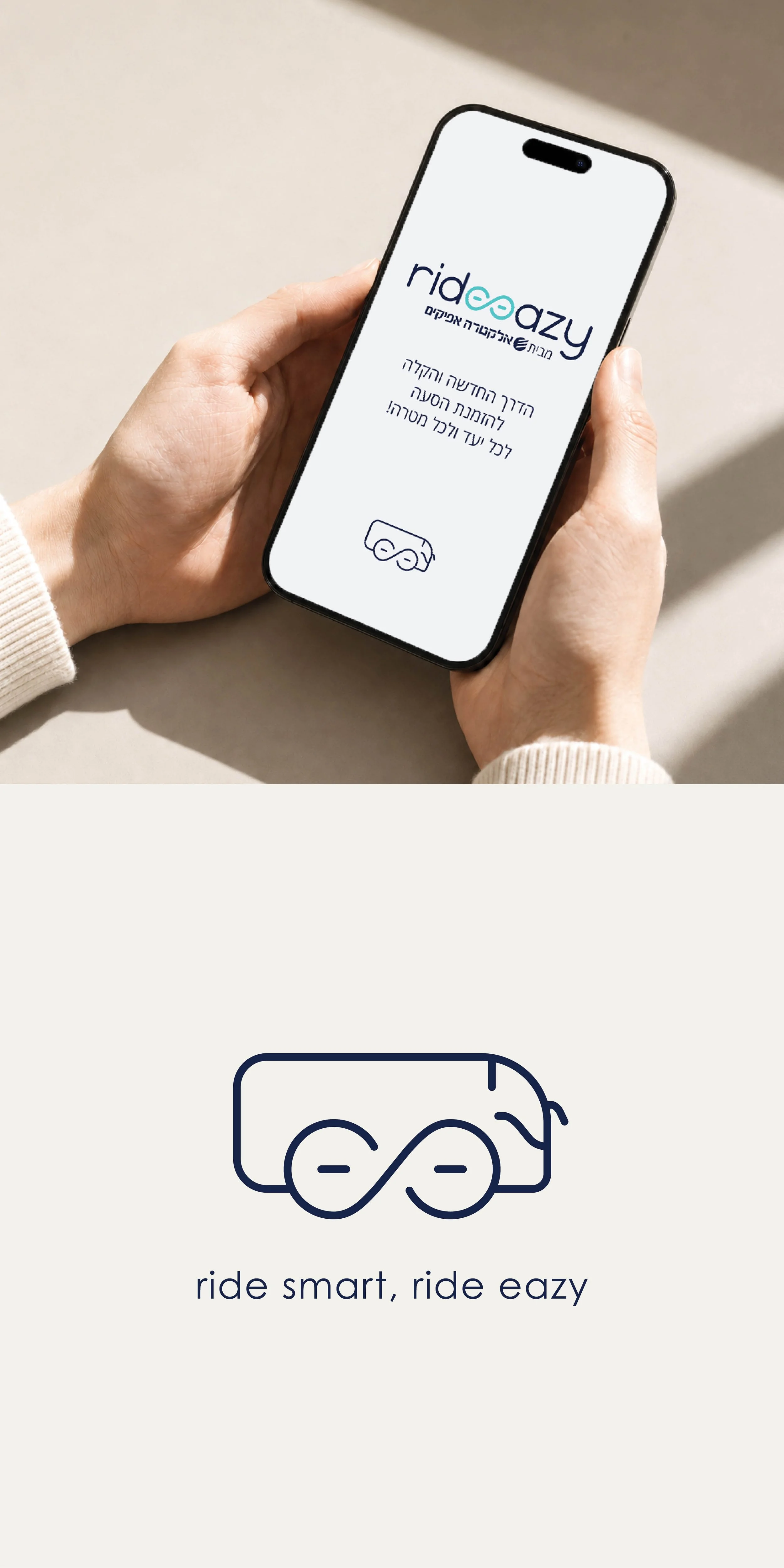
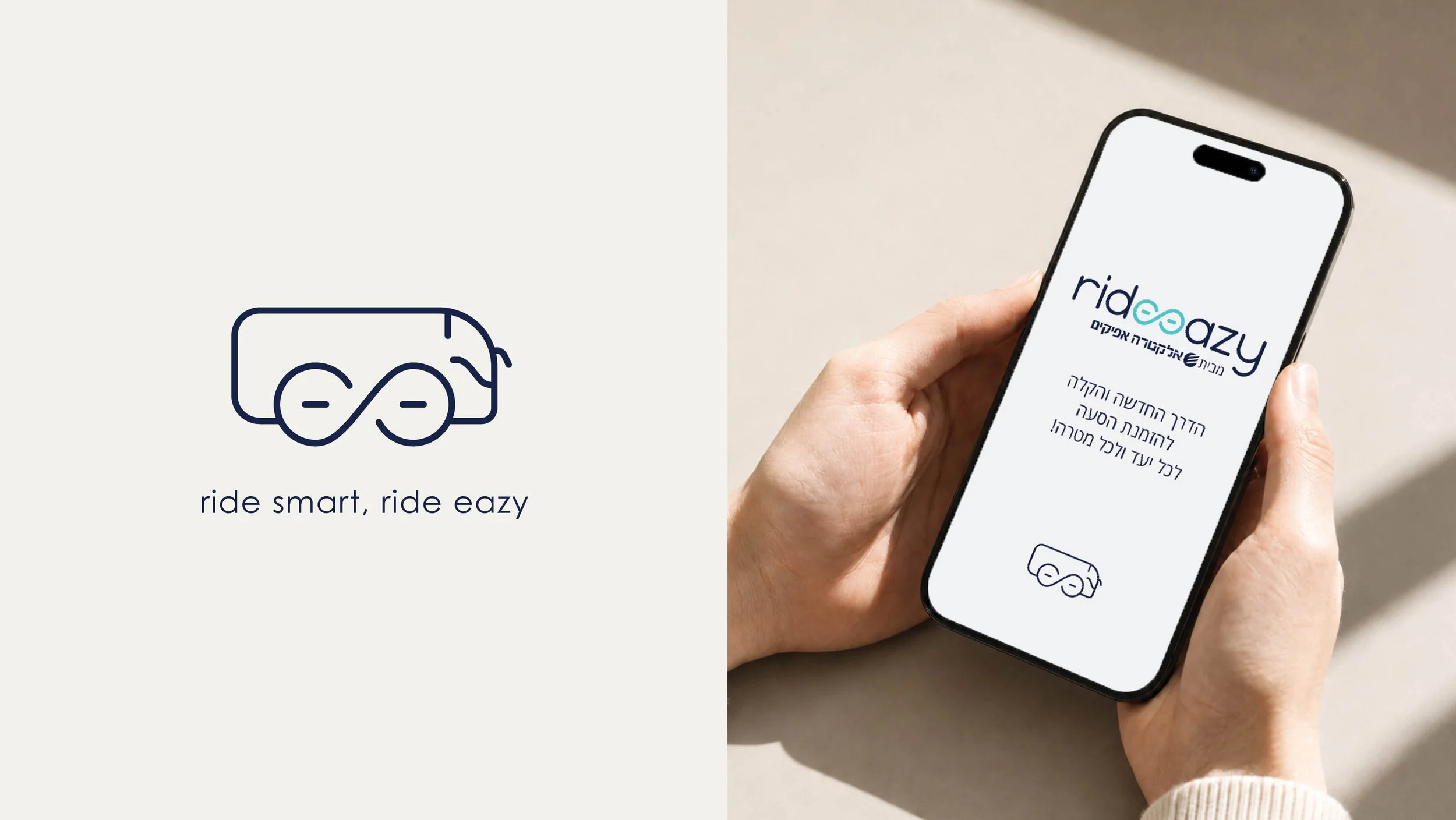
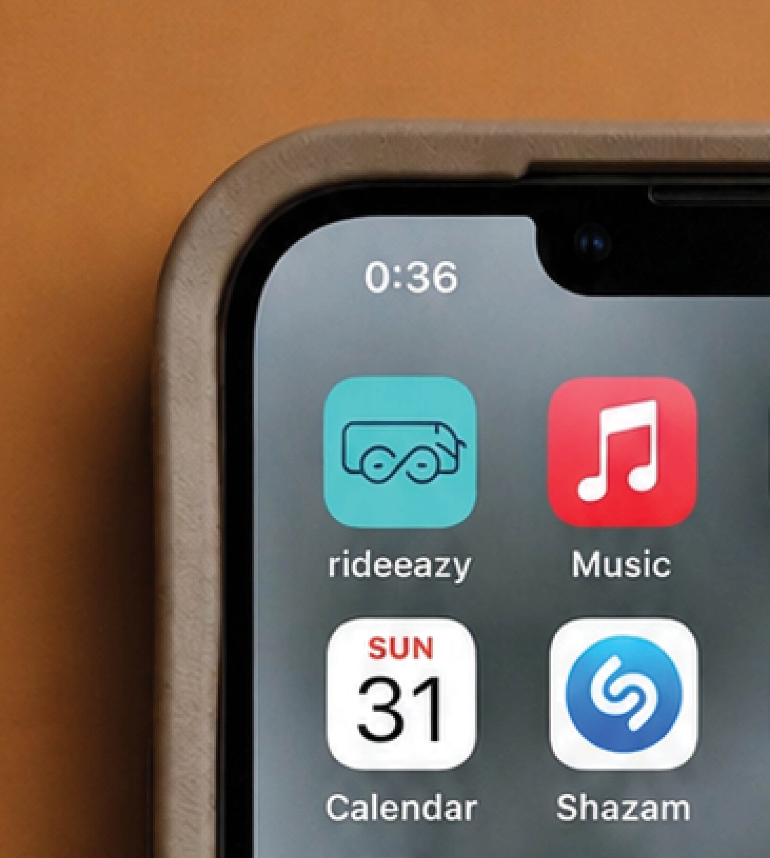
The creative solution balances two factors: infinite scale (any destination, any vehicle size) and total control. By evolving the double ‘e’ in rideeazy into a custom infinity symbol, the logotype visually represents a seamless loop of movement and certainty. It echoes the rolling wheels of transit while shifting the perception from logistics chaos to complete peace of mind.
The Concept:
The Seamless Loop
Visual System &
Art Direction
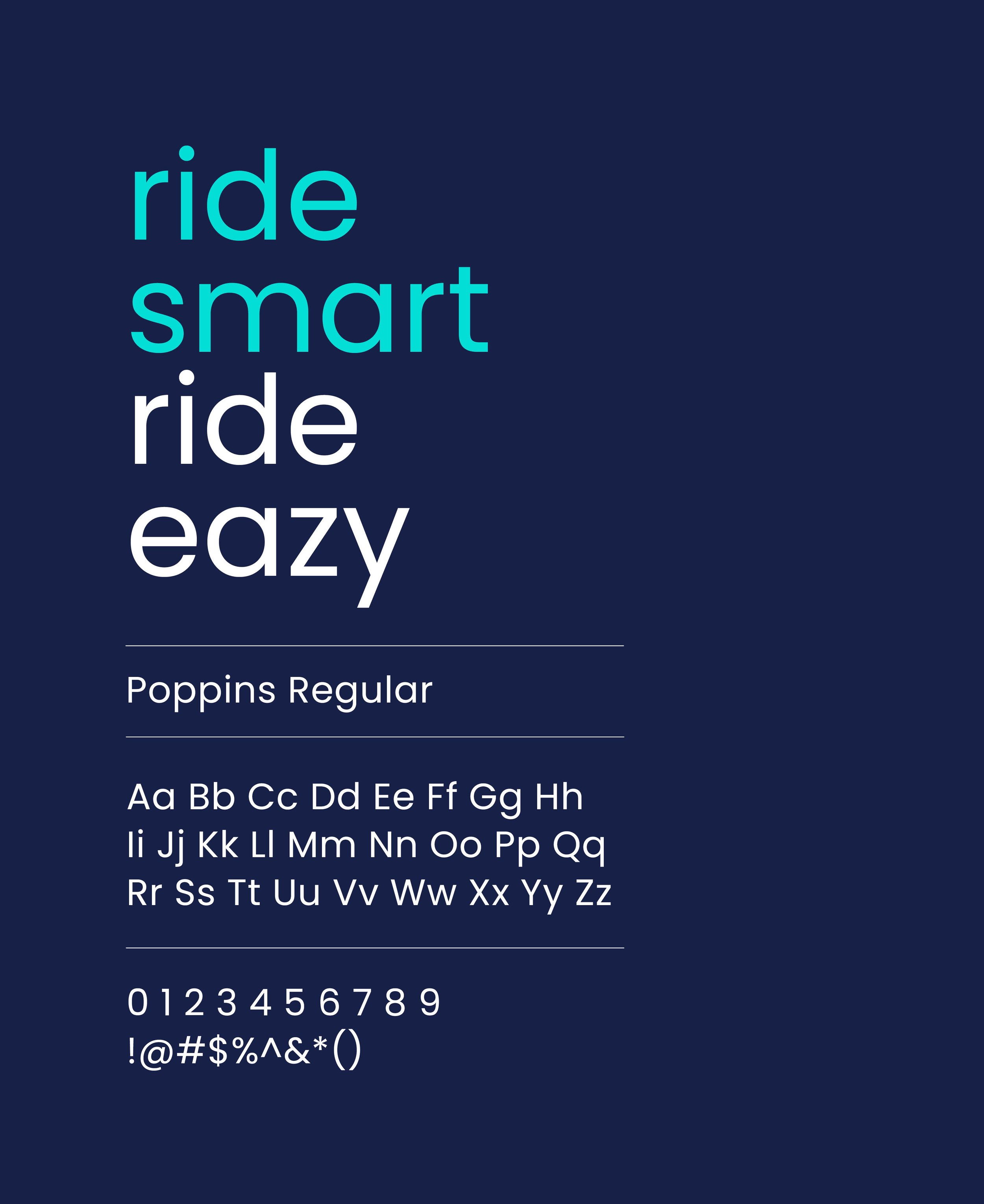
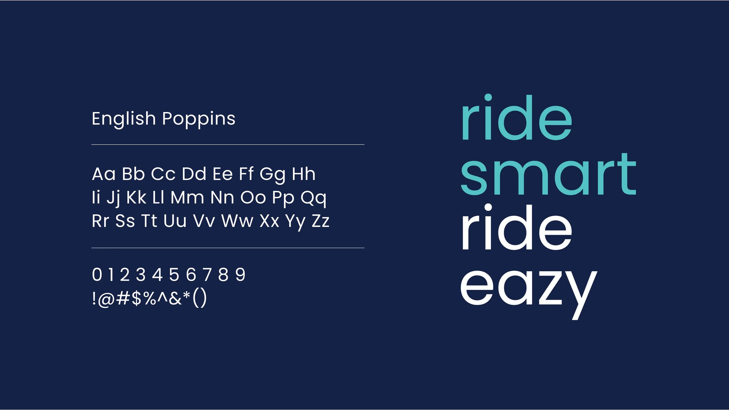
Logotype & Typography: The custom lowercase lettering softens the rigid look of traditional transport, making the service feel approachable and modern. Poppins was chosen for the cross-platform typography because its clean, geometric structure ensures high legibility on mobile screens and digital dashboards.
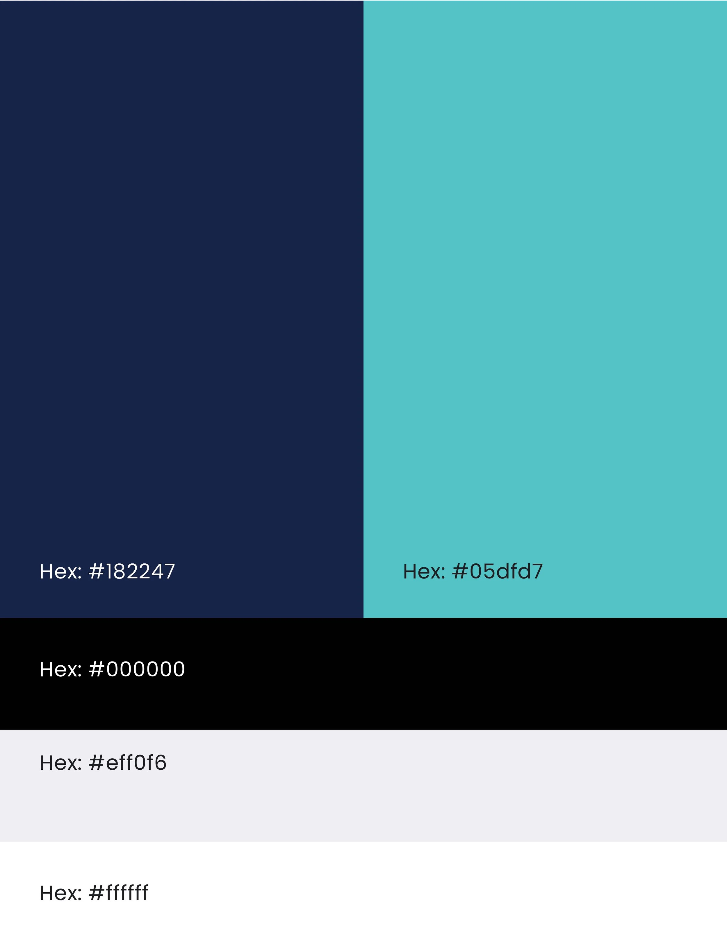
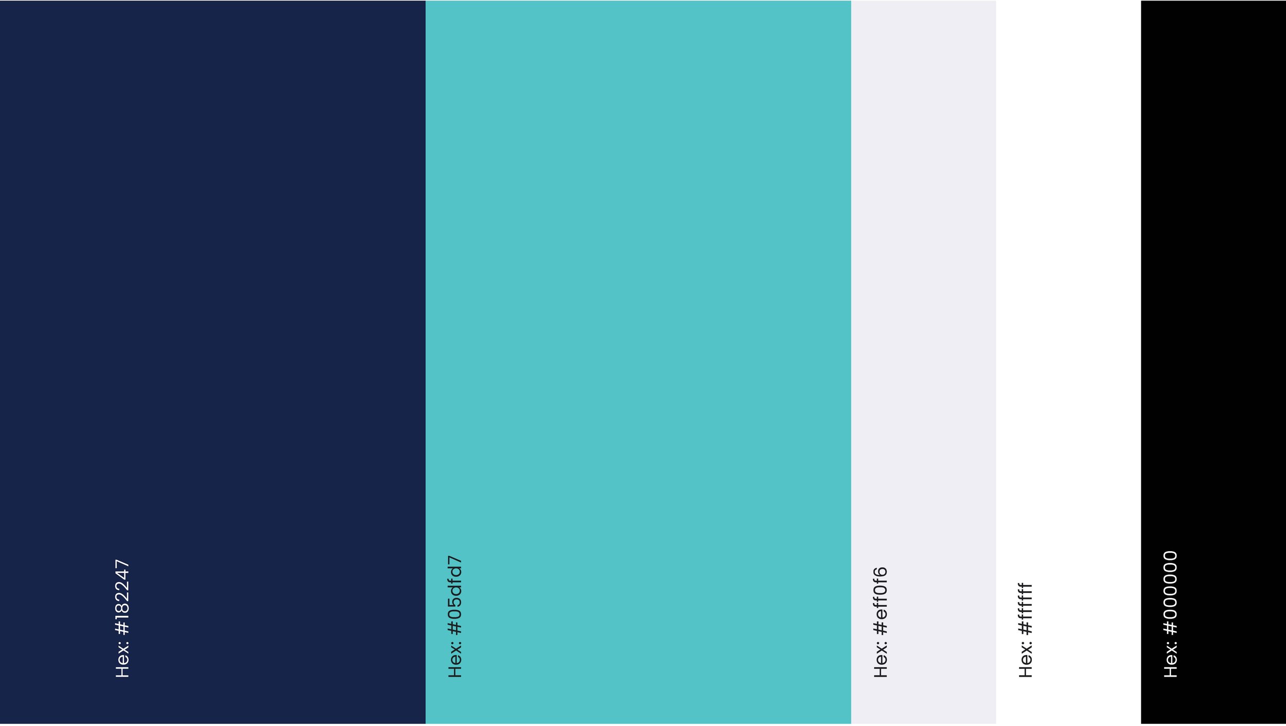
Color Strategy: The palette acts as a bridge between corporate credibility and digital utility. Deep Navy anchors the brand in Electra Afikim’s trusted, safe framework, while Electric Cyan highlights real-time tech, tracking, and speed.
Iconography
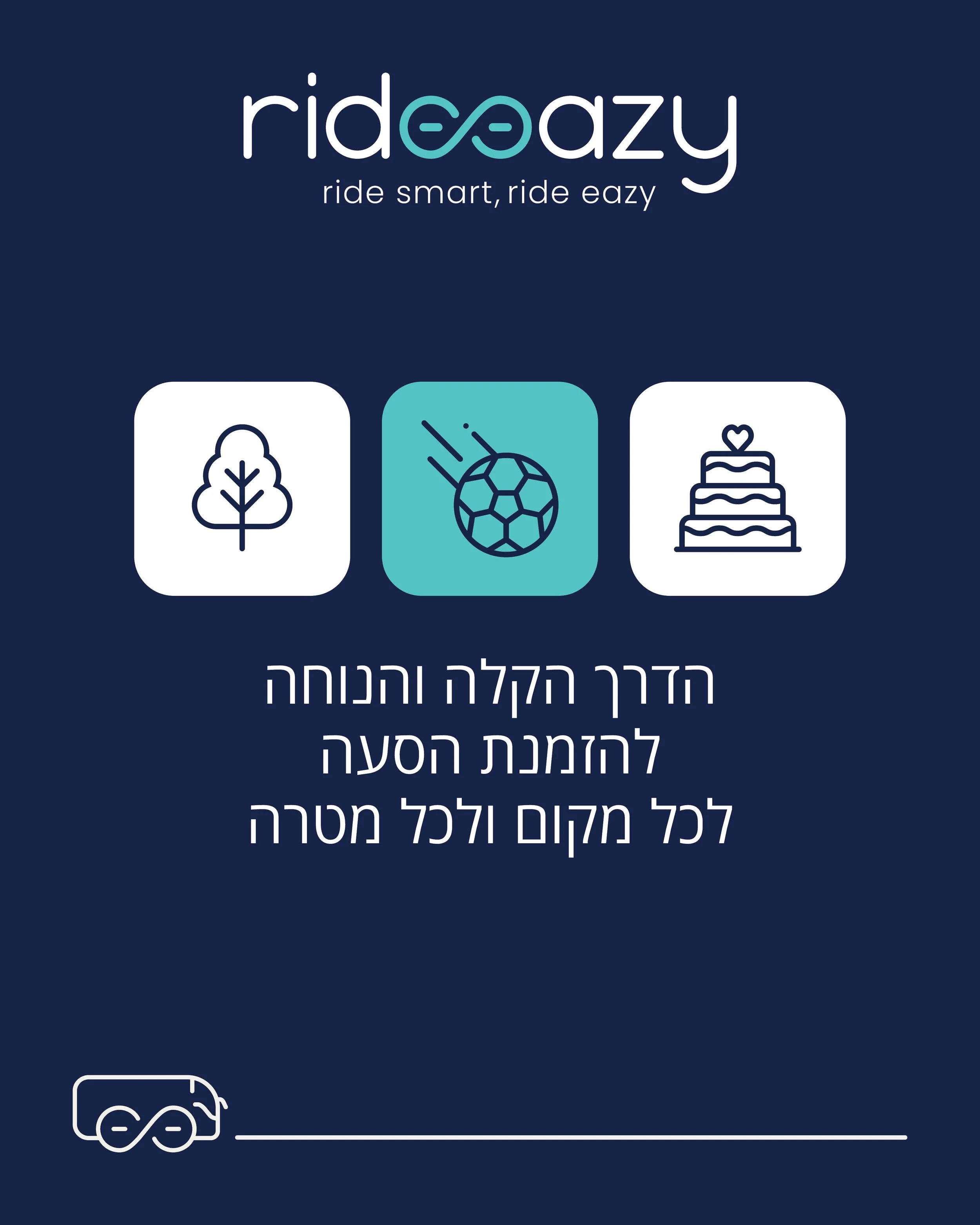
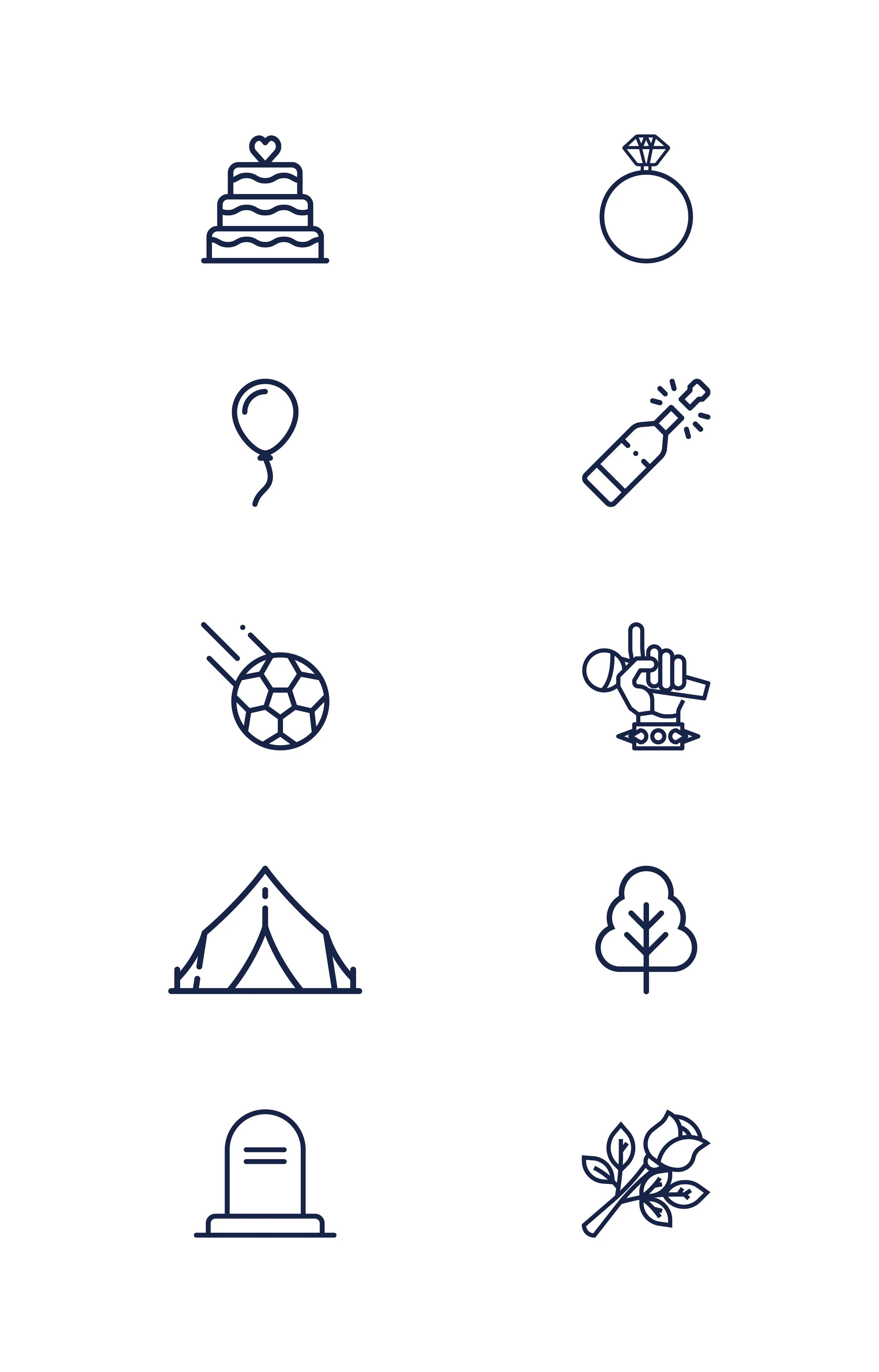
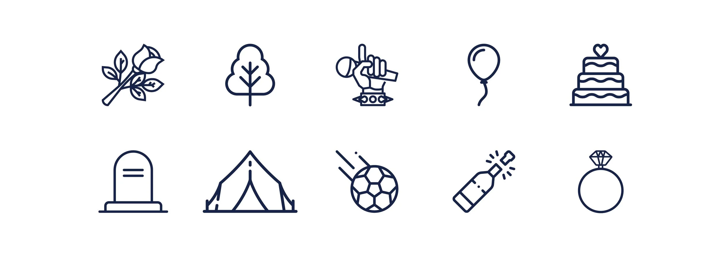
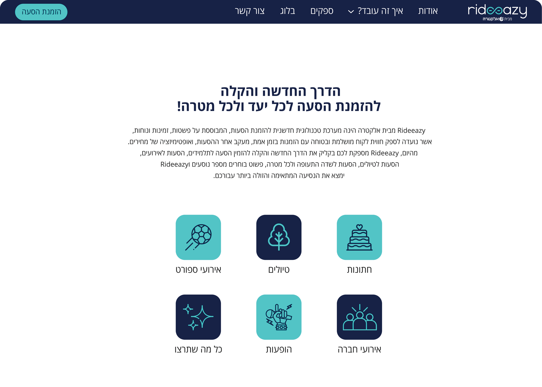
An icon system was developed as a core element of the visual identity. To reduce cognitive load for users managing time-sensitive logistics, the icons act as clear, simplified signposts across all touchpoints. By translating different vehicle sizes and event categories into intuitive visual symbols, the system communicates simplicity and ease at a glance.
Service Website
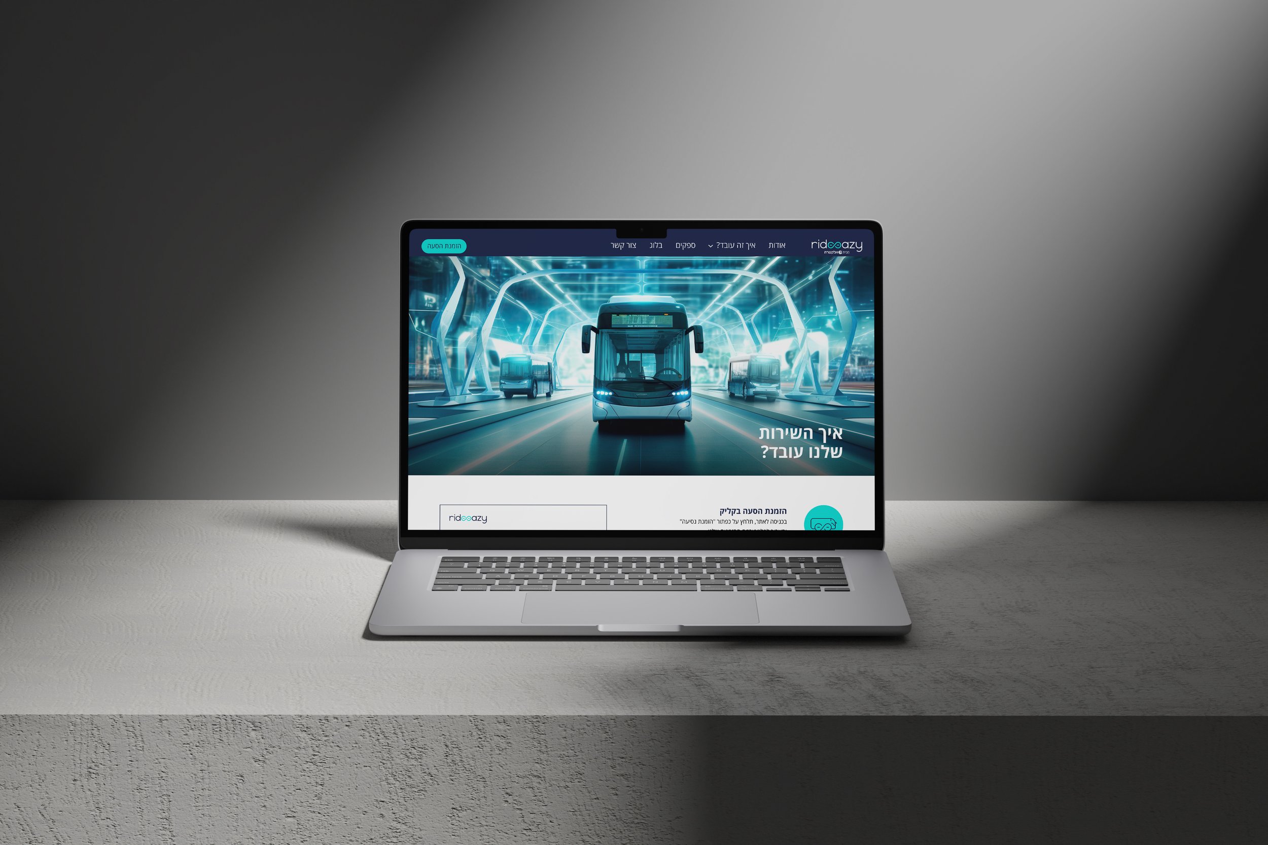
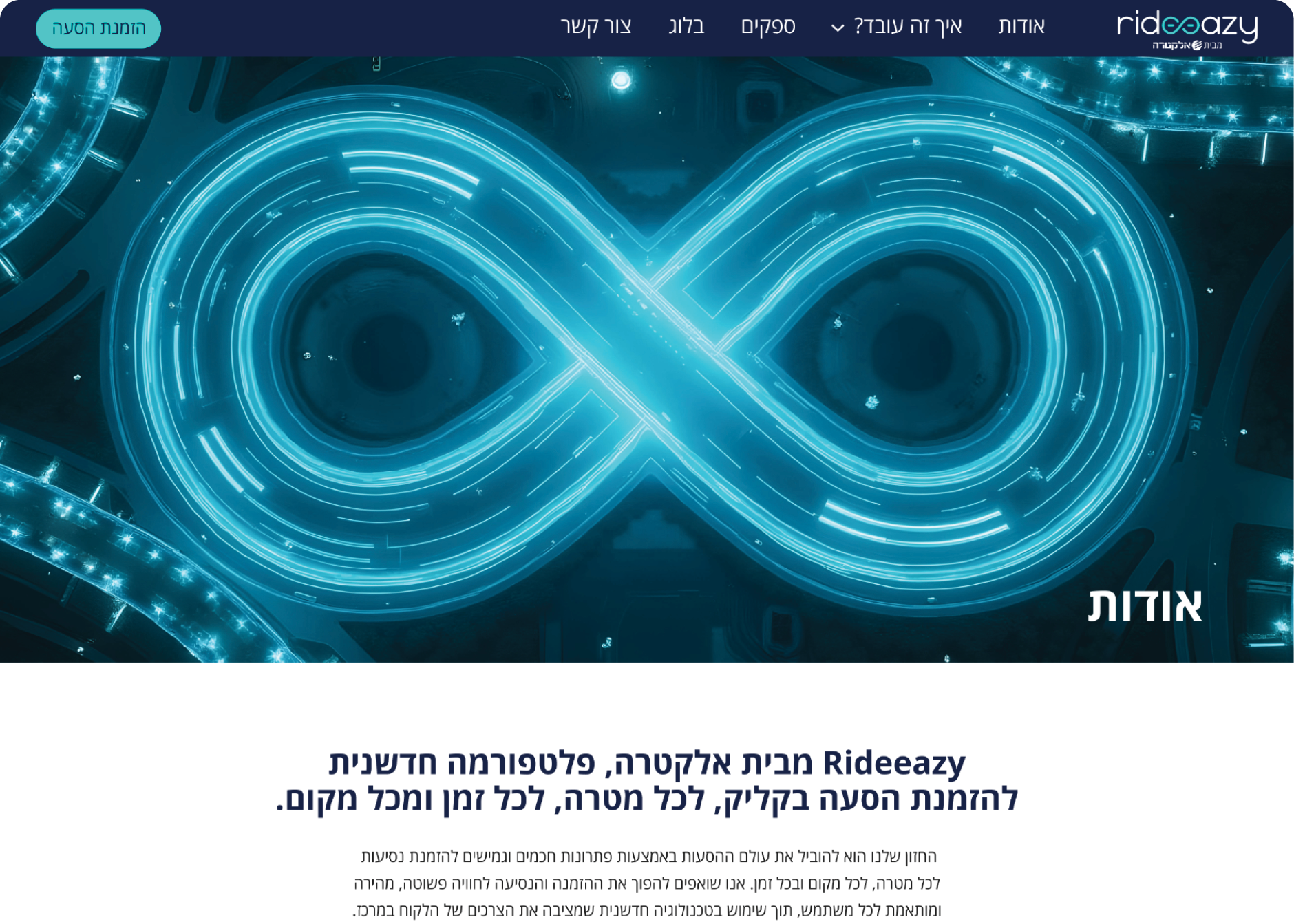
The service website was designed to introduce RideEazy, explain the platform’s value, and build trust before users enter the booking funnel. The layout focuses on clear information architecture, making the service easy to understand: exactly what it does, how it helps, and why it makes group transportation simpler to manage.
Branded Tutorial Storyboards
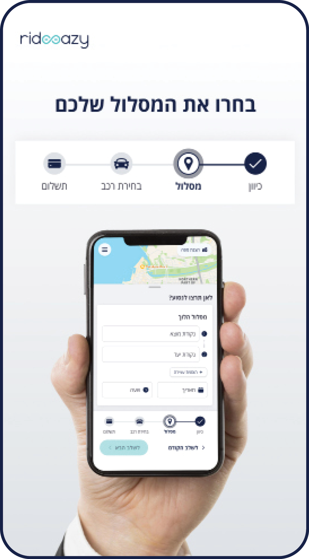
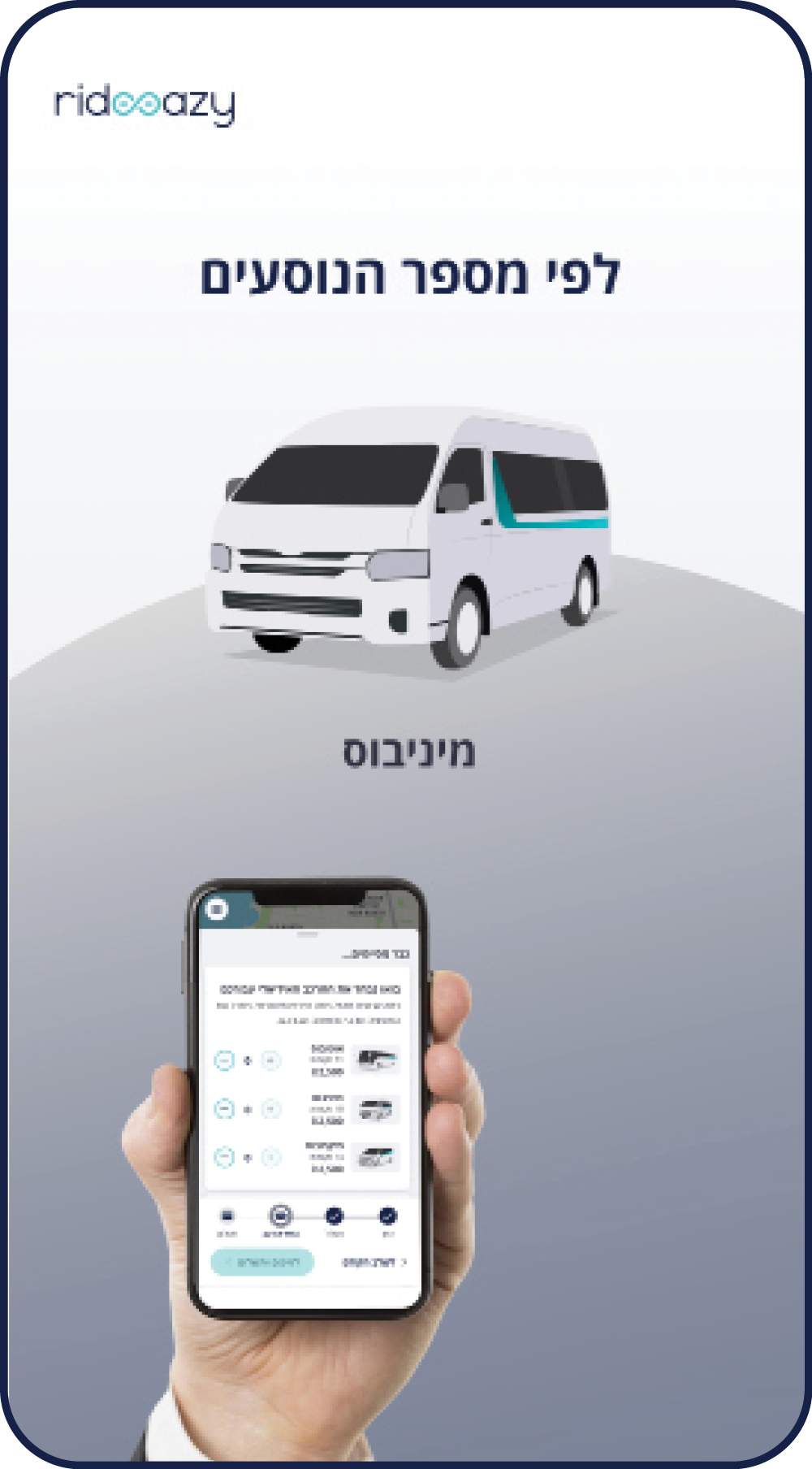
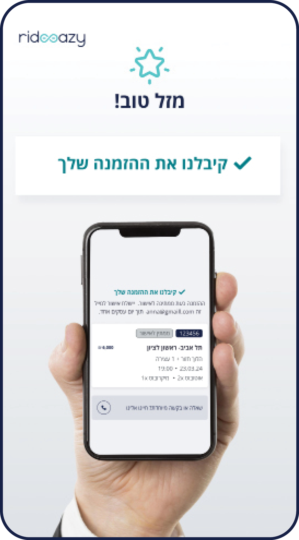
The booking system already existed. My role was to use its screens as source material and translate them into branded tutorial storyboards: one for customers booking a ride, and one for drivers and bus owners responding to ride requests.
Launch Campaign
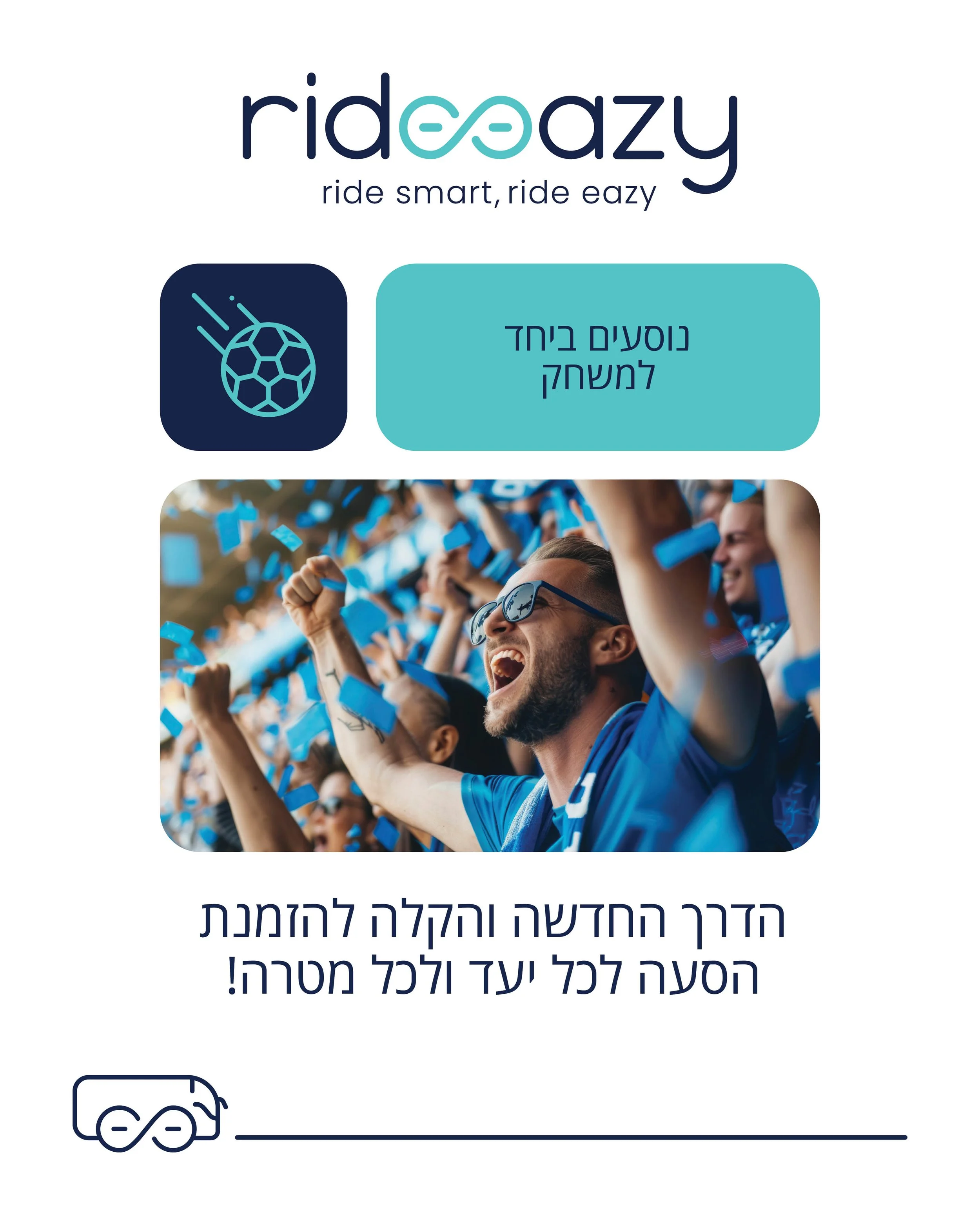
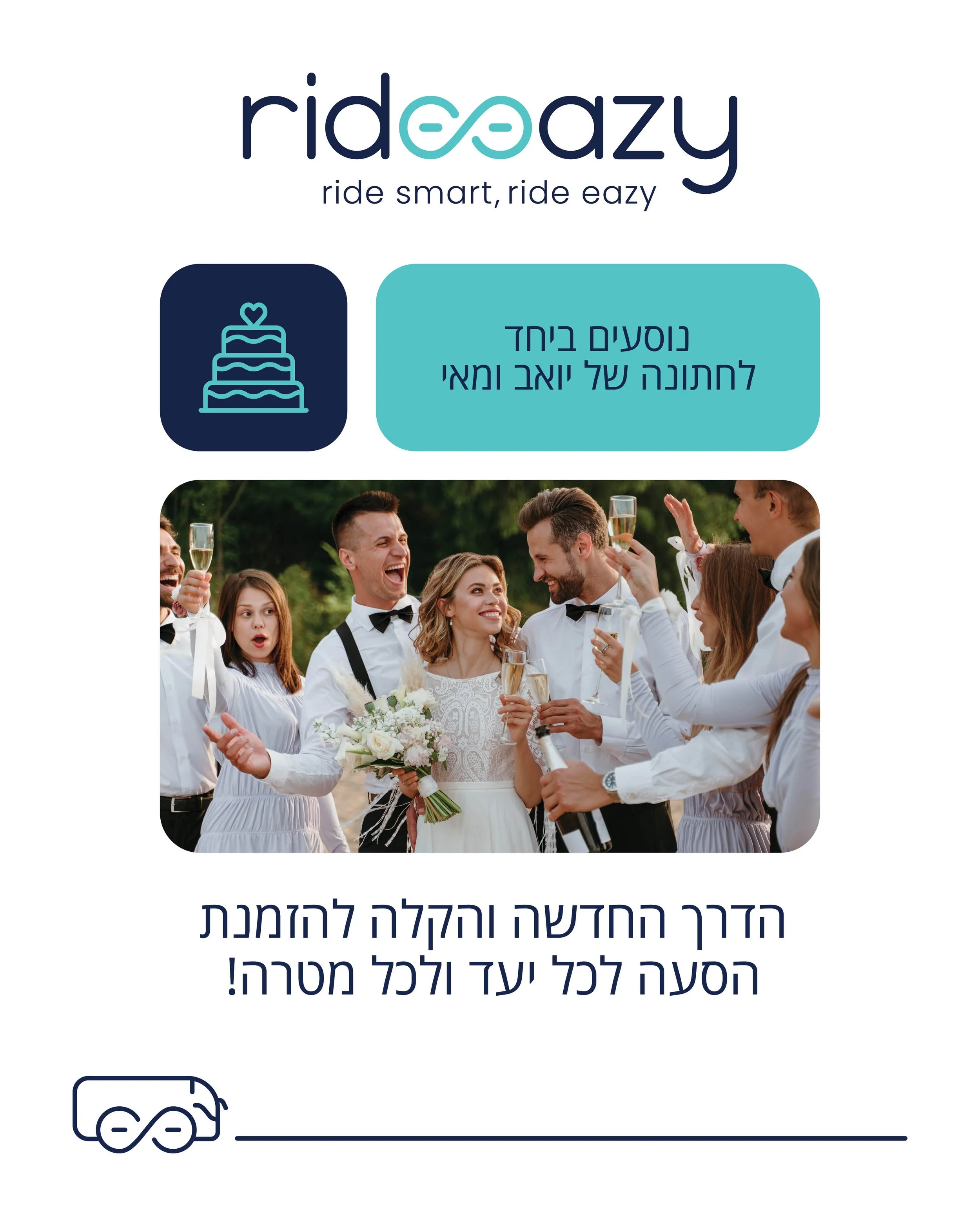
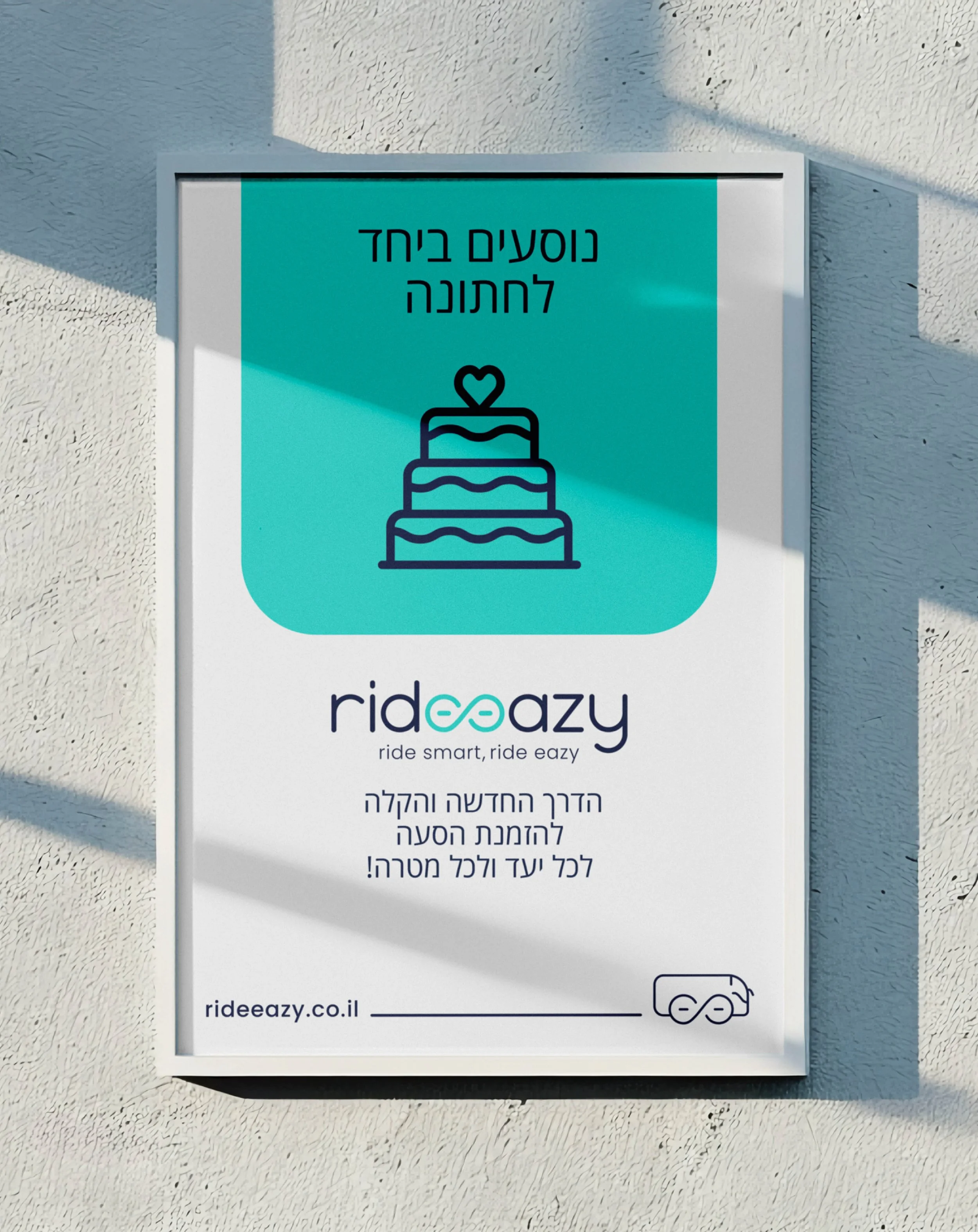
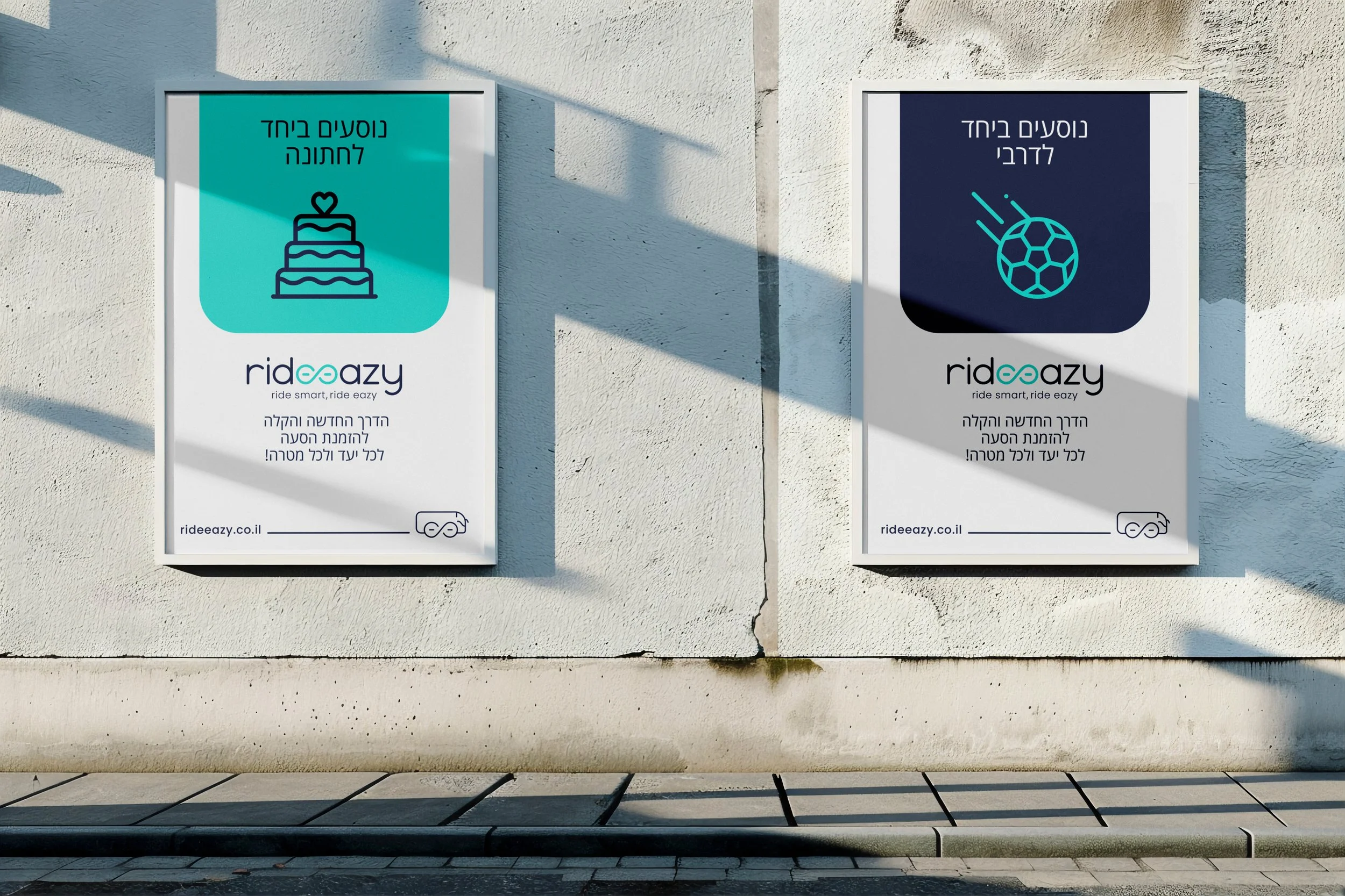
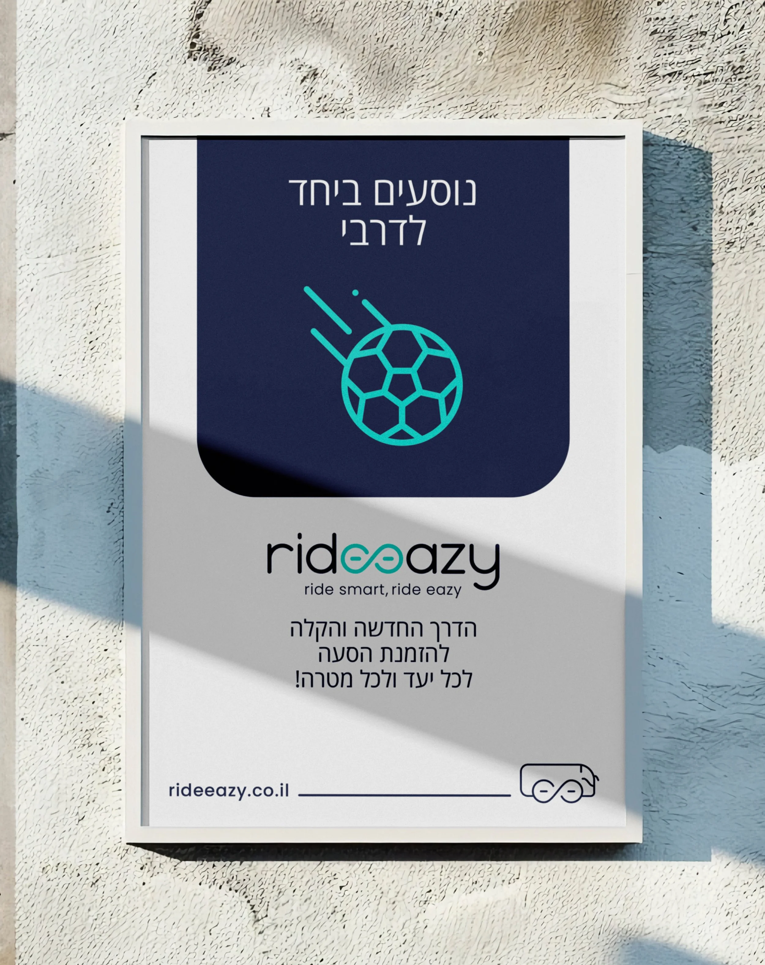
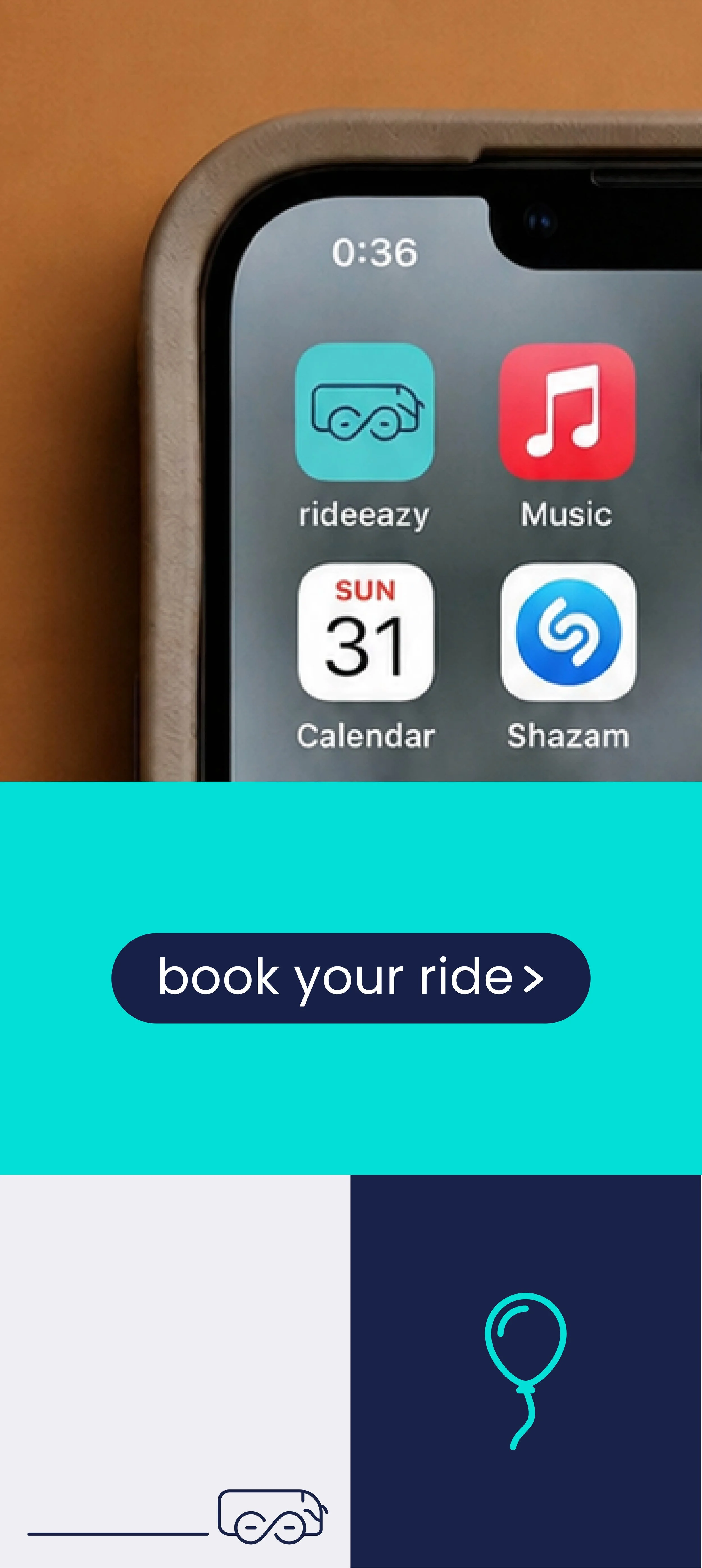
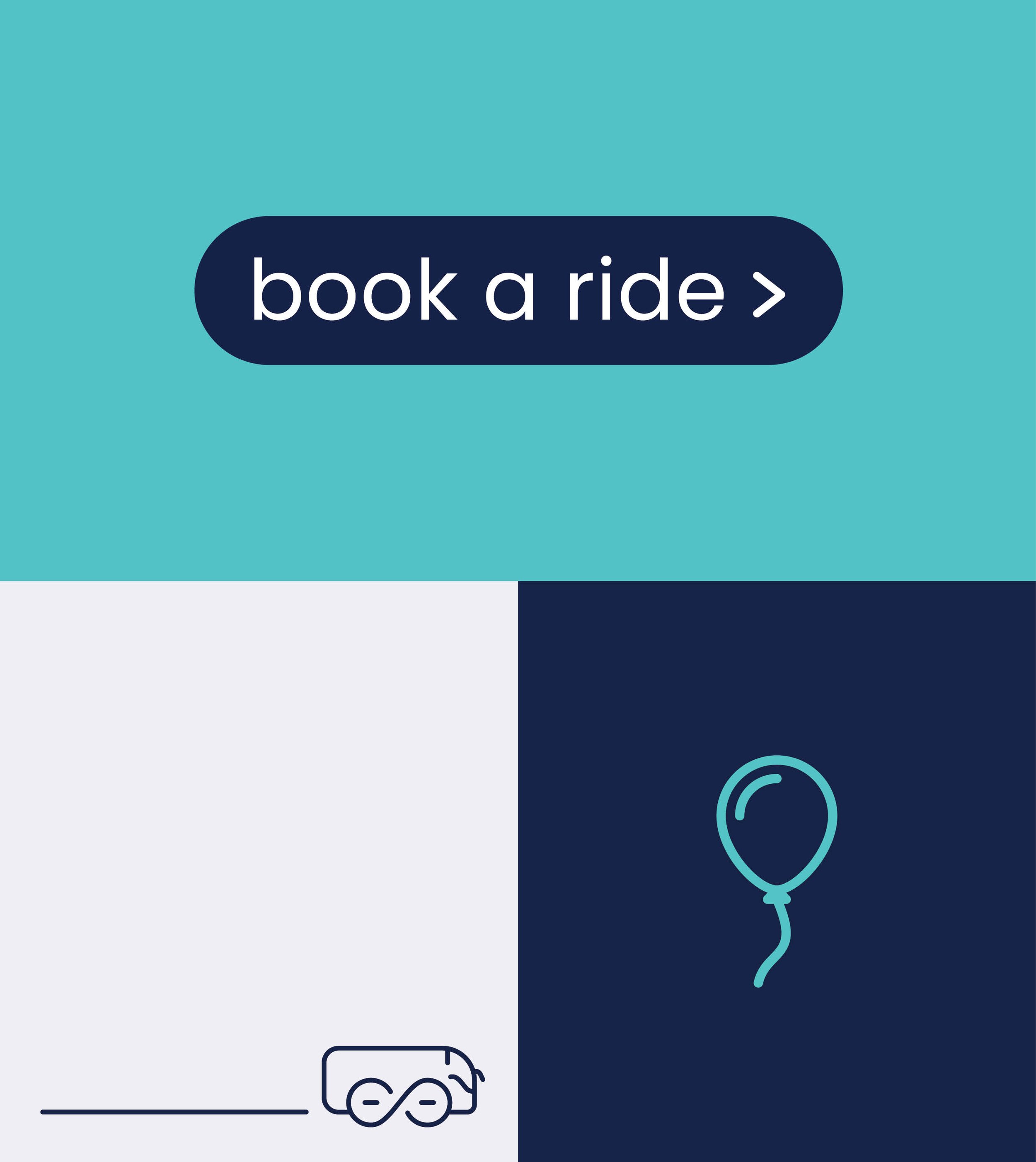
The launch assets translated the brand into everyday ride occasions: weddings, birthdays, games, trips and events. A modular block system was used to reflect the flexibility of the service: different occasions, destinations, group sizes and vehicle types could be communicated through the same visual logic, while keeping the campaign consistent and recognizable.