Tel Aviv LGBTQ+ Center
A signage and wayfinding system built around the freedom to arrive exactly as you are.
Client: Tel Aviv Municipality / The LGBTQ Center
Created at: Kiss Marketing Agency
Architecture: go arch
Role: Art Direction, Creative Strategy, Signage & Wayfinding System, Verbal Identity
The Challenge
The Tel Aviv LGBTQ+ Center moved into a new four-story home in Gan Meir. The wayfinding system needed to bring clarity to a complex public building while reflecting the center’s core idea: a space that welcomes different identities without imposing fixed definitions.
Insight
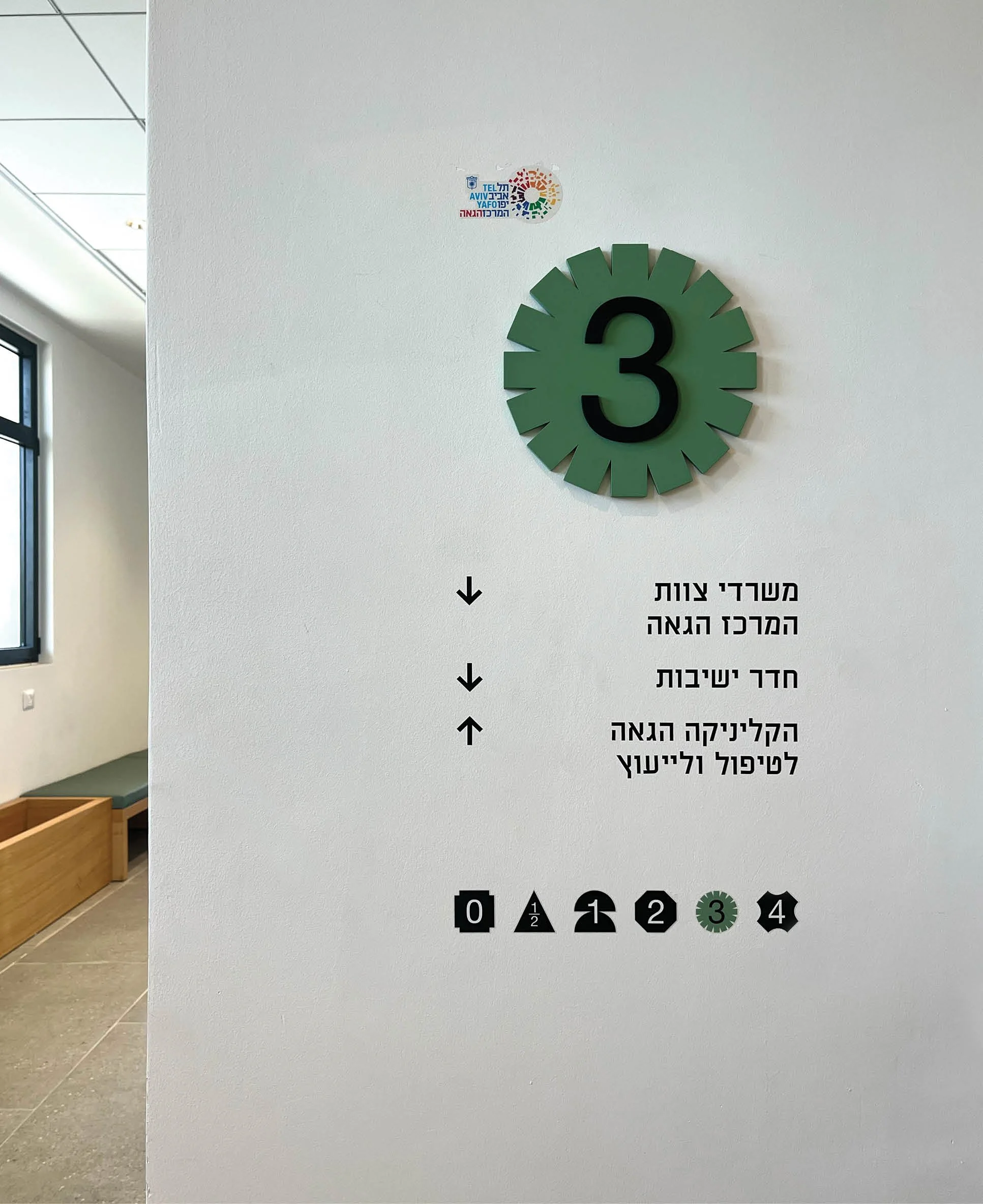
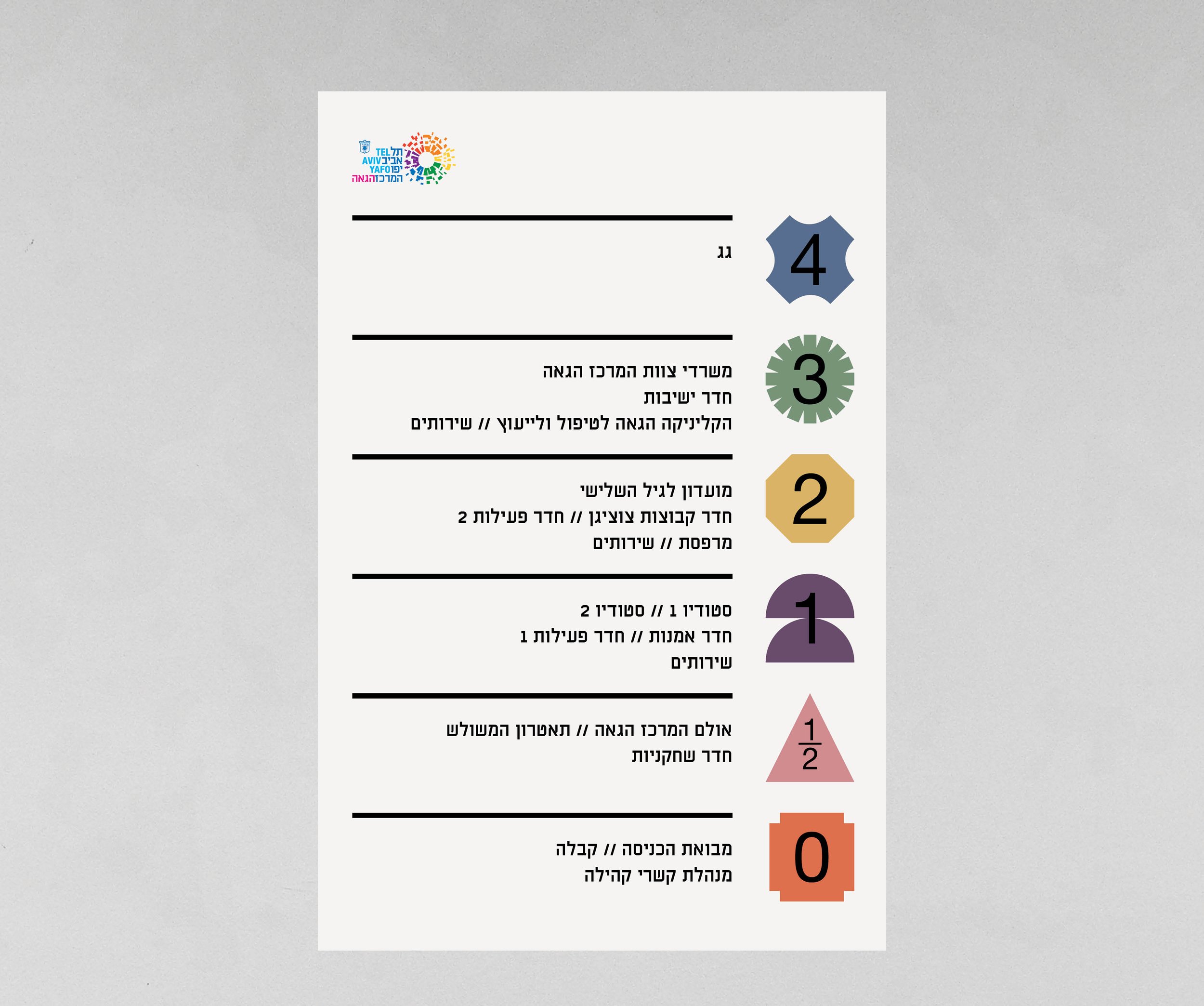
Rather than assign the building a single visual language, the system embraces variation. Changing shapes and colors create distinct identities for each floor, while a consistent underlying logic keeps navigation clear throughout the space.

The Concept -
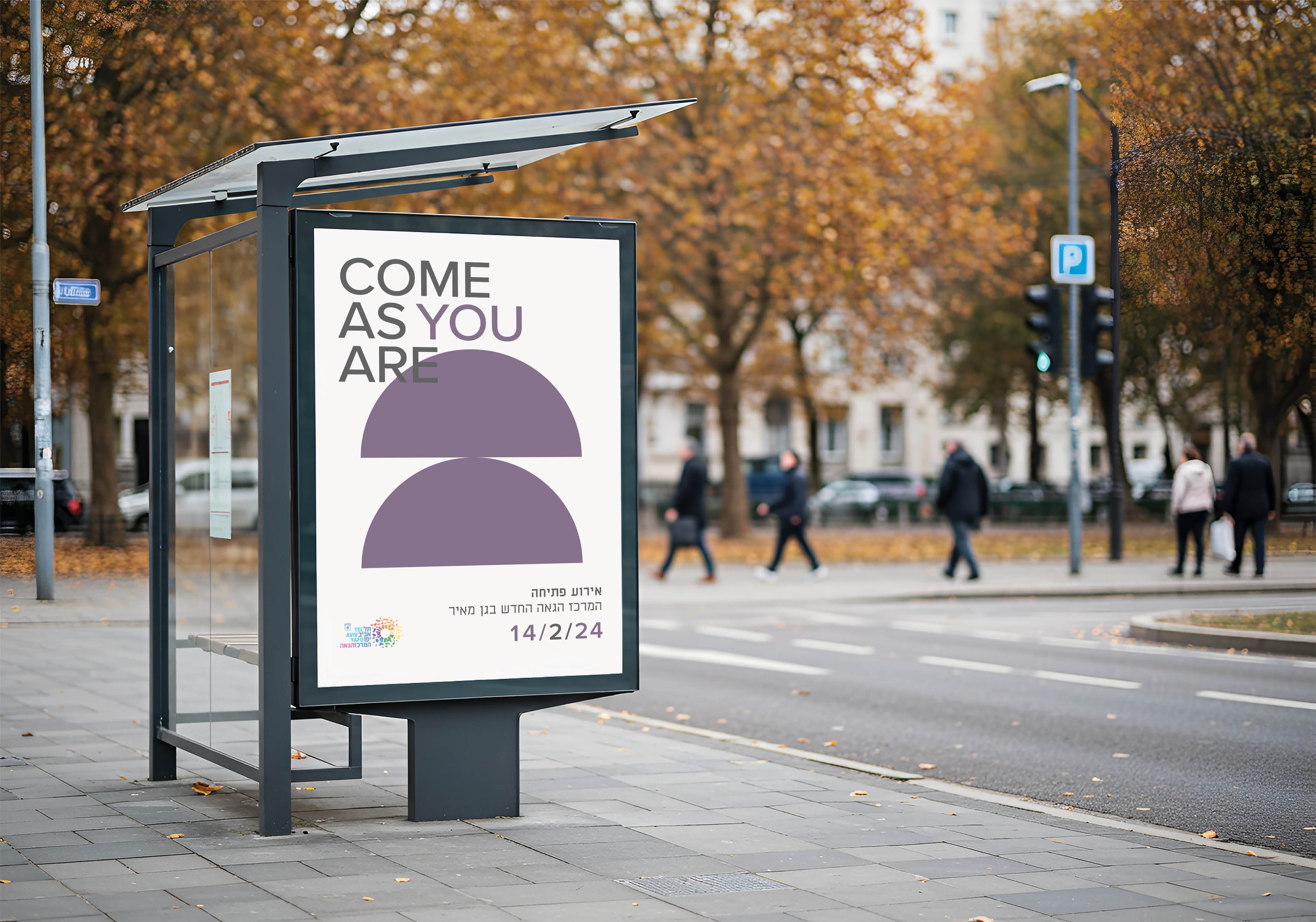
Come As You Are
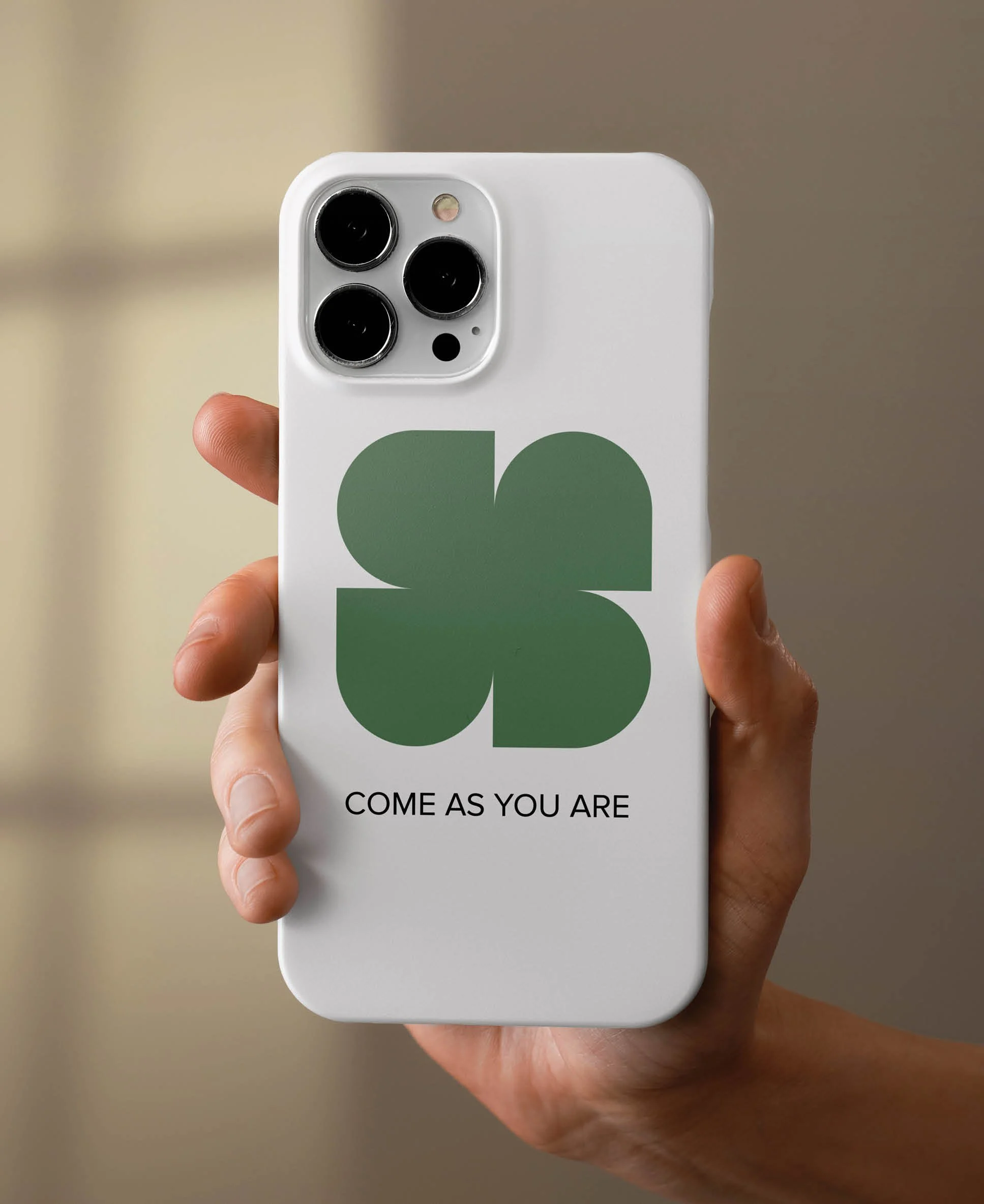
Come As You Are became both the conceptual and verbal foundation of the environment - expressing a place where people are free to define themselves,
or not define themselves at all.
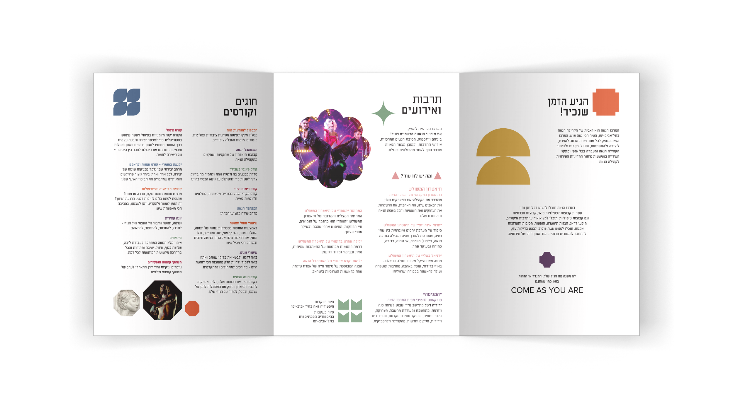
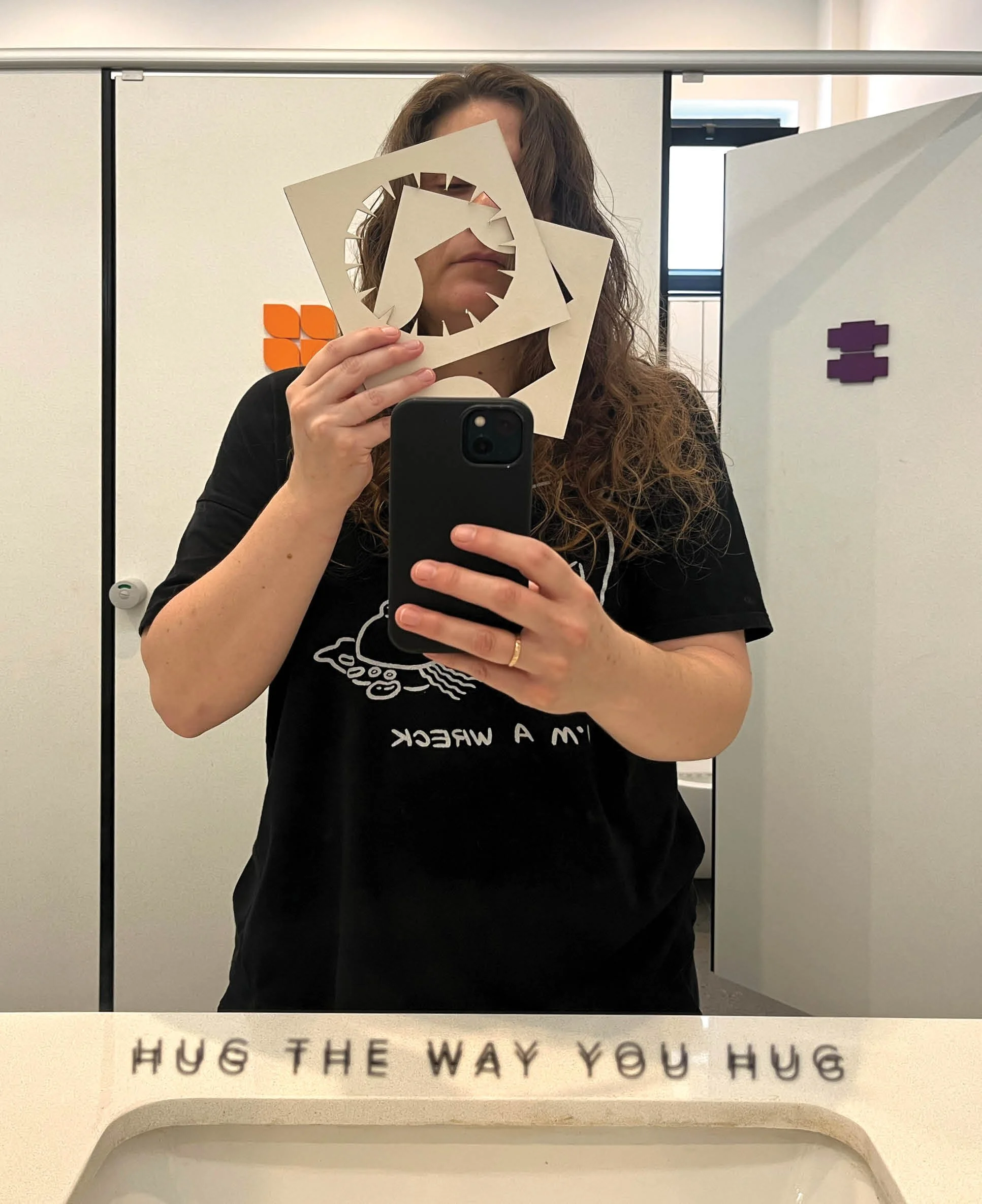
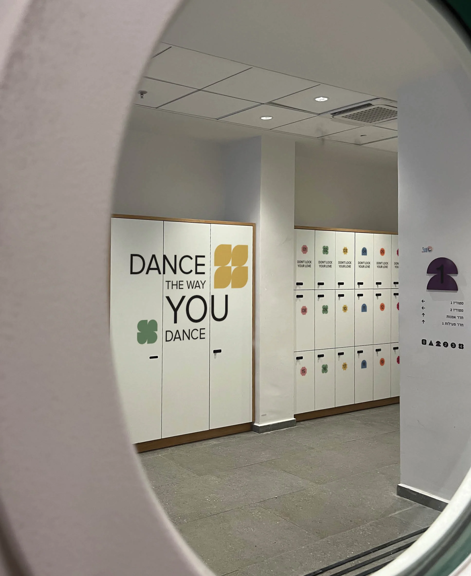
A flexible verbal system turns the core idea into everyday expressions throughout the building.
The Wayfinding
System
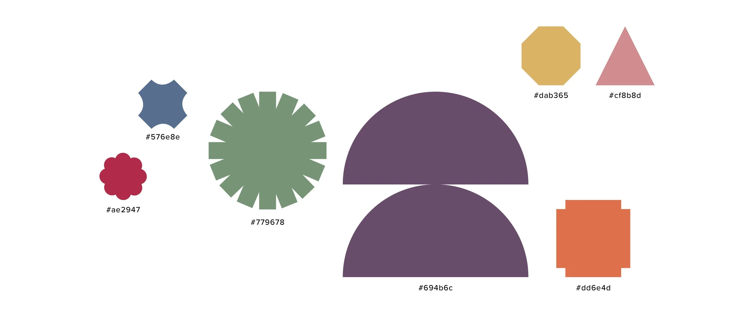
Shapes & Color
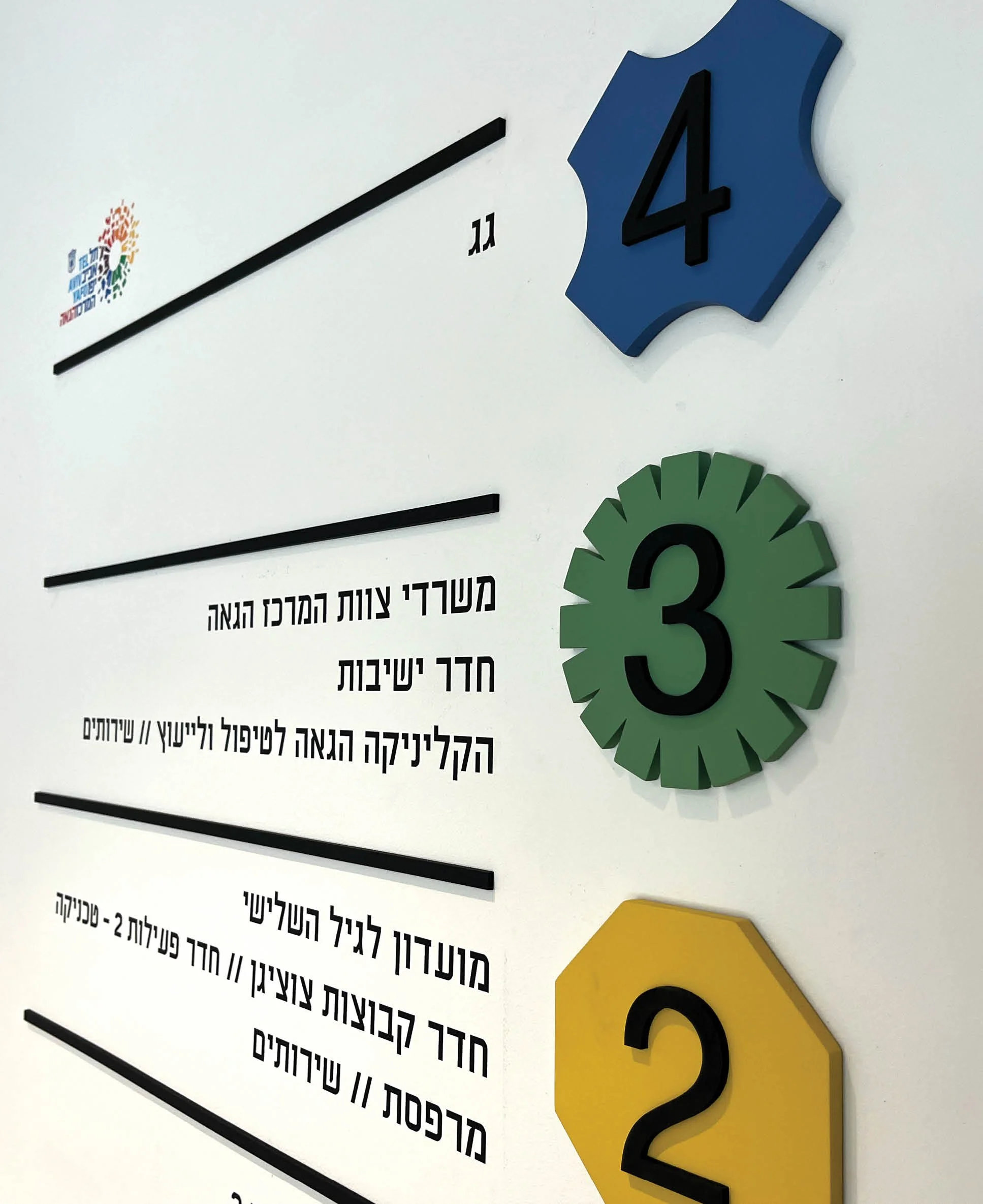
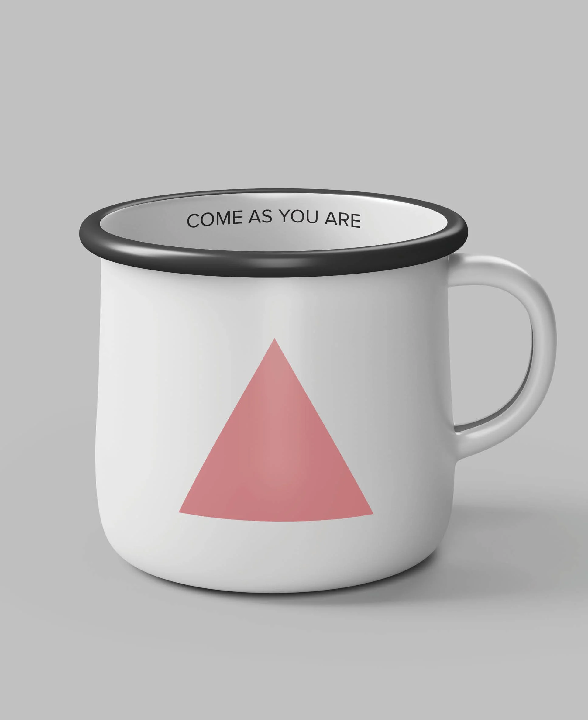
Each floor is identified through its own leading shape and color, creating orientation without losing the diversity of the overall identity.
Iconography
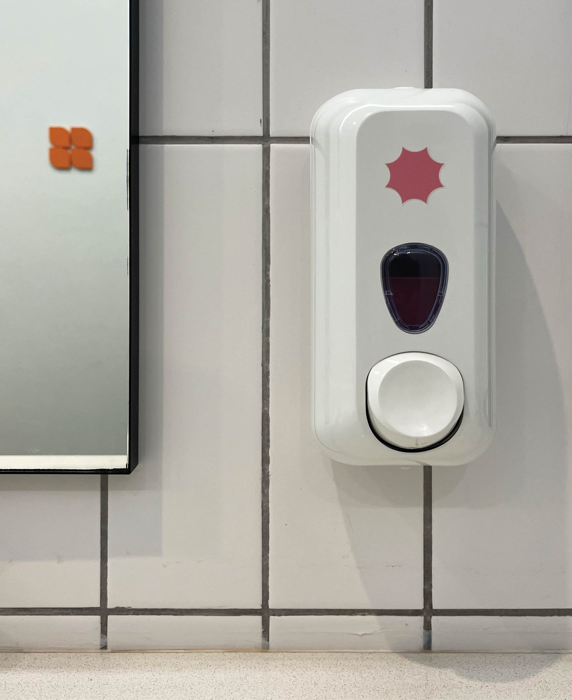
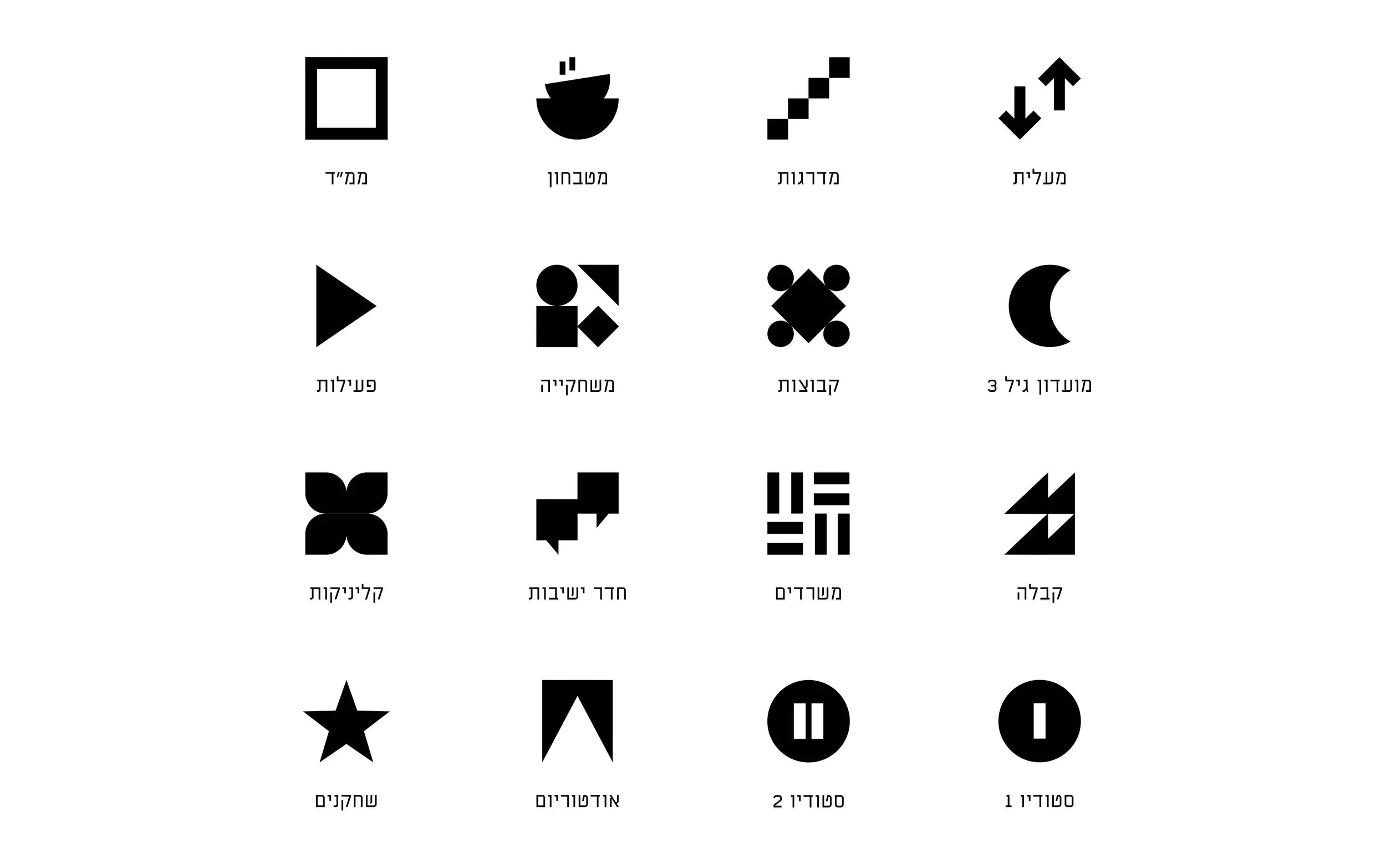
Custom room pictograms are built from the same geometric language, adapting the system to different functions while maintaining visual consistency.
Typography
Bold black typography provides a consistent structural layer across the changing colors and forms.
Wayfinding
Floor, room, and directional signage follow a shared hierarchy, with location markers helping visitors understand their position within the four-story building at a glance.