Tel Aviv Pride 2022
A city-wide identity for the return of Tel Aviv Pride to the streets after a two-year break.
Client: Tel Aviv Municipality
The LGBTQ Center
Created at: Kiss Marketing Agency
Photographer: Sasha Prilutsky
Role: Art Direction, Visual Identity Systems,
Digital & Print Design
The Challenge
After a two-year pandemic break, Tel Aviv Pride returned to public space. The campaign needed to rebuild a sense of collective visibility while working across a large-scale city rollout and international communications.
The Strategy
During the pandemic, LGBTQ+ visibility had largely shifted from public to digital space. The campaign reframed Pride from simply attending an event to reclaiming the streets - making the city itself the stage for the community’s return.
Concept &
Identity Design



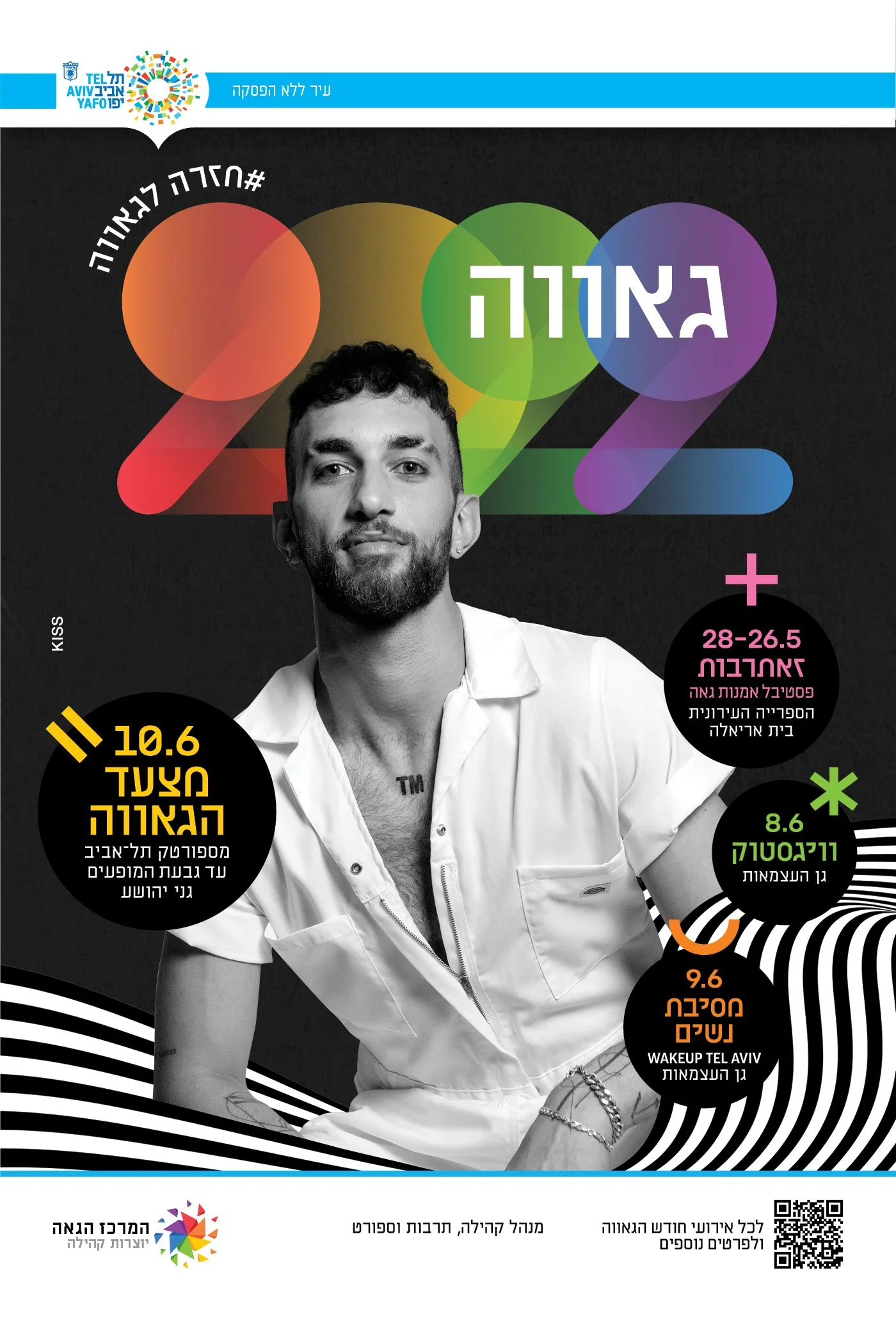
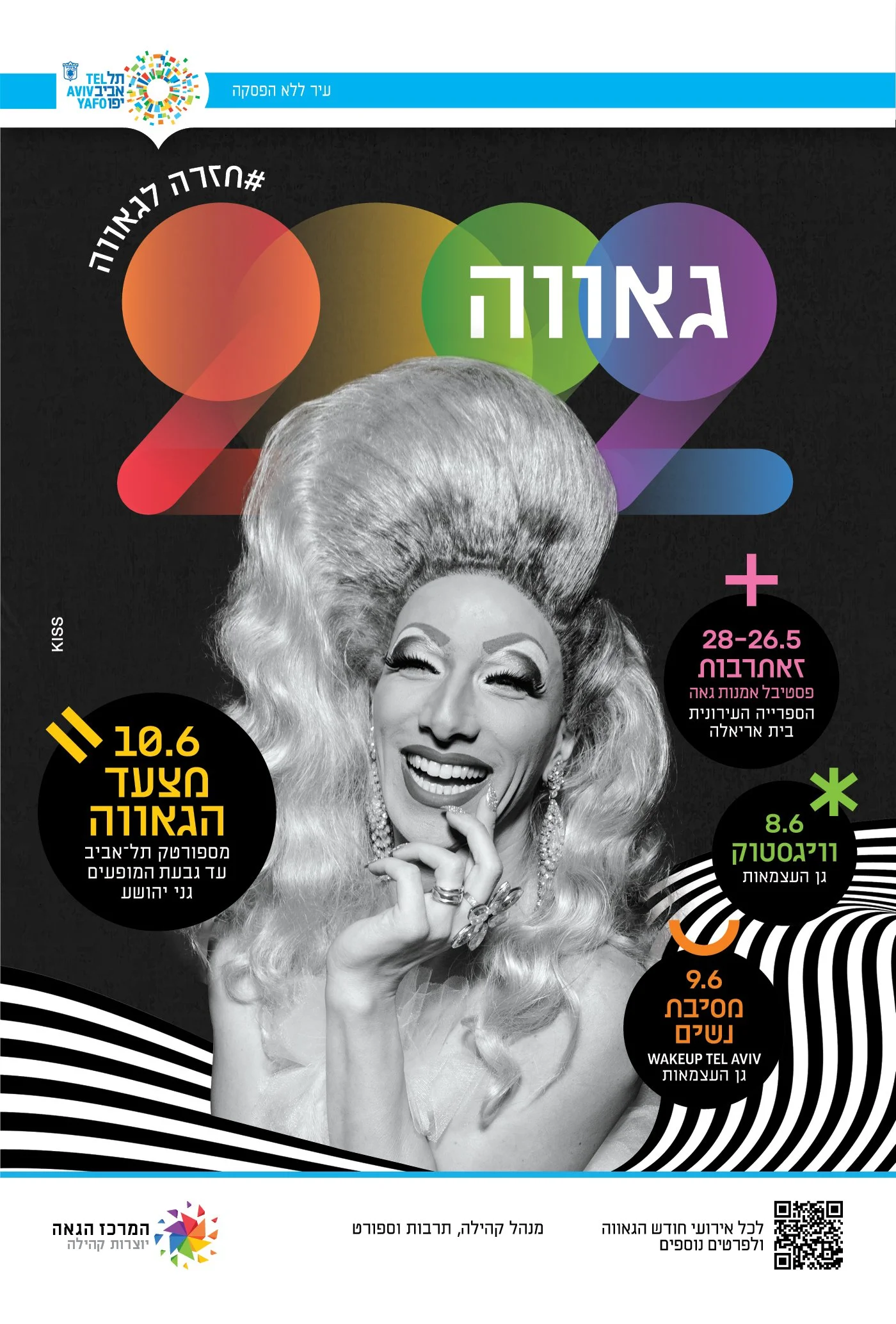
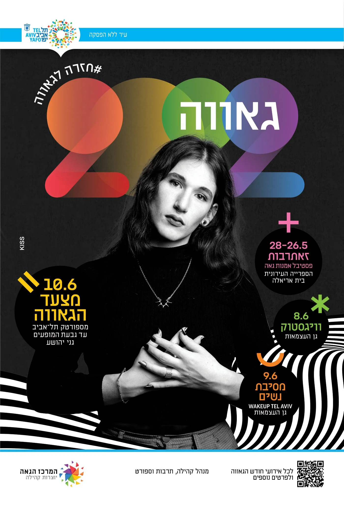
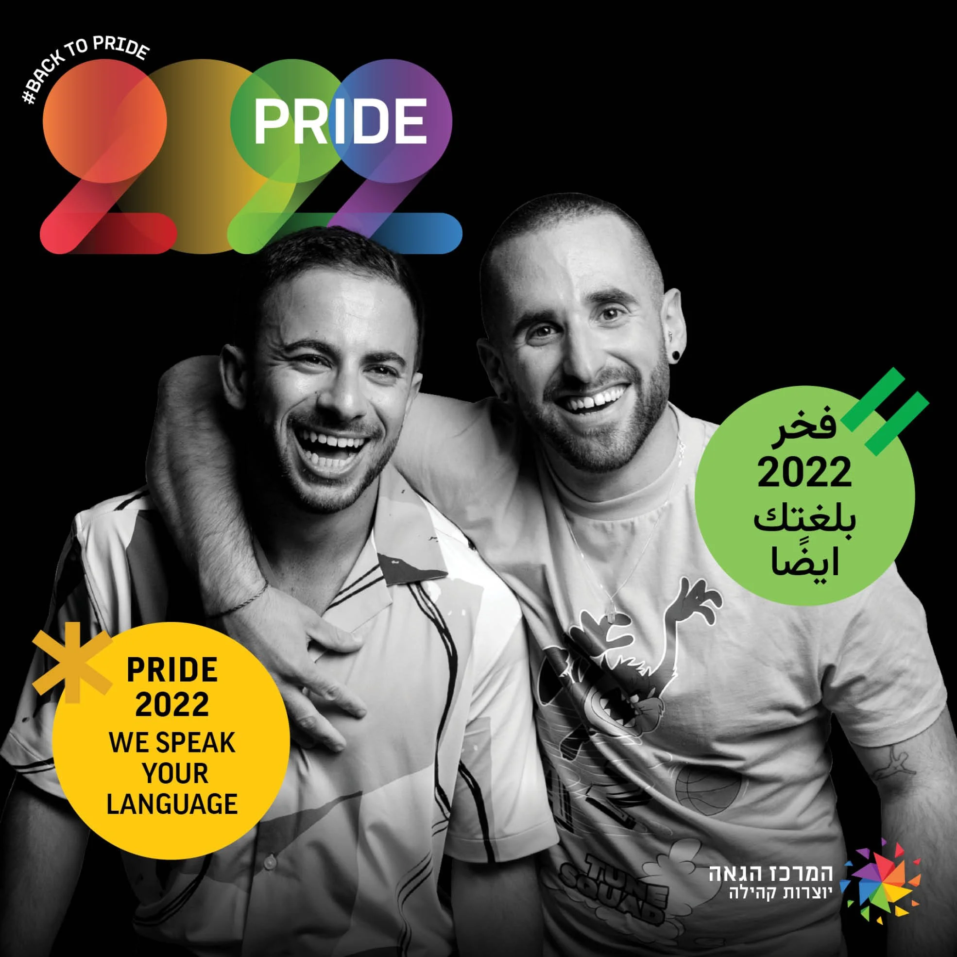
Real members of the community became the focus of the campaign, photographed at moments of unapologetic pride.
The idea of a spotlight was translated into a modular system of geometric light beams, creating a flexible visual language across the entire identity.
Art Direction &
Visual System
Typography
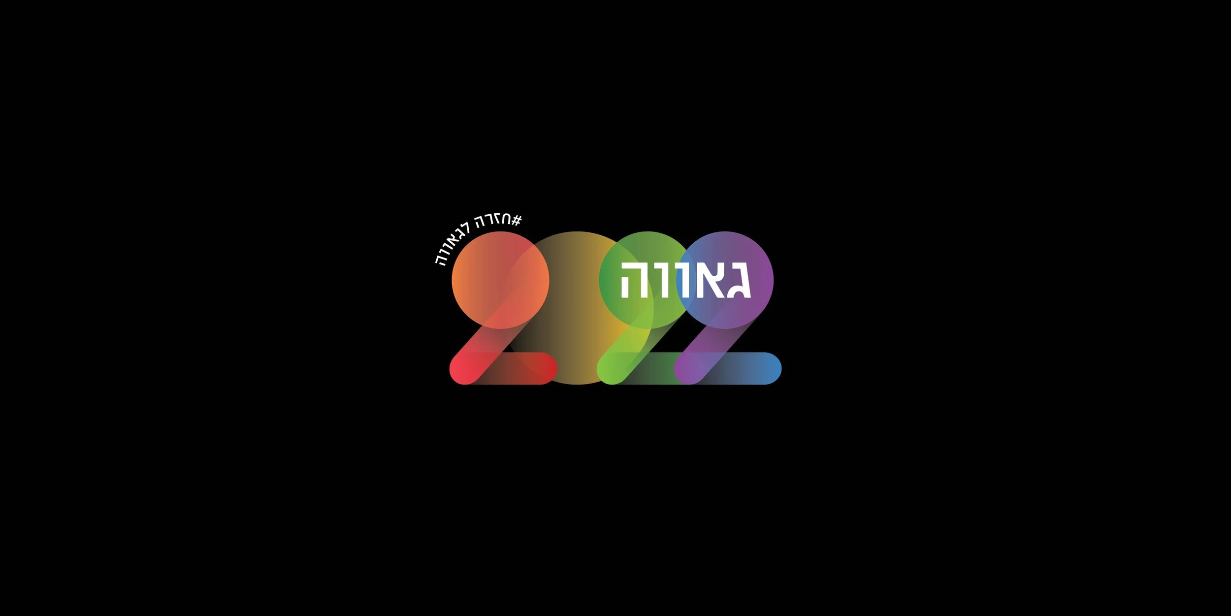
A custom “2022” graphic was constructed from circular paths inspired by beams of light, paired with bold typography built for visibility at urban scale.
Color
A dark visual field allowed the highly colorful identity elements to remain sharp, energetic, and immediately recognizable.
Photography
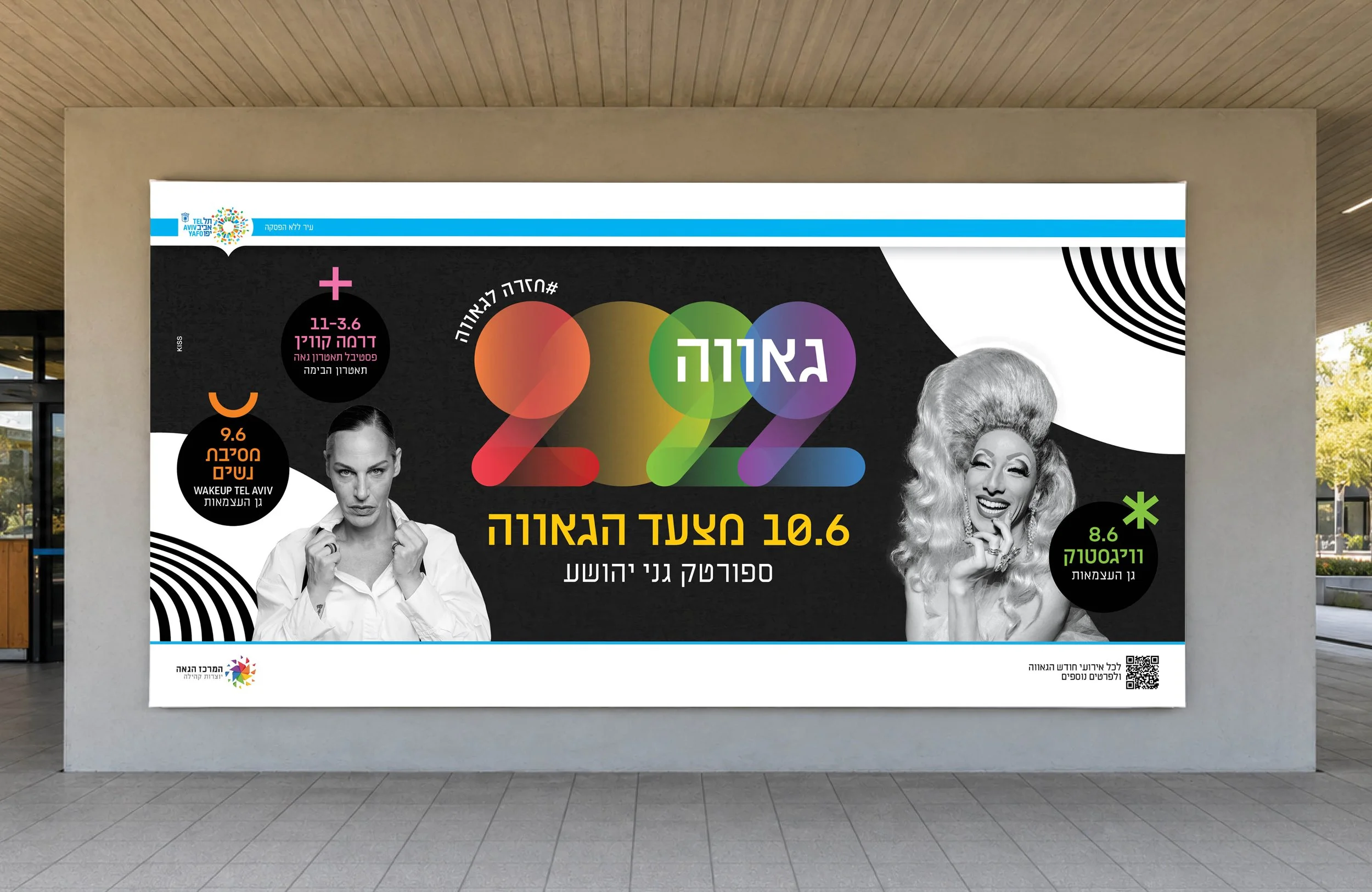
High-contrast black-and-white portraits placed real community members at the center
of the campaign while creating tension with the vivid graphic system.
Built to Scale
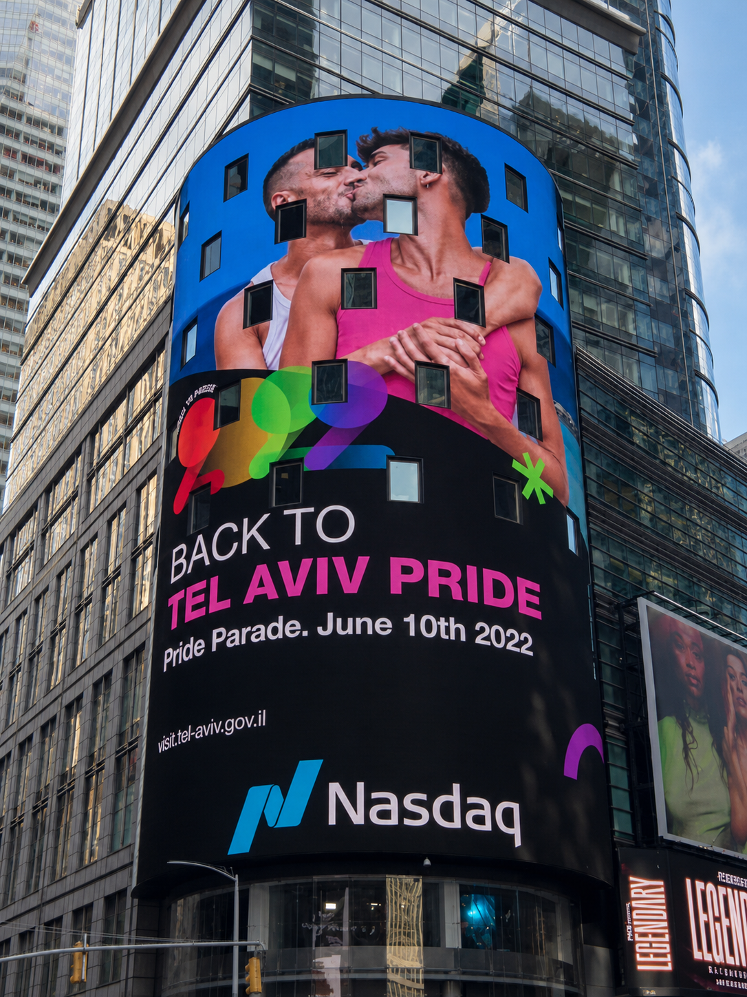
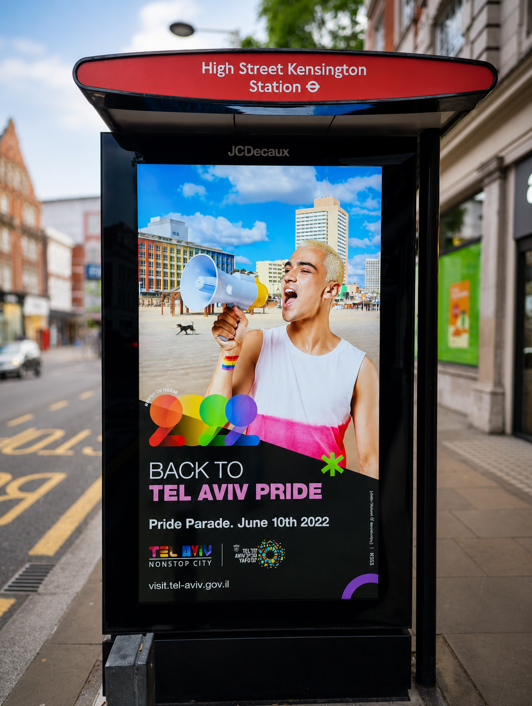
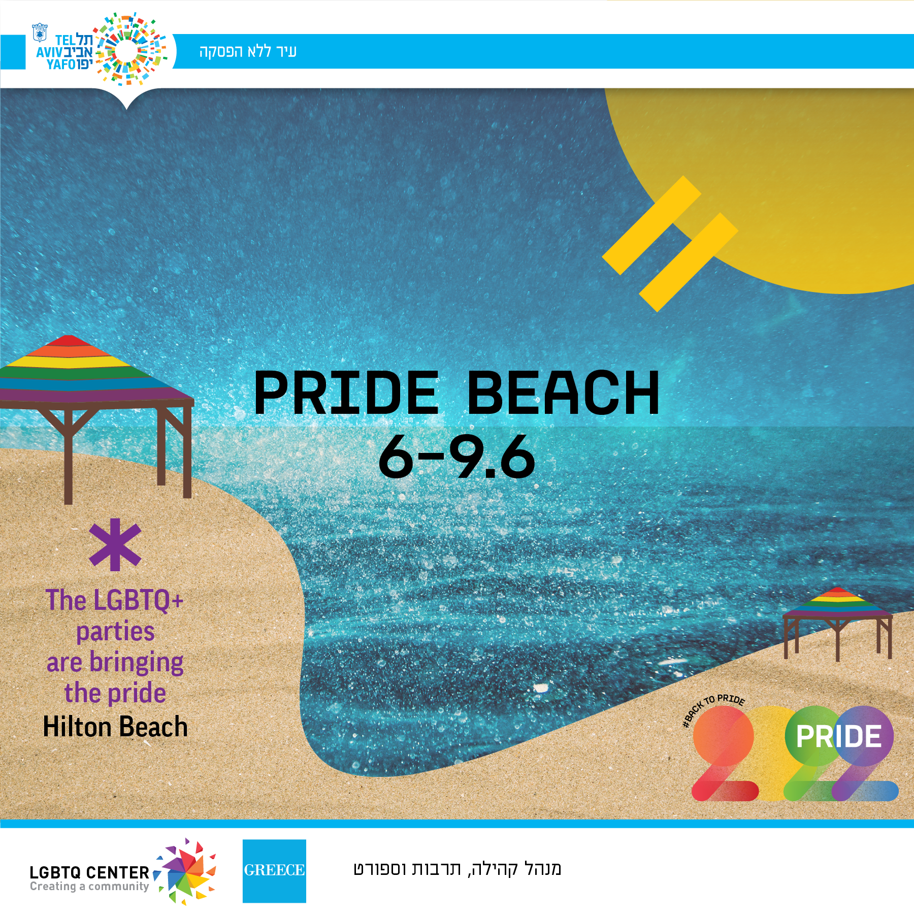
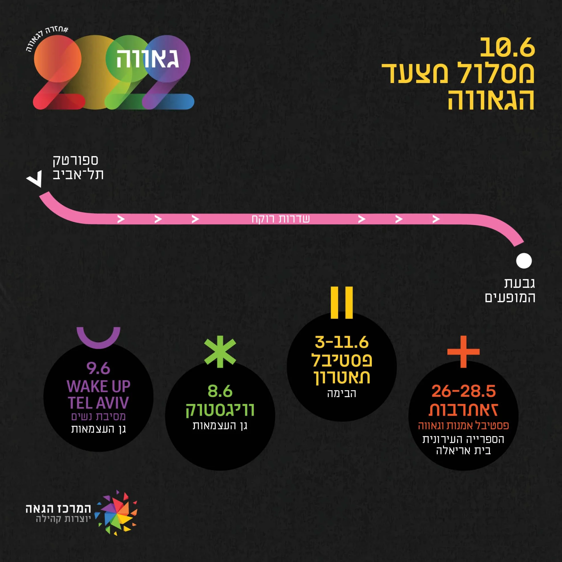
The modular system adapted across social media, outdoor advertising, event schedules, route maps, and multilingual layouts in Hebrew, Arabic, and English. In motion, the geometric elements became animated searchlights, extending the core idea into digital billboards.
Global Rollout
I developed the campaign guidelines and brand kit for use by external partners. The system was later adapted for international Pride communications in New York and London, while retaining its core typography, geometry, and visual structure.