ROOTS
A premium identity for a cross-border real estate and design service.

Client: ROOTS / Design. Real Estate
Created at: Kiss Marketing Agency
Role: Art Direction, Visual Identity Systems, Digital & Print Design
The Challenge
ROOTS provides real estate, interior design, and property management for international clients investing in Israel. The existing identity relied on a literal roots illustration and didn’t reflect the premium, highly personal nature of the service.
The rebrand needed to communicate trust, professionalism, and design expertise - especially for clients managing property decisions from abroad.
The Strategy
We moved away from literal interpretations of “roots” and toward a more architectural visual language built around structure, clarity, and stability.
The Concept
A Structural Anchor
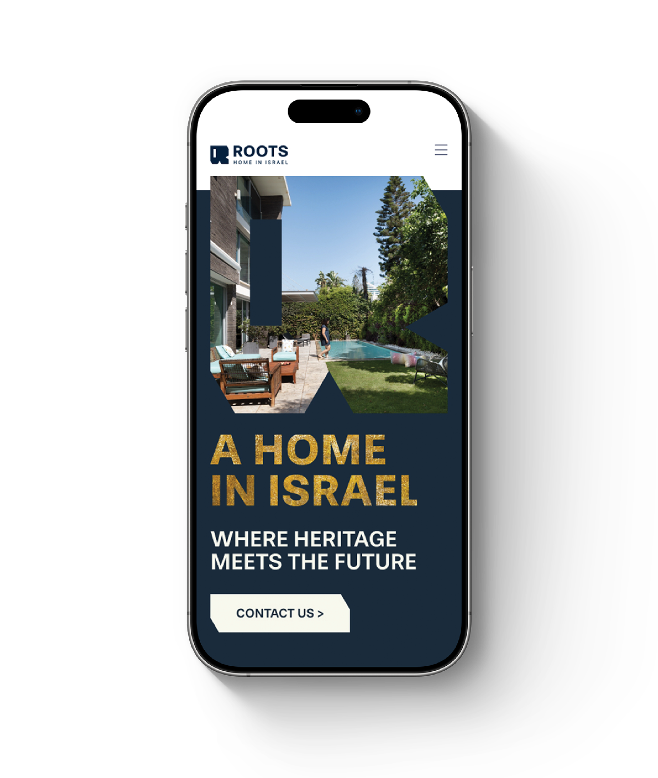
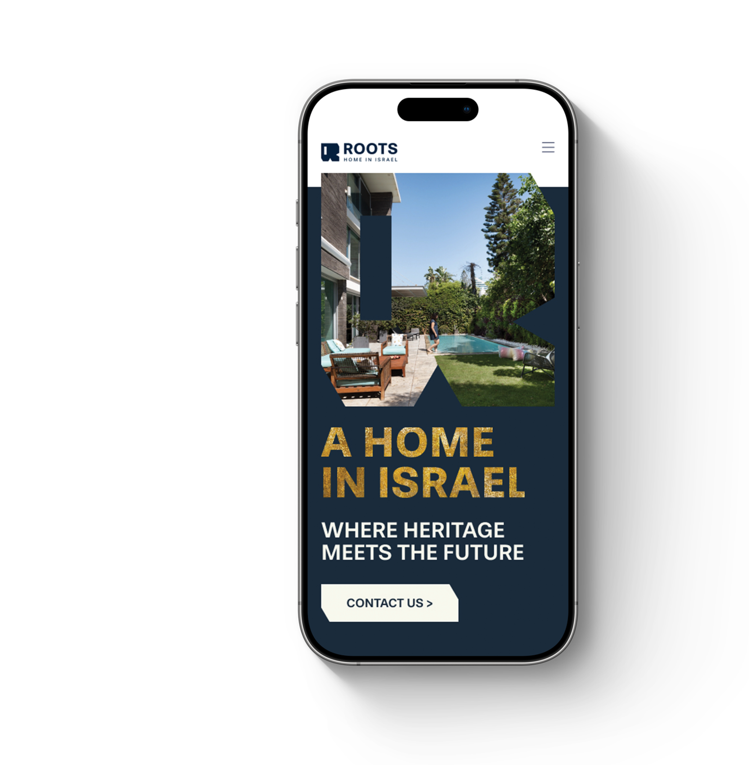
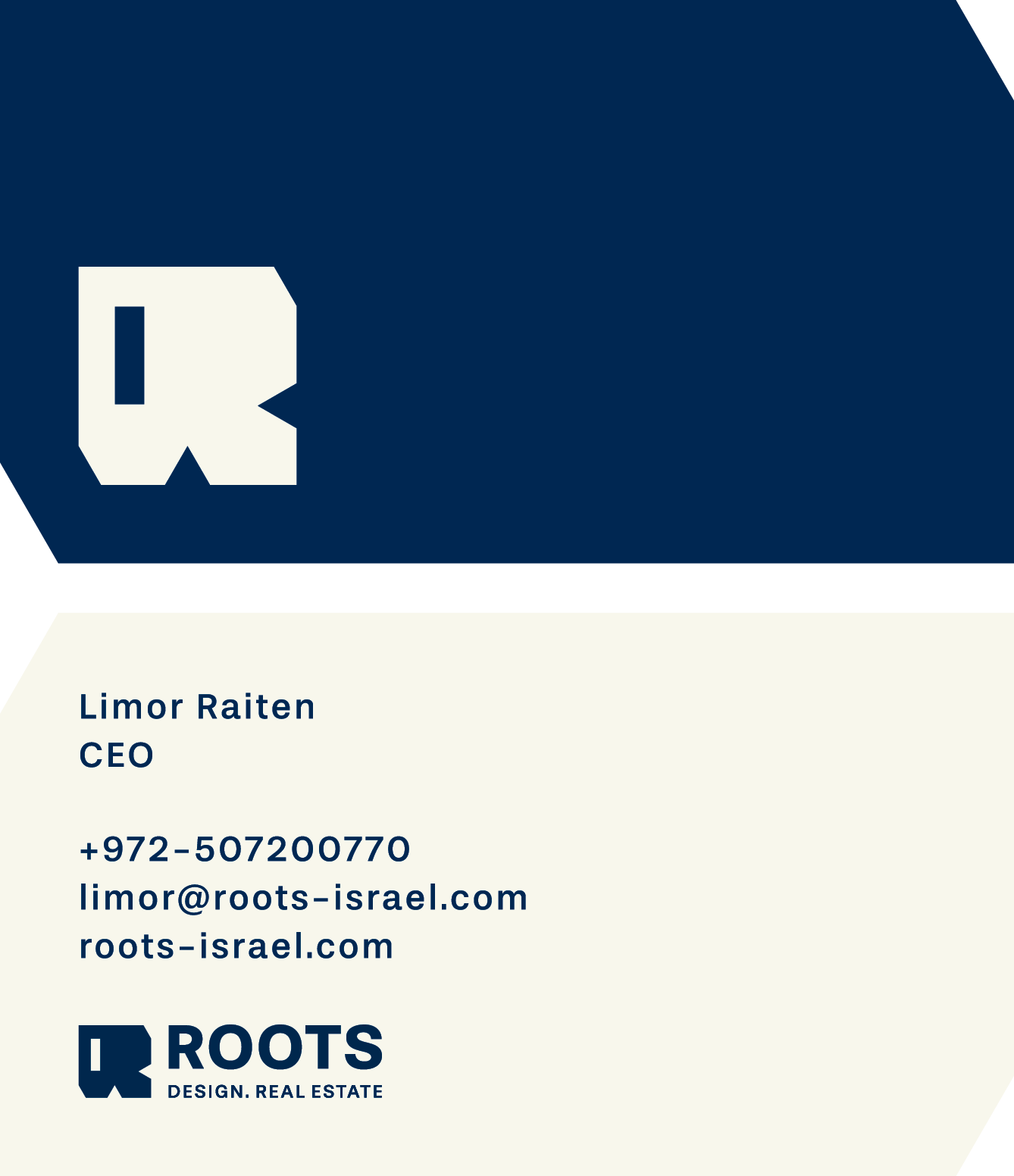
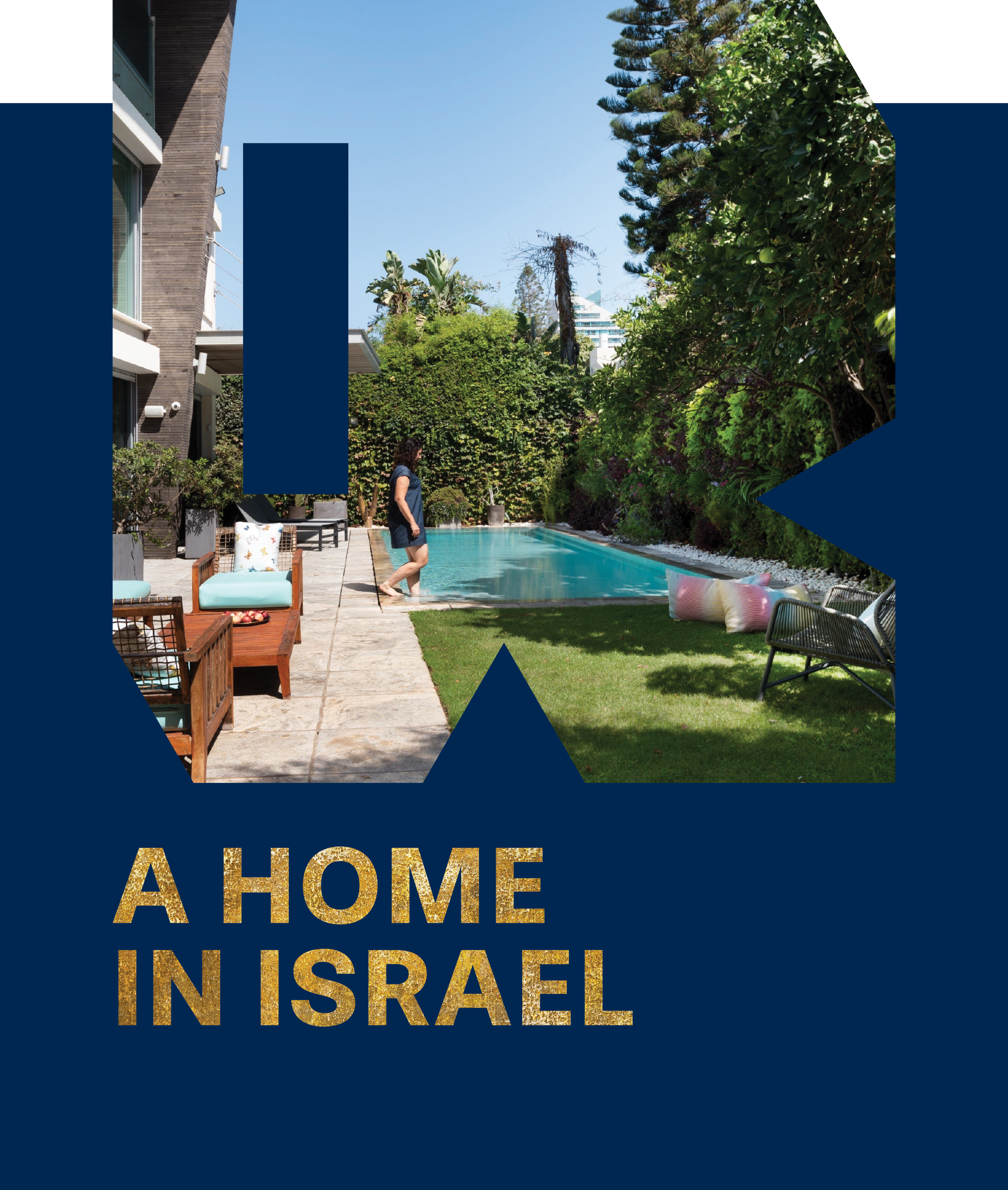
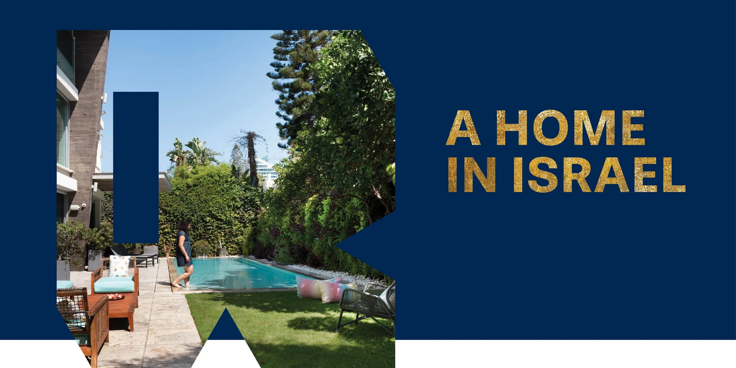
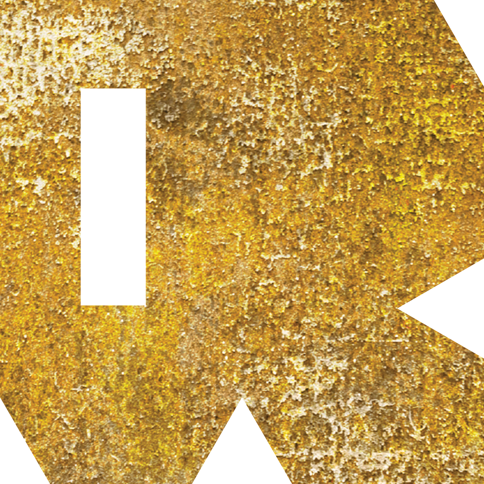
A geometric “R” monogram became the core of the identity. Its solid form acts as both a recognizable brand mark and a framing device for architecture, interiors, and Israeli landscape imagery.
Art Direction &
Execution
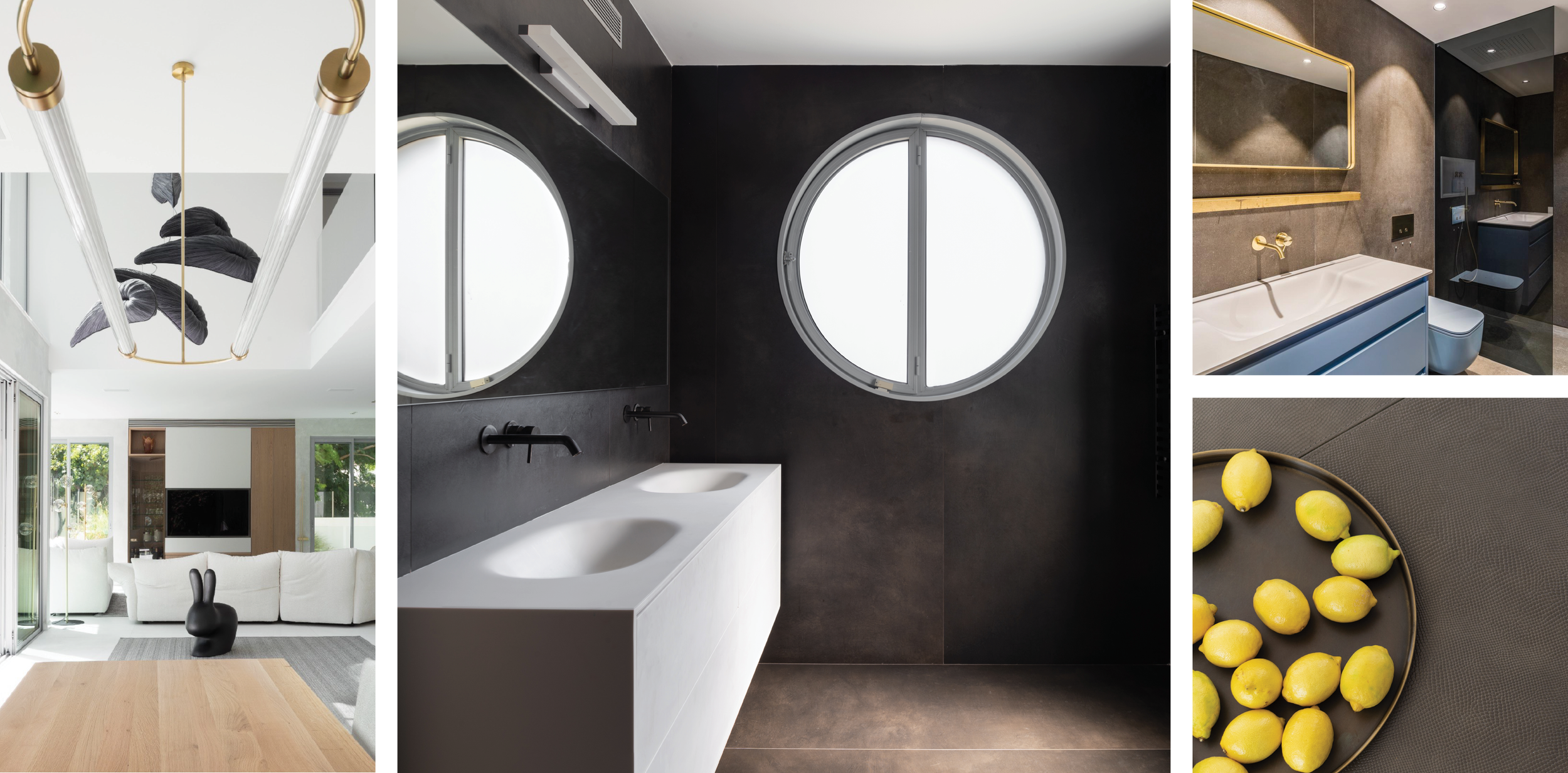
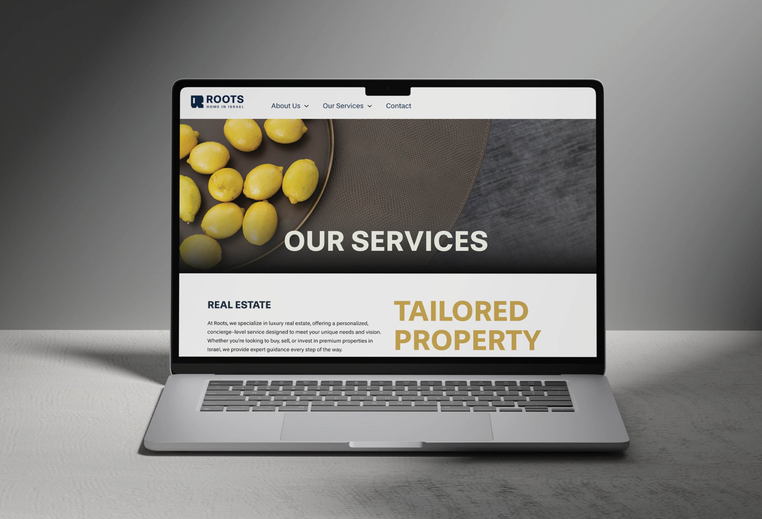
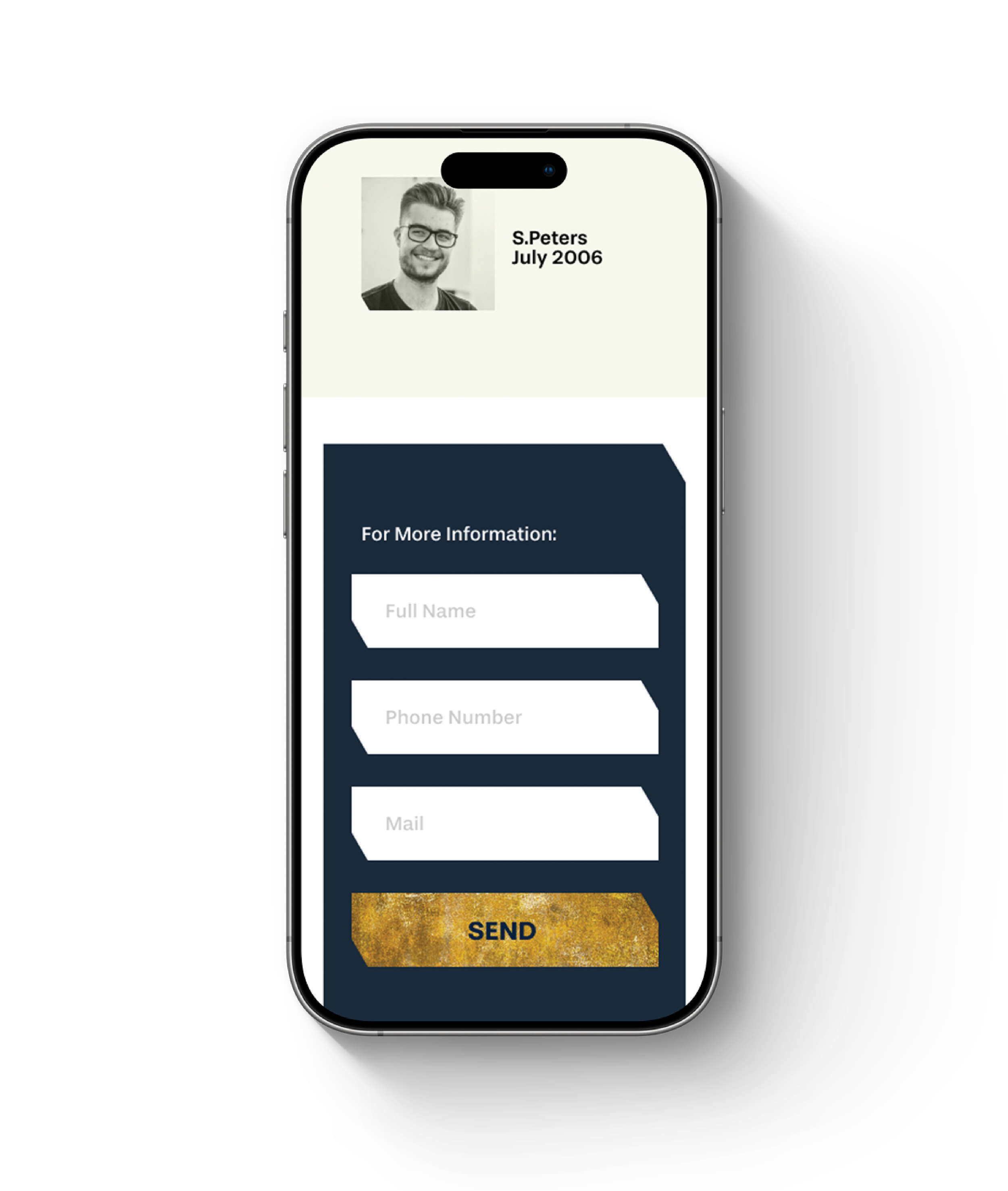
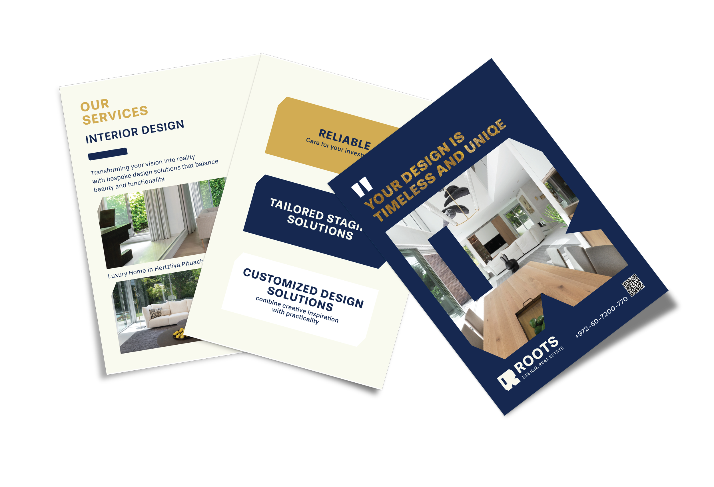
The identity was built as a restrained, architectural system, using the geometric “R” and recurring chamfered details across the website and print materials. Client-supplied photography was selectively curated to support the brand’s premium, design-led character, while maintaining a consistent visual language across digital and physical touchpoints.