Tel Aviv LGBTQ+ Center
Signage & Wayfinding System
Client: Tel Aviv Municipality / The LGBTQ Center
Created at: Kiss Marketing Agency
Architecture firm: go arch
Role: Concept, Art Direction, Design
The Challenge
The Tel Aviv LGBTQ+ Community Center moved into a new, four-story facility in Gan Meir. As a dedicated home for the community, the physical space needed to embody a core philosophy: absolute acceptance without rigid definitions. The challenge was to design a functional navigation system within a given physical space that reflects total personal freedom - allowing people to feel at home exactly as they are, without forcing them into boxes.
Strategy & Insight
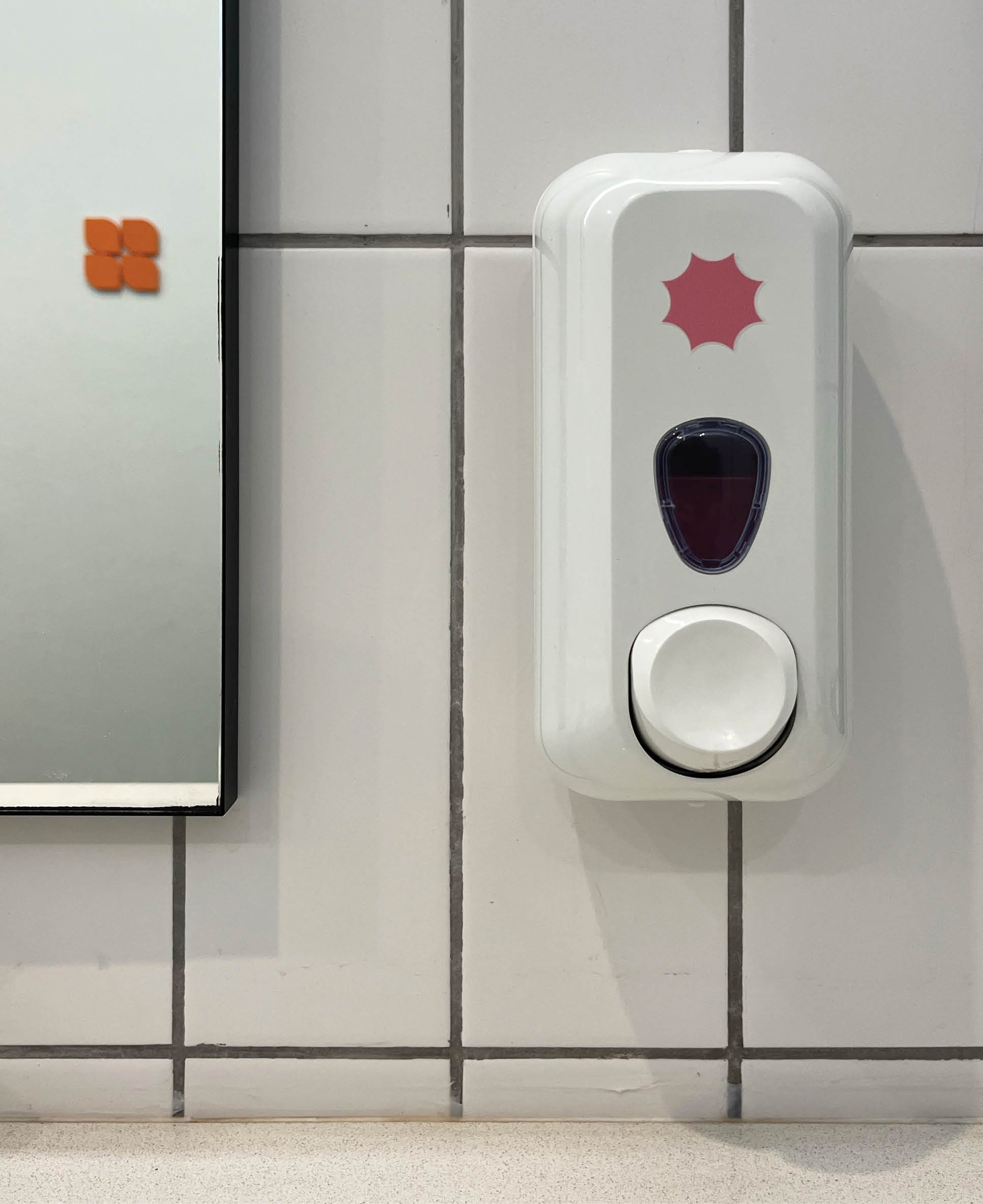
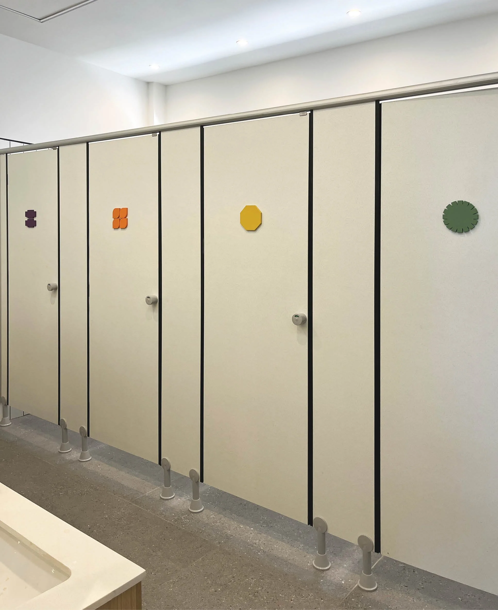
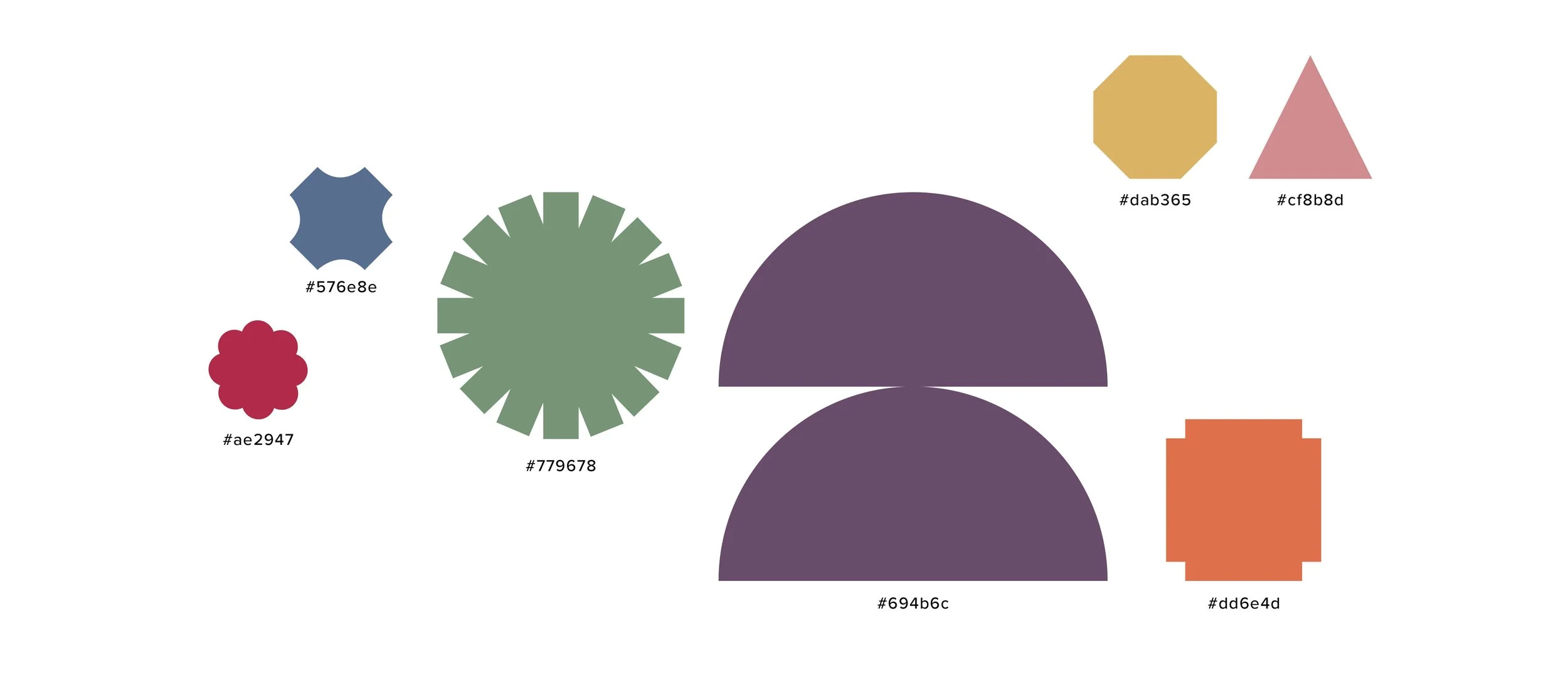
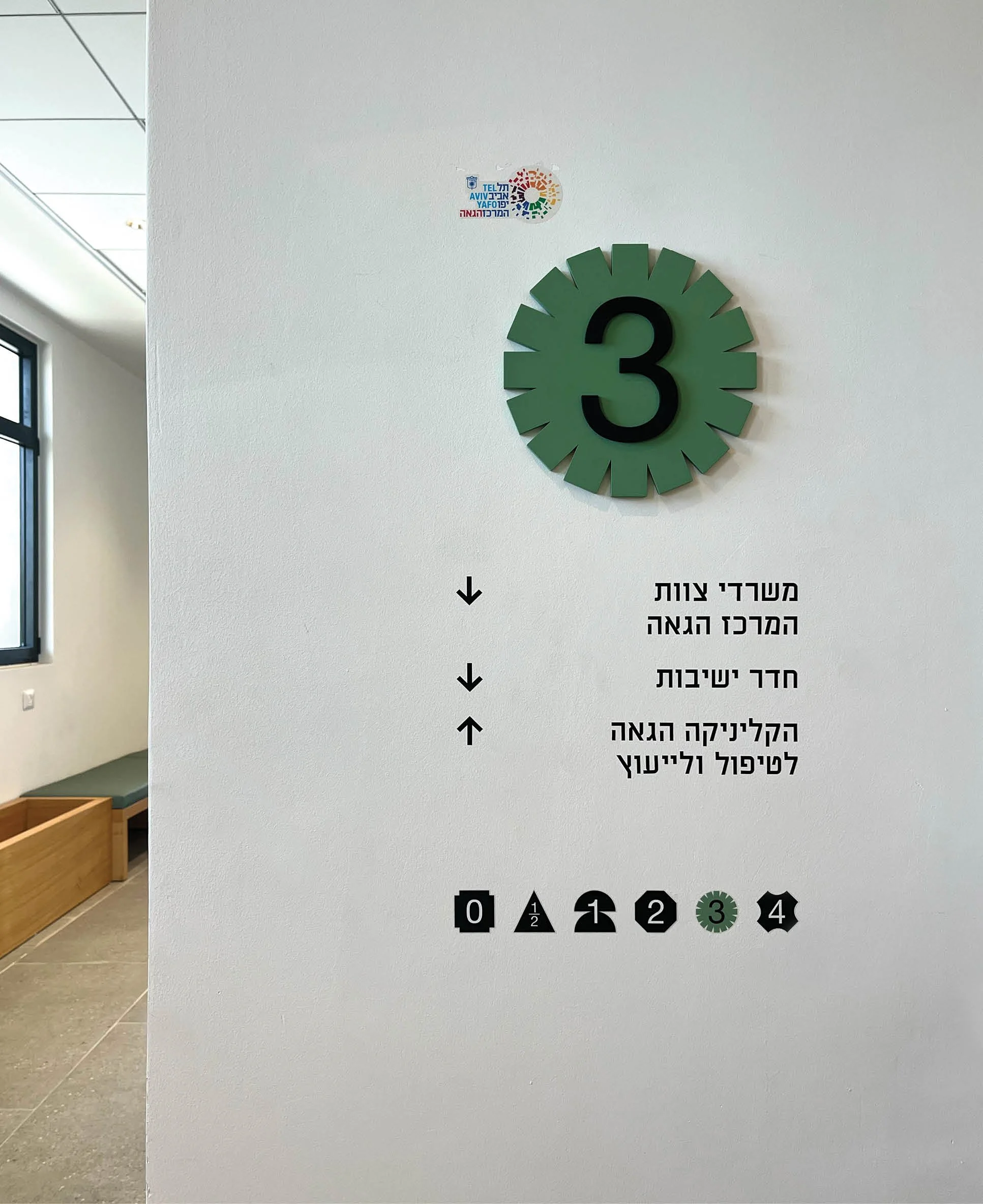
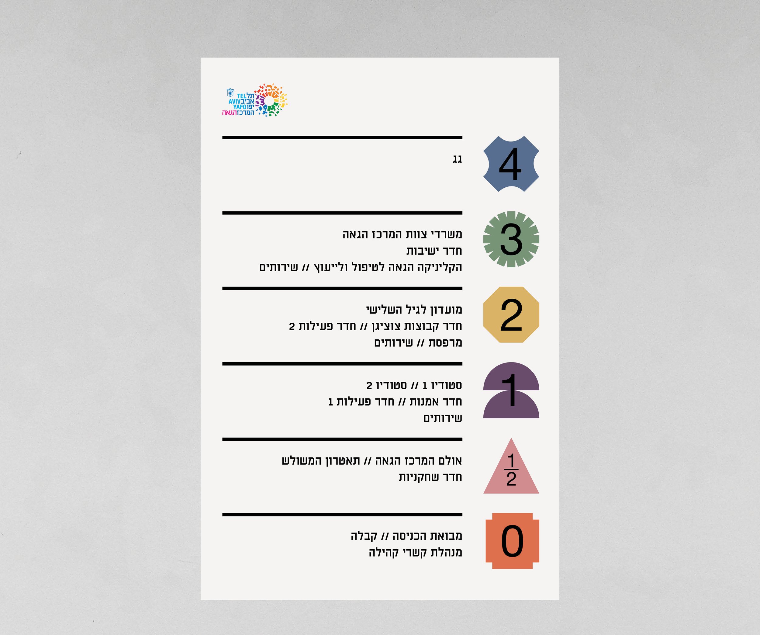
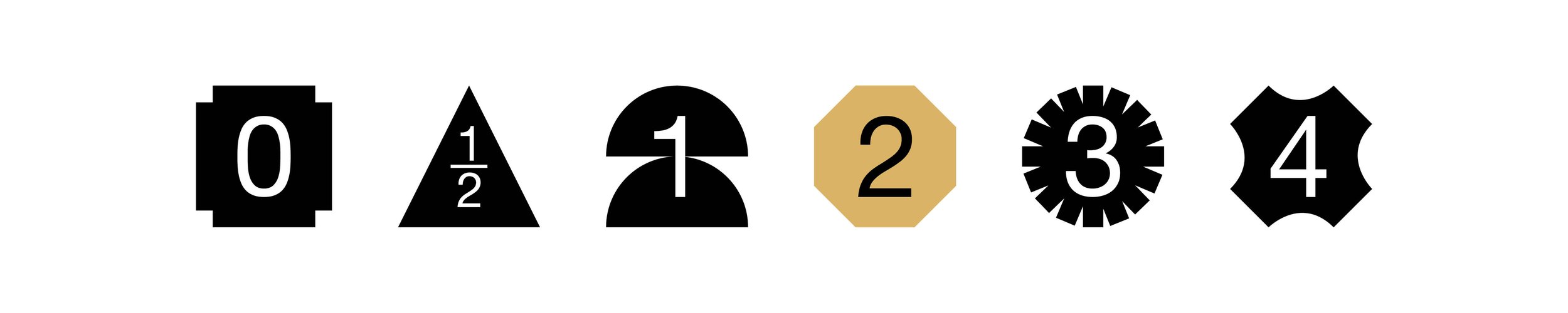
The visual language is built on fluid, changing graphic shapes and a shifting color palette that represents the community's pride identity. Each floor is anchored by its own leading shape and color to establish a clear sense of place. This same design language extends down into the details, where the shapes are developed into custom room icons defined by their specific topics, with tones selected to complement the existing architecture and interior design.

The Concept
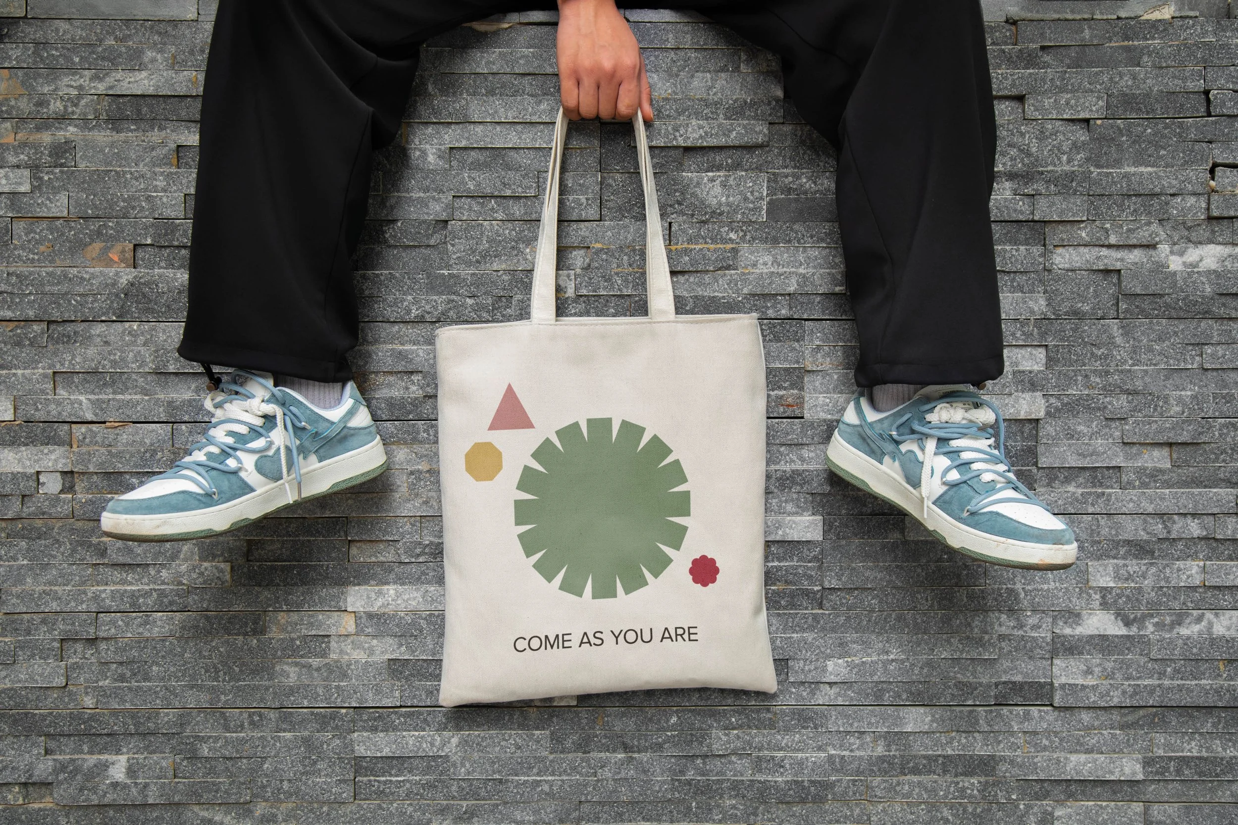
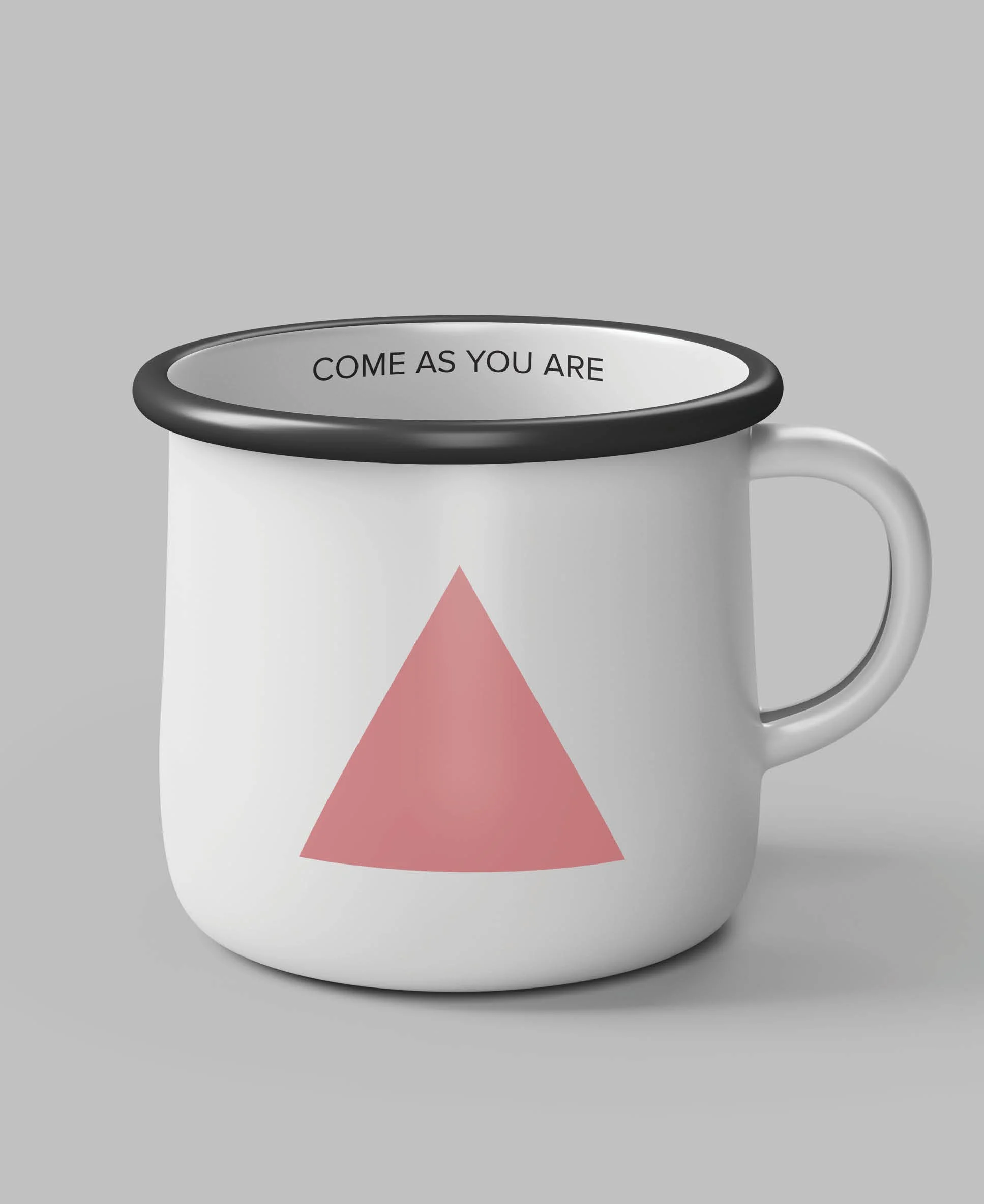
Come As You Are
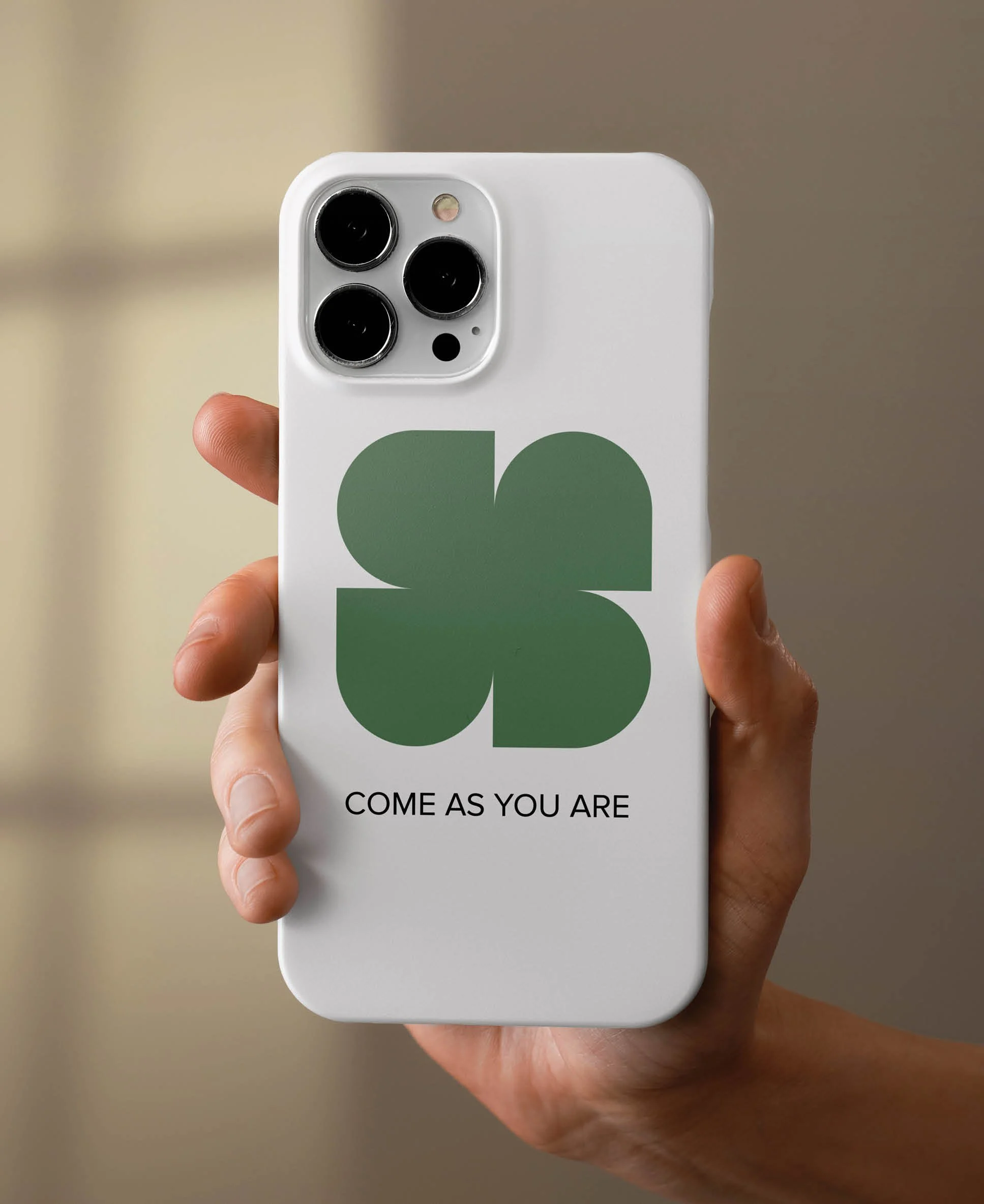
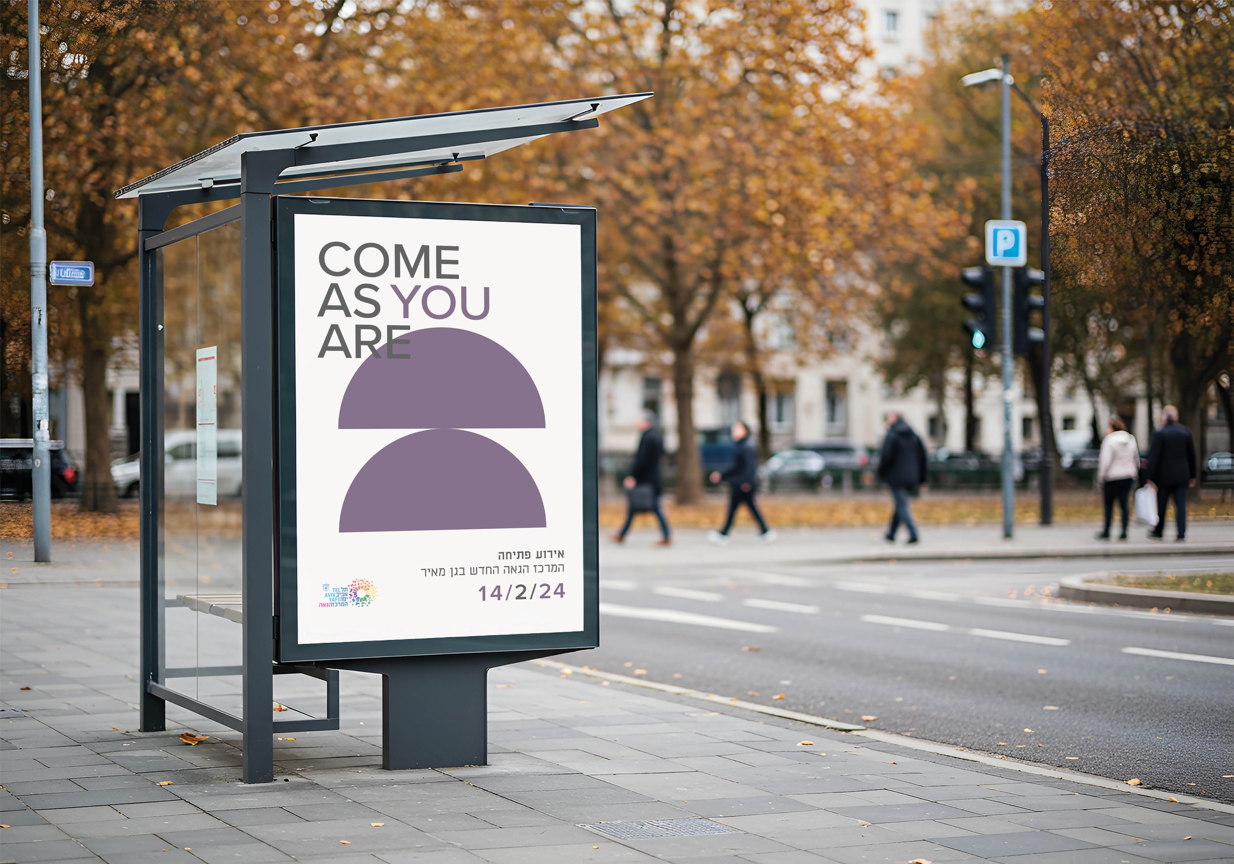
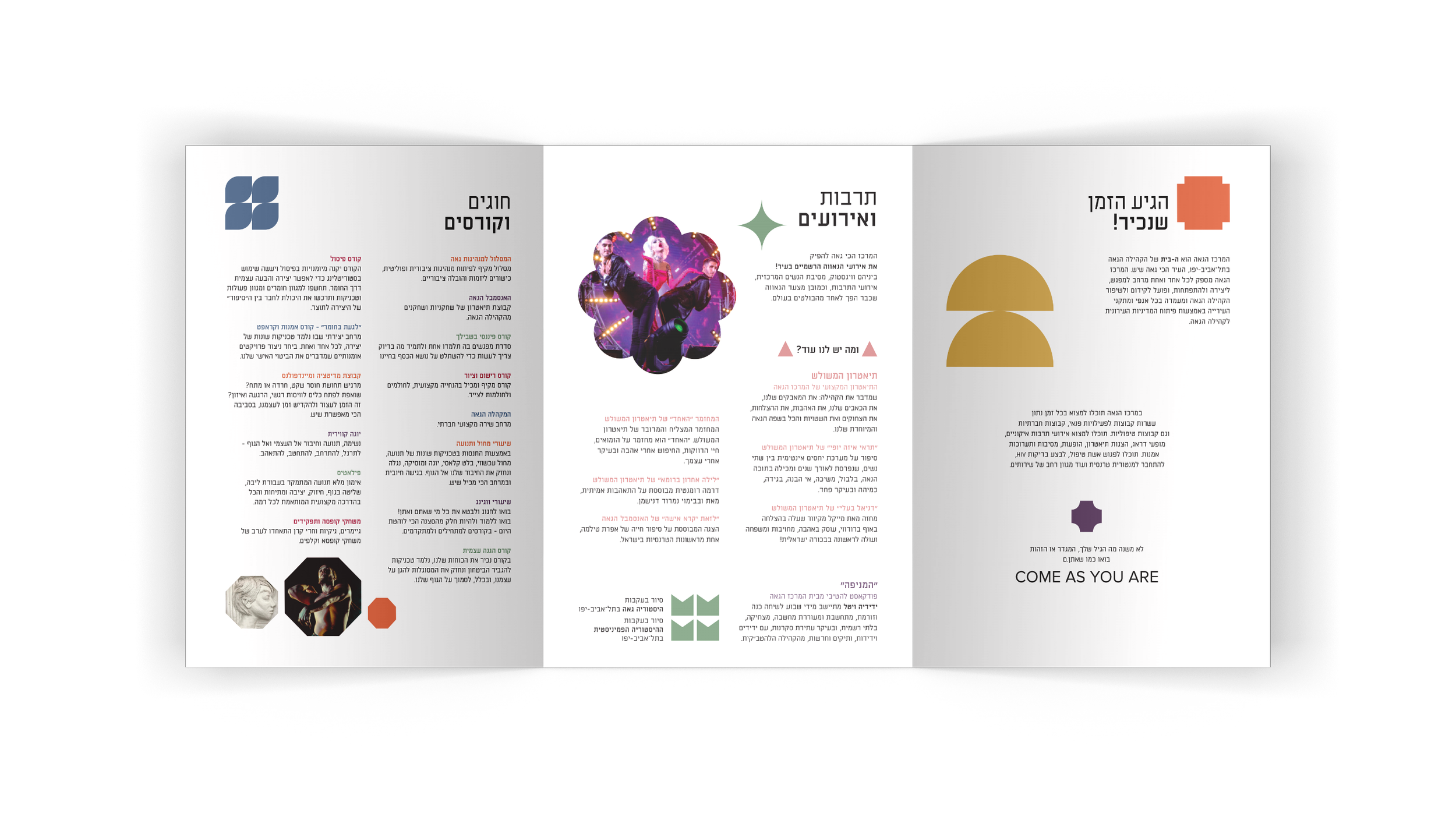
The core concept, "Come As You Are," defines the space as an open and accepting home for the community. The design serves as a framework that welcomes all identities, giving people the freedom to look, speak, and express themselves exactly as they choose. This narrative is carried directly onto the restroom mirrors through subtle verbal variations, such as "Wash the way you wash" and "Smile the way you smile," grounding the philosophy in simple, everyday moments.
Art Direction &
System Mechanics
Iconography
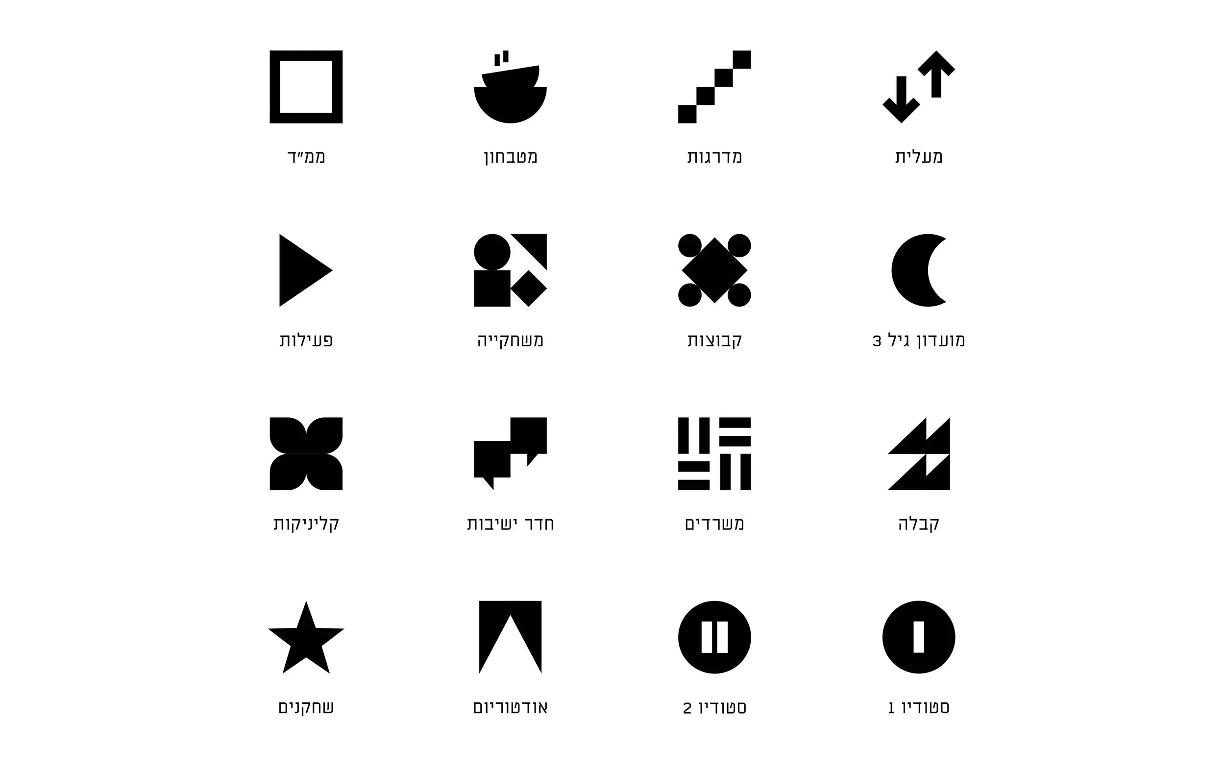
The custom pictogram system is built on a rigid square grid to maintain equal optical weight and visual balance across the entire building. Core geometric shapes were modified through rotation and subtraction to reflect the specific function of each room - such as stacked bowls for the kitchenette, organic leaf patterns for the therapy clinics, and triangle curtains for the auditorium. To prevent visual noise against the floor-specific colors, all pictograms are executed in solid black.
Typography
The Hebrew typeface, Blender, aligns with the municipality's guidelines, serving as a quiet, structural baseline. For numerals, Helvetica Neue replaces the default typeface's shapes, allowing numbers to be scaled large with a strong, distinct presence. Its structural character embodies the same intentional simplicity that defines the rest of the system, keeping all text in solid black for high contrast.
Wayfinding Logic
The vertical floor-level signs incorporate a progressive location bar at the bottom. This design element provides an immediate structural understanding of the building's layout, allowing people to instantly identify exactly where they are within the four floors.
The Outcome
The signage system provided a clear, functional navigation structure across all four floors of the building. Transitioning from the physical space to digital touchpoints, the phrase (come as you are) was adopted as a verbal asset - functioning as a consistent campaign header and social sign-off across the center's official communications.